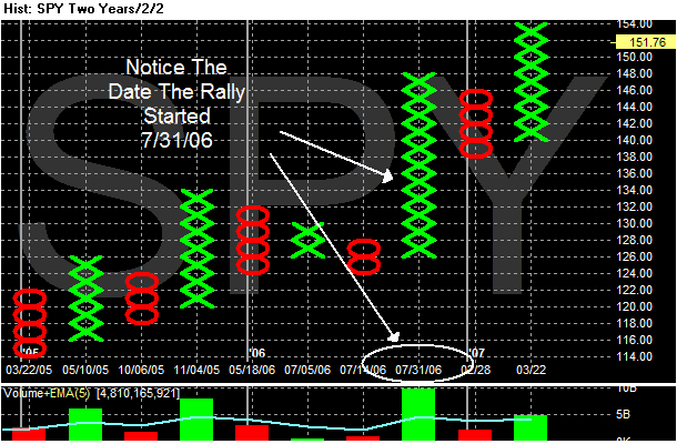
1.) Here's a P&F chart of the SPY rally. Notice it started on 7/31.
2.) The second quarter ended on 6/31. The BEA releases the GDP information on three dates: the last day of each subsequent month. So, we would have the 2nd quarter releases on the last day of July, August and September. In addition, the third quarter numbers would come out on the last day of October, November and December.
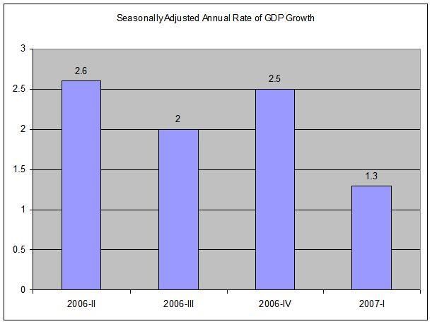
3.) By the end of November 2006 we had the second release of third quarter GDP. By then it was obvious the US economy was slowing down. Here is a chart of the last 4 quarters of the seasonally adjusted annual rate of US GDP growth.
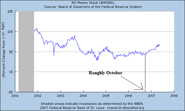
4.) Here's a chart of the YOY change in money supply. Notice it starts to pick-up in roughly late October/early November. Let's assume the Federal Reserve policy makers have advance knowledge of the GDP numbers.
This train of thought leads to the following question.
1.) Is the Federal Reserve "priming the pump" -- keeping the market afloat with more actual dollars when the economy is slowing down?
2.) Why is the Federal Reserve Increasing money supply when they are concerned about inflation? Aren't they contributing to their problem?
Now -- why would the Fed do this?
1.) Increasing the money supply would help to ameliorate the slowdown by giving people more money to spend. This could partially explain why consumer spending has been robust throughout the slowdown -- people simply have more physical dollars in their pocket. This is an entirely legitimate exercise of the Fed's authority.
2.) The US has become an asset dependent economy. As the US savings rate has decreased, it's asset base has increased. And as those assets increase in value, people are more likely to spend. By the end of last year it was obvious one major asset class -- namely housing -- was decreasing in value. Therefore, the Federal Reserve has to stabilize the value of other asset classes -- here, equities.