Friday, June 22, 2007
About That Low Unemployment Rate....
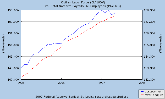
Here is a chart from the St. Louis Federal Reserve's FRED system. The blue line is the civilian force and the red line is the total number of employed according to the establishment survey. Notice the blue line has remained fairly constant for the last few months while the red line has increased. That means the low unemployment rate is partly explained by simple math rather than a really strong employment situation. That does not mean the employment situation is incredibly bad. I would guess that if you took out the skewing of the numbers you'd wind up with an unemployment rate around 5% (this is a guestimate, nothing more). However, the picture isn't as rosy as implied by the numbers either.