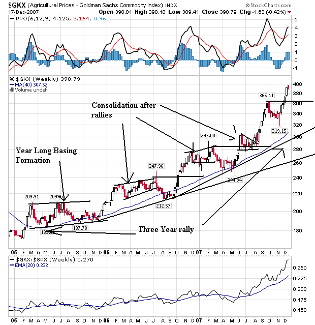
For the last three years, agricultural prices have been increasing. The chart above shows an incredibly strong chart that is a great example of a bullish chart. Prices formed a strong base in 2005. They rallied from the base and then consolidated in a bullish pennant formation in 2006. After selling off a bit, prices again rallied into 2007 where they again consolidated in two patterns -- a broadening pattern and then a triangle pattern. Prices have risen twice since then. In short, this chart says prices are increasing and will be for the foreseeable future.
From Bloomberg:
Wheat futures gained in Chicago as rising food costs signaled increased demand for the grain at a time of shrinking global stockpiles. Corn and soybeans declined as recent advances may have been overdone.
U.S. consumer prices rose the most in two years last month, while inflation surged 6.9 percent in China and 3.1 percent in Europe. Inflation is accelerating as oil and other energy prices reached records in November, spurring investors to buy commodities as a store of value.
``The global backdrop of inflationary pressure is supportive for agricultural products as we head into 2008,'' Nie Ben, manager at Liaoning Cifco Futures Co., said by phone from Dalian in northeastern China today.
.....
Corn reached a nine-month high yesterday at $4.4325 a bushel, while soybeans extended a rally to the highest since 1973 on speculation that U.S. demand for fuel made from grain and oilseeds will surge. The Senate passed a bill Dec. 13 that may boost use of alternative fuels such as ethanol and biodiesel.
Let's look at some of the individual charts:
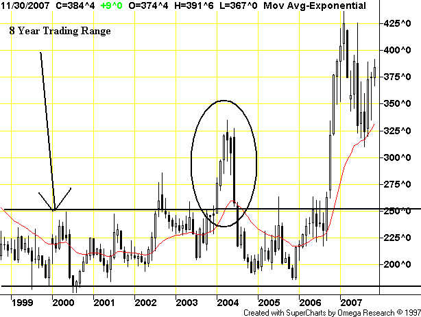
Except for a price spike in early 2004, corn traded in a 20% range for 8 years. An old trading saying is the longer the base, the stronger the rally. If that holds, we're in for one hell of a bull run.
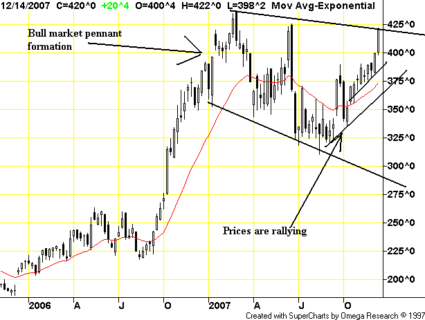
On corn's weekly chart, note it has been in a bull market pennant pattern for most of this year. This is a classic consolidation pattern. Also note that prices are making a move to break out of this pattern and move higher.
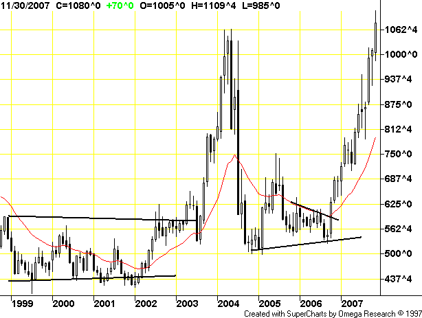
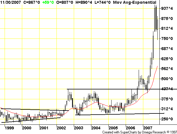
The monthly soy chart shows prices have been here before.
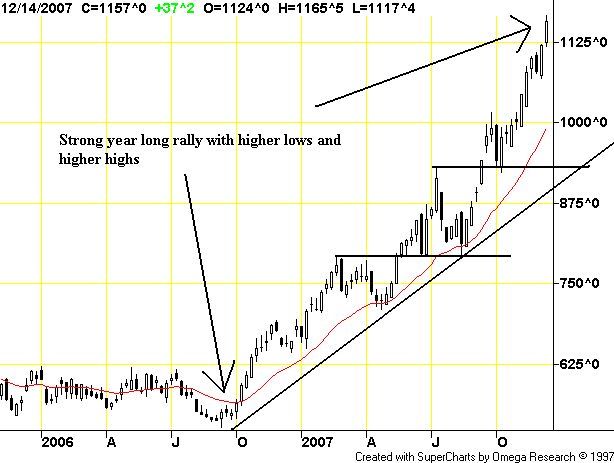
But, for the last two years, soy beans have also rallied. This is another example of a bullish chart. Note the continual pattern of higher highs and higher lows. While soy beans have been here before as the monthly chart demonstrates, this week chart shows there is every reason for prices to continue higher.
Like corn, wheat was in a pretty tight range for 8 years.
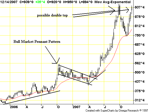
But since then, prices have clearly rallied. They broke out of their base in late 2006. From the end of 2006 through the first quarter of 2007 prices consolidated. Then they broke out. The only drawback to this chart's bullish angle is the possible formation of a double top this year.
Short version: agricultural prices are in a strong position to continue moving higher.