Saturday, January 27, 2007

The Market's Last Week

Let's see how the markets acted last week. Just for review, I use the exchange-traded funds for the S&P 500 (SPY), Nasdaq 100 (QQQQ) and the Russell 2000 (IWN). The DJIA is at best antiquated.

Here's a chart for the S&P and QQQQs, which both say the same thing.

Photobucket - Video and Image Hosting

Photobucket - Video and Image Hosting

We had two days of gains followed by two days of selling. However, the selling occurred on noticeably higher volume. In addition, the SPYs hit a higher level on Wednesday, then quickly retreated to lower levels -- again on higher volume. The QQQQ's looked like they were going to start moving up, but sold off the earlier in the week levels -- on higher volume. So -- short version is simple: last week there were more sellers than buyers in the market. In addition, market participants sold into the rallies. This is not a sign of confidence.

The IWNs were a little different.

Photobucket - Video and Image Hosting


This average has been trading in a range since the beginning of December. Last week we say a similar pattern to the SPYs and QQQQs, but the IWNs sold off to about 50% of the Tuesday-Wednesday rally. In addition, it looks like the IWNs may be forming a triangle trading pattern, which usually means consolidation before a move in wither direction.

In summation, traders were concerned about the market last week, with an emphasis on selling rather than buying. Before I speculated that the decreased likelihood of an interest rate cut may be acting as a ceiling on the market. With the numbers from Friday showing strength, that may still be the case.

Friday, January 26, 2007

Weekend Weimar

Photobucket - Video and Image Hosting

New Home Sales Increase 4.8%

From Bloomberg

New home sales in the U.S. rose more than forecast in December, showing the real-estate market is improving following its biggest slump since 1990.

Sales rose 4.8 percent to an annual pace of 1.12 million in December, the most since April, from a 1.069 million rate the prior month, the Commerce Department said today in Washington. For all of last year, sales dropped 17 percent, the biggest decline in 16 years, to 1.061 million from a record 1.283 million in 2005.

Buyers were lured back into the market after builders cut prices and sweetened incentives. Combined with more jobs, rising incomes and still-cheap mortgage rates, the sales increase may give companies such as Lennar Corp. reason to be more optimistic on the outlook for this year


Looking at the numbers from the Census Bureau, there are two large gains in the Midwest and Northeast -- which each increased 27% from November levels. I am guessing that unseasonably weather weather had something to do with these increases. Finally, these numbers to not completely comport with the slew of horrible homebuilder announcements this quarter, a majority of which have been horrible. I speculated that homebuilders may be front-loading bad news into their reports -- that is, adding a ton of bad news to an already bad quarter simply to get it over with. We'll have to wait and see if this is the case.

(From Bloomberg) The median price of a new home fell 1.5 percent in December, to $235,000 from $238,600 a year earlier. The median price of $245,300 for all of 2006 was 1.8 percent higher than the previous year.

The number of homes for sale at the end of the month fell to 537,000, the fewest since January, from 542,000 in November. That left the supply of homes at the current sales rate at 5.9 months' worth, compared with 6.1 months in November.


The drop in median prices indicates that sellers concessions are starting to pay-off in terms of higher sales. However, I would caution that lower prices do not include the increased use of incentives in sales. I would also caution that new home sales do not account for cancellations. Home builders have reported a much larger cancellation rate over the last few months.

Home builders have piled on incentives, including offering free vacations and new cars, to sell homes and reduce inventories.

Such incentives are not subtracted from the sales price reported to the government. Sales are reported when a contract is signed, not at the closing of the sale.

What's more, many of the nation's home builders have reported a large increase in cancellations in recent months. Cancellations are not reflected in the government data, so the reported sales are likely overstated.


The drop in inventory is a welcome development. The huge inventory overhang over the last year has been very concerning. However

However, the inventory of completed-but-unsold homes rose to a record 172,000, up about 50% in the past year. With builders having to carry the costs of those vacant houses, housing starts should weaken further this year until the inventory is worked off, Moody said.

Durable Goods Orders Increase 3.1%

From the Census Bureau:

New orders for manufactured durable goods in December increased $6.7 billion or 3.1 percent to $221.9 billion, the U.S. Census Bureau announced today. This was the fourth increase in the last five months and followed a 2.2 percent November increase. Excluding transportation, new orders increased 2.3 percent. Excluding defense, new orders increased 3.9 percent.


These numbers jib with the Fed's industrial production figures for December.

Excluding transportation, the overall number has decreased each month for the last three months. This indicates how important Boeing is to the US economy.

There was a big drop in semi-conductors (down 22%), but semis increase big two months ago (up 29.2%). My guess is producers are still working off that inventory.

There was also a big drop in computers and related equipment (down 5.7%). Communication equipment dropped 10.7%,Considering how important technology is to the latest stock market rally, this does not bode well for the coming trading week.

We saw a good increase in auto production (up 5.8%). This is probably a production increase in anticipation of new models.

Thank-God foreign airlines are buying planes.

Construction Layoffs In Last Unemployment report

For the last few months, I've been looking at the weekly unemployment reports to see how the housing slowdown is impacting construction employment. There have been some pretty sizable layoffs, and last week was no exception.

California had 10,000+ layoffs in "construction and service" employment.

Minnesota had Pennsylvania had 4000+ layoffs in construction or "construction, trade and service."

Florida had 3400 layoffs in "construction, trade, service, and manufacturing industries."

I am expecting this slow bleed to continued for some time. We've had a rash of homebuilding companies report very negative numbers for the 4th quarter. While housing inventory decreased in the latest existing homes survey, it's still had very high levels. Sales in 2006 dropped the most in over a decade. In other words, the soft landing for housing is still suspect.

Thursday, January 25, 2007

Richmond Fed -- Another Bad Month

The Richmond Fed issued this report on January 23. Because I was traveling I missed it and am now playing catch-up/.

From the Richmond Fed

Manufacturing activity in the central Atlantic region contracted again in January, according to the Richmond Fed’s latest survey. Respondents reported further declines in factory shipments and new orders, although employment and order backlogs declined on pace with December. Capacity utilization moved slightly lower, while delivery times edged higher. In addition, manufacturers reported somewhat quicker growth in finished goods inventories.


Photobucket - Video and Image Hosting

This chart is not good -- it shows the Richmond Federal Reserve District had another bad month and has been contracting for the better part of 2006. On the good side, the overall index had similar performance between 2004 - 2005 without a major problem. However, seeing any index drop like this does not raise confidence.

Here are the shipments and new orders indexes. They both show a similar pattern.

Photobucket - Video and Image Hosting

Photobucket - Video and Image Hosting

We've seen mixed manufacturing news over the past month. While overall industrial production for December increased .4%, the 4th quarter showed an overall decline. The Phily Fed was up moderately, but was nothing to write home about. The Empire State Survey softened a bit. The Kansas Fed index eased as well.

All of these regional reports are pointing to a slowing of overall production in February.

The Long View: Where Is the Trade Deficit?

BruceMcF

A long time ago, I looked at the current account blowout in The Long View: Current Account, which ended with a promise to have a look at the make-up of the blow out in terms of both geography and industry.

What I am looking at now is the broad outline of the geographic break down.

How broad? I am breaking the whole world down into The Americas, Europe, Asia & Oceania, and Africa. So the answer is, just about as broad as possible.
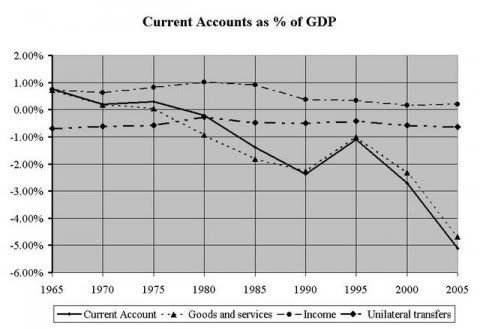
The Story So Far

Where I left off, before the long haitus, was the stark reality of the current account blowout:
  • It is massively bigger than anything we have experience in living memory

  • The problem is not income or unrequited transfers: it is trade

The trade account is made up trade in goods and trade in services. What I am going to be looking at today is trade in goods.

And before I put this information up, I will add a note that you should not shoot the messenger. After careful contemplation, I have come to the firm conclusion that messenger-shooting is counter-productive.

The source of this information is the same BEA site that provided the info for the first in this series. The only difference is that instead of working with table 1, I am working with Table 2b: Trade in Goods, Additional Historical Historical Data.

Where In The World Is the Trade Taking Place?

First, lets look at Exports to these four regions as a share of total exports. In all three of these graphs:
  • the Americas are the "dash" line,
  • Europe is the "dot" line,
  • Asia and Oceania is the "dash dot" line, and
  • Africa is the "dash dot dot" line.


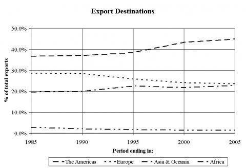
The trends here are simple. Europe is losing ground as an export market, with most of that share being taken up by the Americas, and some being taken up by Asia and Oceania. Africa is a very small market, both because of the small size of so many African economies as export markets, and because of the dominance of European firms in those markets.

Now, lets look at Imports from these four regions, as a share of total imports.

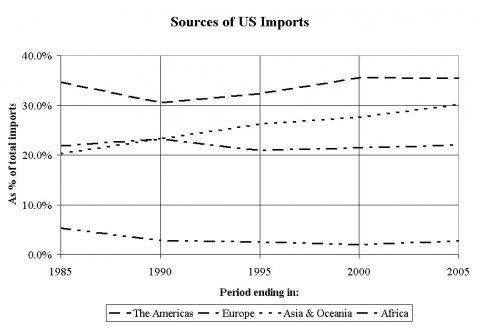
Here we have the Americas as the dominant source of imports, with a loss in market share in the 80-85 period that is regained with something to spare. The second spot, however, trades place, Europe holding a slight lead over Asia in 80-85, while by 01-05, Asia and Oceania is on a path toward taking over as the primary source of imports.

Don't Forget the Blowout

A word of caution is in order here. It is important to bear in mind that the two diagrams are showing shares of totals that are sliding rapidly apart. That is, 45% (about) of our goods exports go to the Americas, and 35% of our goods imports. But that is 45% of a smaller number, and 35% of a bigger number.

The way I have set this up is to take the average of imports and exports as "average trade", and look at the Balance of Payments with each global region as a percentage of "average trade". And here ... as in the earlier diary that focused on the current account overall ... things are moving "south" at a very rapid pace.


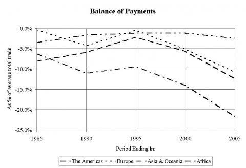
Bear in mind here that what you are looking at is trade in goods, not goods and services overall. The US tends to have a stronger position in services than in goods. As you will see when I look at trade in services, a "small" negative balance in goods trade is good news for the overall trade account.

And for the global regions, the balance of trade compared to average trade breaks down into two stories. For the Americas, Europe, and Africa, the story by and large is improvements up through to 90-95, and then a rising deficit through to 00-05 (and, if we sneaked at table 2a, on to the present).

For Asia and Oceania, the "improvement" in the trade deficit is there, but it is very small ... from about -11% to about -9% ... and the slide since then is the single largest source of the trade deficit.

And remember: this last figure is compared to the average amount of all trade in goods. The deficit in goods trade with Asia and Oceania is more than 20% of the average trade in all goods.

The Path Ahead

Of course, whenever you find Economic bad news, you can find a pollyana that will explain that its just the market in operation, and in the end its all for the best. The main hope for the pollyanas are that "in the long run", the deficits in the goods trade will be balanced by surpluses in services trade.

And so, in the third installment in this series, I will see what the long term view of the balance of trade in services has to tell us. ... to be continued ...

Existing Homes Sales Decrease .8%

From Bloomberg

Sales of previously owned homes in the U.S. declined in December for the first time in three months, capping the biggest annual drop since 1989, a slide that's shown signs of bottoming.

Purchases dropped 0.8 percent to an annual rate of 6.22 million, the National Association of Realtors said today in Washington. For the entire year, sales fell 8.4 percent from 2005's record. In a sign the slide may be nearing an end, the number of homes on the market decreased for a second month.

``This grinding sort of correction will continue for much of this year,'' said Joshua Shapiro, chief U.S. economist at Maria Fiorini Ramirez Inc. in New York. ``Housing will make a negative contribution to the economy this year, but the declines won't be as big as those we have seen in the most recent past.''


The best news in this report is the drop in inventory, which decreased from a 7.3 month supply to a 6.8 month supply. While that figure is still high, it is lower than recent inventory readings.

It's important to remember that interest rates have increased to around 4.85%. This does not bode well for continued strength in the housing market. When interest rates dropped from this level in mid-October we saw an increase in housing sales. Now that rates have returned to this level, I would expect sales to decrease.

While sales appear to have stabilized over the last four months, the high level of consumer debt indicates we are not out of the woods yet in housing.

Tuesday, January 23, 2007

State of the Union: A Nation Off Track

So, we’re all eagerly awaiting President Bush’s State of the Union address to hear the honest facts about the nation’s economy, among other key issues.

OK, not.

Looks like we’ll have to dig up the real deal on our own by taking a gander at some of the recent data and what they portend for us working types.

Tonight, Bush likely will talk about the great economic recovery we’ve seen in the past couple of years. But newly released data from two separate sources reveal just how skewed the distribution of economic growth has been in the current recovery, according to the Economic Policy Institute.
Data from the Bureau of Economic Analysis through the third quarter of 2006 show that a historically high share of corporate income is going into profits and interest (i.e., capital income) rather than employee compensation. And a newly released Congressional Budget Office (CBO) analysis of household incomes shows that a greater share of this capital income goes to the richest households than at any time since the CBO began tracking such trends. In other words, our economy is producing more capital income and that type of income is more likely to go to those at the very top of the income scale. Together, these dynamics are contributing to a uniquely skewed recovery.
That means those in the top 1 percent of the income scale received 59.4 percent of all the capital income in 2004 (CBO's latest data), up from 49.1 percent in 2000 and just 37.8 percent in 1979. The increase in the concentration of capital income to the upper 1 percent grew as quickly over the four-year period from 2000 to 2004 as over the preceding 11 years (1989–2000).

So, the economic recovery Bush will tout is mostly about the rich getting richer. And those tax cuts that Bush will call the shining star of his economic acumen? Guess what. They’re helping the rich more than the economy. As Citizens for Tax Justice puts it:
First, the tax breaks enacted since 2001 are heavily skewed toward the very wealthiest few. Second, because the tax cuts are being paid for with borrowed money, the cost of paying the added national debt more than wipes out any benefits from the tax cuts for 99 percent of residents in each state. Only the best-off one percent are net winners from the president’s fiscal policies.
But those tax cuts for the wealthy must do something for the overall economy, right? Indeed. According to the Center on Budget and Policy Priorities:
Congressional Budget Office data show that the tax cuts have been the single largest contributor to the reemergence of substantial budget deficits in recent years. Legislation enacted since 2001 has added about $2.3 trillion to deficits between 2001 and 2006, with half of this deterioration in the budget due to the tax cuts (about a third was due to increases in security spending, and about a sixth to increases in domestic spending). Yet the president and some Congressional leaders decline to acknowledge the tax cuts’ role in the nation’s budget problems, falling back instead on the discredited nostrum that tax cuts “pay for themselves.”
As the Center on Budget and Policy Priorities sums up:
A study by the president’s own Treasury Department recently confirmed the common-sense view shared by economists across the political spectrum: Cutting taxes decreases revenues.
The Bush administration ran the Clinton budget surplus into the ground after less than a year in office—and has kept adding to the national tab so that the United States is now more than $8 trillion in debt (that’s nearly $29,000 for every man, woman and child in the nation). Yet after all these years of draining the federal budget into oblivion, administration cronies now suddenly are sounding the alarm.


And they’re offering solutions. But they’re not suggesting the nation cut back on the $255 million a day Bush is spending on the Iraq war or back off those tax cut payoffs to wealthy donors. Instead, in a recent speech, Ben Bernanke, Federal Reserve chairman, used a warning about the growing deficit as the opening salvo to attack on what’s left of our country’s successful heath and retirement programs.
Warning against complacency over the federal deficit, Ben S. Bernanke, the Federal Reserve chairman, said Thursday that recent positive trends on the budget were a “calm before the storm” masking a long-term danger posed by looming deficits in Social Security and Medicare.

snip

Bernanke’s comments were consistent with his past warnings, and those of his predecessor, Alan Greenspan, about the unfunded cost of the postwar generation’s retirement. But his tone was more urgent, and it seemed aimed at the arrival of a new Democratic-led Congress that is just now setting its priorities.
Let’s see. The budget deficit is in the dumpster and the Bush administration wants to salvage it by cutting back on retirement and health care. Let’s look at retirement. Without Social Security, millions of retired Americans would struggle in poverty. Between 1960 and 2004, Social Security helped cut the poverty rate among seniors by more than two-thirds, from 35 percent to 10 percent. Social Security takes on more, not less, importance as we go forward, with fewer and fewer workers getting retirement benefits on the job. As AFL-CIO Secretary-Treasurer Richard Trumka said in testimony today before the House Ways and Means Committee:
Only half of American families have an employer-provided retirement plan of any sort, a proportion largely unchanged for decades. However, whereas 40 percent of workers participated in employer guaranteed “defined-benefit” pension plans in 1980, today only 20 percent have such plans. In substituting “defined-contribution” for defined benefit plans, employers are shifting the risk of retirement onto workers. And American workers are ill prepared to carry this risk.
There are a lot of reasons why Bush’s approval rating has tanked, according to recent polls. And it’s pretty clear that Iraq isn’t the only reason 71 percent are saying the country is seriously off track.

Traveling

I am traveling today and tomorrow. Posting will resume on Thursday afternoon.

BS

Sunday, January 21, 2007

10-Year Treasury and Housing

Talk of a housing bottom started sometime in October. Since then we've gotten more news on new and existing home sales to stoke talk of a housing bottom (We've also had home builders report some really lousy earnings reports). In addition, interest rates started to drop about that same time. Here's a chart of the 10-year Treasury from stockcharts.com

Photobucket - Video and Image Hosting

Rates have risen steadily since early December, largely because good economic news and public statements from various Fed governors dampened speculation of a rate cut in early 2007. As a result, the 10-year Treasury's interest rate is back near 4.84%. This was at least a non-restrictive interest level in October. We'll have to see if that still holds going forward.