The short version of the above three articles is the economy is looking very bad right now. If we're not in a recession, we're really close to it. In addition, I think the situation in the financial industry will last for at least the next year adding further downward pressure on growth.
Let's assume that earnings are a big driver of the market. Considering that most traders use the S&P's overall PE ratio as a measure of value this seems a solid statement of fact. Therefore, if the economy is slowing, earnings will stand a good possibility of dropping which will lower share prices.
All of this means we can continue to expect the averages to under perform for the foreseeable future. So this week I'm going to look at a lot of charts of the indexes and industries to see what they say.
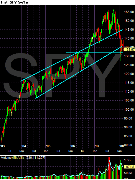
The 5 year SPYs chart shows the average has broken through two key upward sloping trend lines. In addition, the trend break occurred on high volume. Finally, prices settled around support from a price established in 2006. A move through that level would make 130 the next strong supper level (remember: the market's like round numbers).
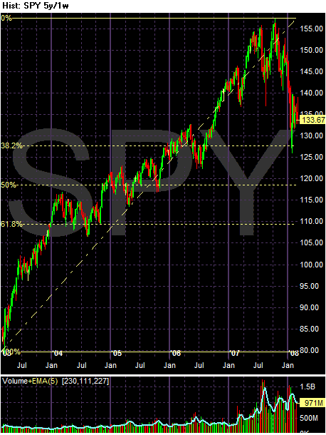
The above chart assumes the last 5 years comprise one long upward sloping run. Therefore, use the Fibonacci levels as ideas for where support might be.
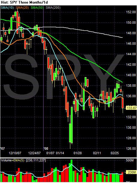
The SMAs paint a very confusing picture. The longer-term averages -- the 50 and 200 SMA -- are both heading lower. But the shorter term SMAs are bunched together with prices, indicating a clear lack of direction. Prices have been bouncing around the shorter SMAs for the last month or so.
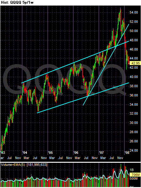
The 5-year QQQQ chart shows the average has broken two key support lines. The upper channel line started in early 2004 and the upward trending support line started in mid-2006. Currently the QQQQs are consolidating.
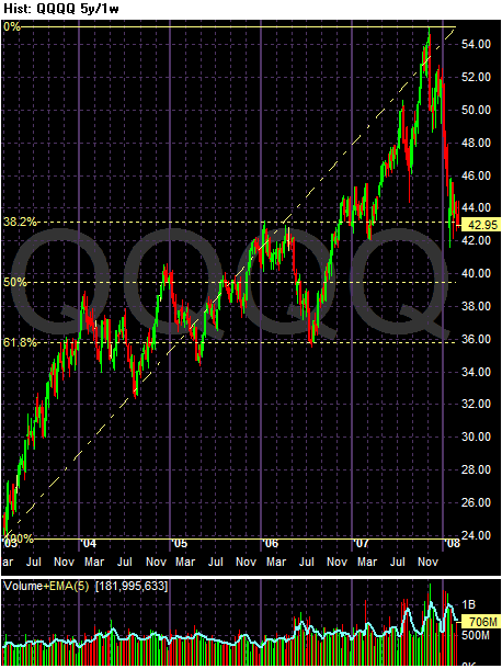
Assuming the last 5 years is one ling uptrend, here are the Fibonacci levels for a pullback.
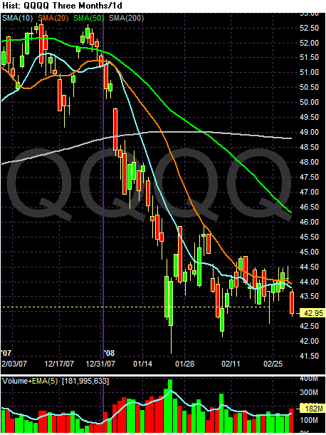
The SMA picture of the QQQQs is just as confusing as the SPYs. The shorter SMAs are below the longer SMAs. But the 10 and 20 day SMA are both heading sideways and both have been tangled up with the candles for the last month. This indicates a lack of direction in the market.
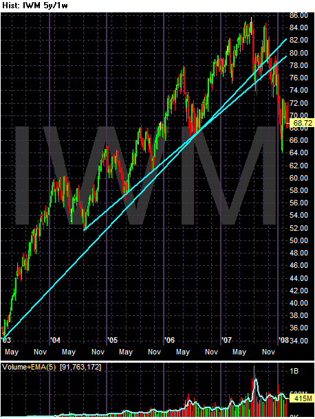
The IWMs have two possible support lines, but the average has clearly broken both.
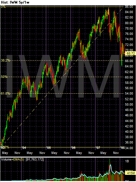
Assuming the last 5 years has been one long uptrend, here are the Fibonacci retracement levels.
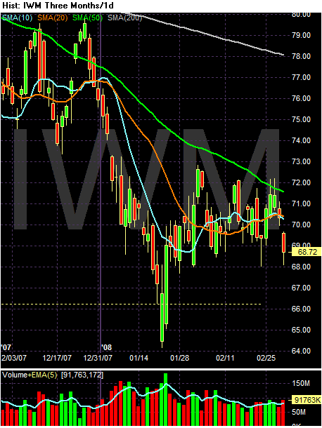
The SMA picture mirrors the SPYs. The longer SMAs (50 and 200 day) are clearly moving lower, but the shorter SMAs are heading sideways and are tangled up with price.
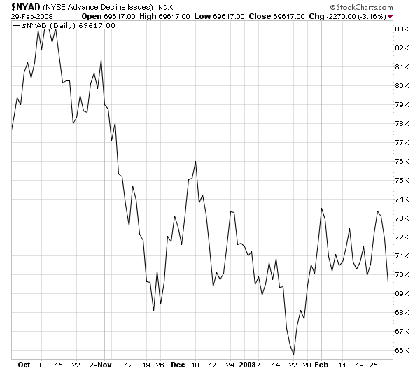
The NY advance/decline line shows the market's indecision. Notice this average is clearly in a trading range.
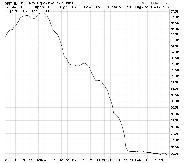
While the NY High/Low is heading lower, the angle has clearly moderated.
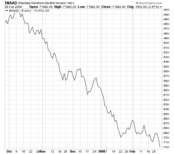
The NASDAQ advance/decline line is still moving lower, but again at a slightly smaller angle.
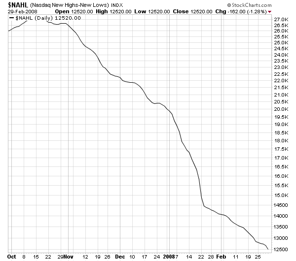
The NASDAQ new high/low line is heading lower, but at a slightly less severe angle.
So, what do all of these charts mean?
-- All of the major averages have clearly broken multi-year uptrends.
-- However, their current status is very unclear. The long-term SMAs say the markets are moving lower, while the shorter SMAs indicate a clear indecisiveness. My guess is the bad economic news is being trumped by the Fed's promises to continue cutting rates in the near future.
Next up, we'll take a look at some of the market sectors to see how their charts look.