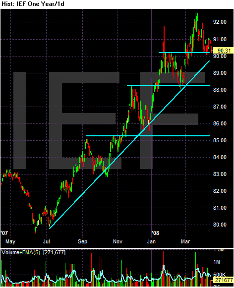
On the 1 year chart, notice the prices have been in a clear uptrend, continually making new highs by breaking through previous resistance levels. This is a solidly bullish chart.
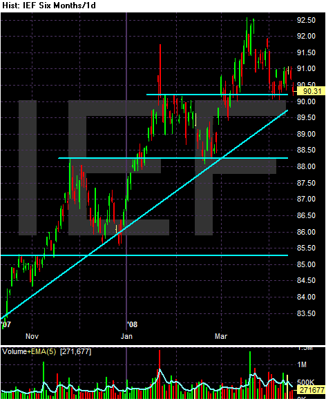
On the six month chart, notice that prices rise then sell-off a bit after hitting new peaks. This is healthy.
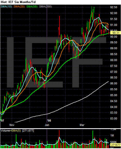
On the six month SMA chart, notice the following:
-- Prices have continually bounced off the 50 day SMA as support
-- The 50 day SMA has continually moved higher.
-- The 10 and 20 have consistently been above the 50 day SMA, although the 10 and 20 have intertwined over the same period.