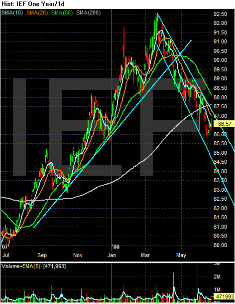
The middle part of the curve started rallying at the beginning of July. This was a flight to safety caused by the start of the credit crunch. Prices rallied until early March of this year when they started to move lower.
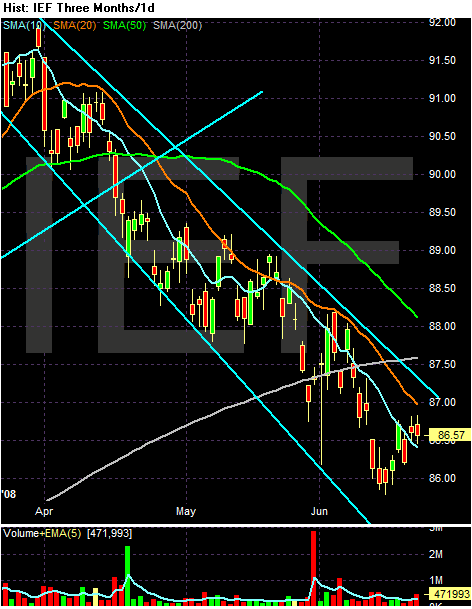
On the 3-month chart, notice the following:
-- Prices have moved below the 200 day SMA
-- The 10, 20 and 50 day SMA are all moving lower
-- The 10 and 20 day SMA has move below the 200 day SMA
-- Prices are below the 20 and 50 day SMA; prices are just above the 10 day SMA
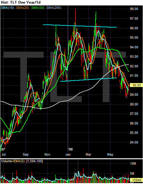
The long end of the curve (20+ years), is a bit different. They consolidated from the end of November/beginning of December to mid-May of this year. That's when they fell below support and moved lower.
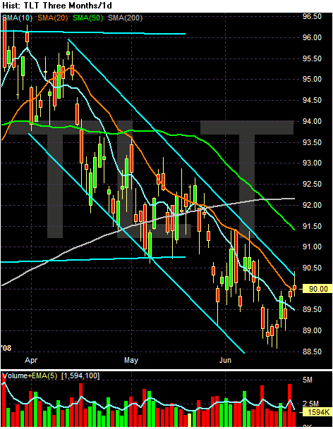
On the three month SMA chart, note the following:
-- Prices are below the 200 day SMA
-- The 10, 20 and 50 day SMA are moving lower.
-- The 10, 20 and 50 day SMA have all moved below the 200 day SMA
-- Prices are in a clear downward sloping channel
-- Prices are just above the 10 and 20 day SMA. But prices have used the 20 day SMA as a pivot point for the last few months.
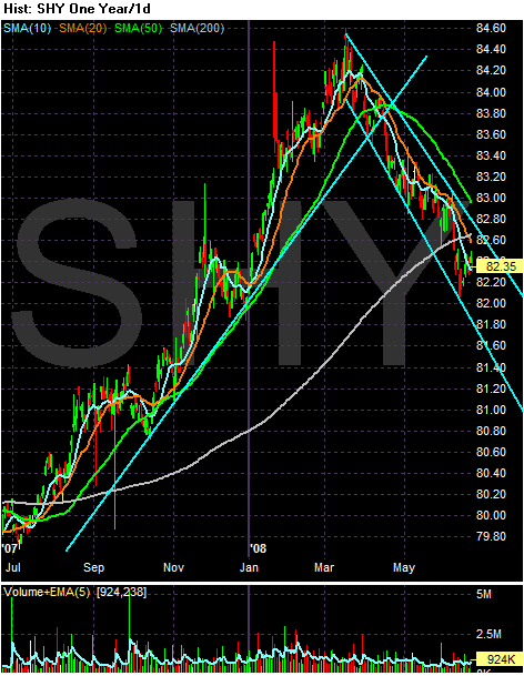
The short end of the curse (1-3 years) really benefited from the credit crunch. They rallied hard for nearly a year as traders parked their money in short-term bonds.
On the short-tern SMA chart, notice the following:
-- Prices are below the 200 day SMA
-- The 10, 20 and 50 day SMA are all moving lower
-- The 10 and 20 day SMA have both moved below the 200 day SMA
-- Prices are in a clear downward sloping channel.
All of these charts have clear downward sloping channels that have been in place for a few months. All also have downward sloping short-term SMAs (10, 20 and 50 day SMA). The bottom line the Treasury market has been correcting for a few months and the charts indicate we're in for more of the same.