
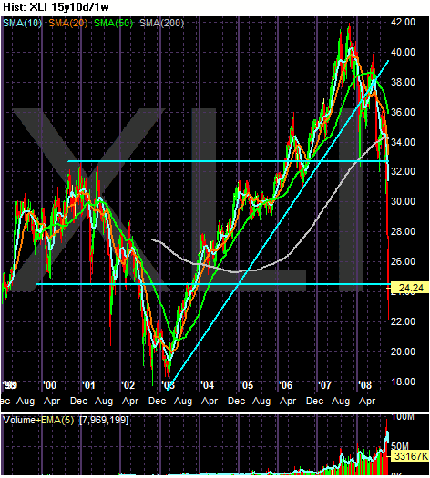
On the 15-year chart, note the chart is at levels from 2000. In other words, 8 years of gains have been wiped out. Also note the uptrend that started in 2003 was clearly broken.

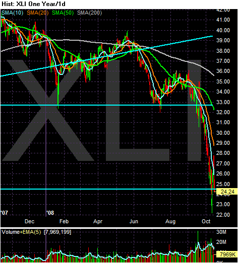
On the yearly chart, notice we're near yearly lows.

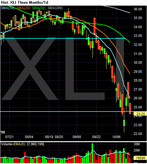
On the three month chart, note the following:
-- Prices are below all the SMAs
-- All the SMAs are moving lower
-- The shorter SMAs are below the longer SMAs
Bottom line: This is a very bearish chart.


1 comment:
Hi, Bonddad,
Been following you on DKos for several years now, and on your own blog for almost as long. Can I make a suggestion? I hold a BSEcon from Wharton, but still have trouble remembering which charts are which. Would you mind using English in describing which charts you are presenting? I find that I often have to figure out what the chart abbreviations represent. Just a bit more readability is all I'm asking for.
Thanks, and keep up the excellent summaries and analysis. You provide a great one-stop service for many of us.
Tim (aka outragedinSF)
Post a Comment