The economic data this week favored the bulls. Retail sales, industrial production, capacity utilization, and jobless claims were all to the good side. In particular, industrial production is up about 2.5% in the last three months, close to the point at which historically jobs have started to increase. Real retail sales gave back September's cash-for-clunkers advance, though, and are only up about 1% from their April bottom at this point. Consumer sentiment was down from a month ago, but well within the range of noise. CPI showed mild monthly inflation, and will probably probably rise into year-over-year inflation no later than next month.
Additionally, I've been tracking indicators that come out each week, particularly with respect to what they might mean for the creation of jobs.
The ICSC reported Tuesday that same store sales for last week were up 0.6% from last week, and up 1.0% from a year ago.
Meanwhile, Shoppertrak reported that as to mall traffic, "On a weekly level, ... sales for the week ending October 10th were down -3.o percent as compared to last year, while weekly sales decreased -0.7 percent versus the previous seven-day period ending October 3rd."
Initial Jobless Claims fell to 514,000 from a revised 524,000 a week ago. The 4 week average fell to 531,500. Claims are just slightly above the level where, if maintained for several months, I believe that jobs will actually start to be added to the economy.
Railfax reported that rail traffic is up from the previous week, and slightly improved (but still negative) on a year-over-year basis.
All things considered, a good week in the data.
From Bonddad:
I was especially pleased with this week's data. Industrial production was an indicator that gave me great concern for some time. While we are not out of the woods yet, we have seen some good improvement in this figure. For me, the continuing drop in initial jobless claims is very good news. While the number is still high (it is still a bit over 500,000) it has been continually coming down since the earlier part of this year. Retail sales ex-autos were up, indicating the C4C program helped but was not all that was going on there. The consumer sentiment numbers are concerning. However, despite the drop we still had an increase in retail sales which is positive. Additionally, the continued drop in initial unemployment claims indicates we should see a better jobs number in the next report which should help to boost this number going forward.
----
Quick update by NDD: There is one important negative I meant to include, and that is the price of Oil which closed at about $78 today. Above $80 for any length of time will start to drag the economy -- not just of the US, but the global economy -- back down, with another crash in demand. I cannot imagine what the geniuses trading Oil must be thinking.
Friday, October 16, 2009
Emerging Economies To the Rescue?
Does the worldwide recovery even need the US? Consider these charts of the BRIC ETFs (click on all for a larger image):

The Brazil chart is printing a classic higher higher and higher low chart. It has been doing this for the entire year. Also note all the EMAs are moving higher, the shorter EMAs are above the lower and prices are above all the EMAs -- the most bullish orientation possible.

A.) The Russian market rose from March to early June
B.) Prices consolidated in a downward sloping pennant pattern from June until late July
C.) Prices continued higher from late July until now
D.) Prices have broken through upside resistance, consolidated gains and then moved higher. Also note that as prices have moved higher they have made several upside gaps.

India;
A.) Prices gap higher
B.) Prices form an upward sloping trend
C.) Prices move through upside resistance and then continue to move higher

China
A.) Prices move higher in a strong upward move
B.) Prices consolidate
And just for good measure

Emerging European markets are also rallying
A.) Prices form a strong uptrend
B.) Prices break through upside resistance and continue higher
Big Business vs. the Little Guy -- Economic Fallout
I mentioned in a recent post that I believe the United States is losing its worldwide economic mojo -- its hegemony. I believe we're seeing some evidence of that now unfolding, and the future effects will be far-reaching and long-lasting. And I'm not sure it's reversible, as the U.S. consumer still has yeoman's work to do repair his/her balance sheet. And even then it will be a long road home.
Rex Nutting wrote a piece over at MarketWatch Wednesday that I would have written were I a business writer. I believe it speaks to some of the effects of our situation:
WASHINGTON (MarketWatch) -- The stock market achieved a milestone on Wednesday, withthe Dow Jones Industrial Average surpassing 10,000 once again. Along with stellar earnings from big companies such as J.P. Morgan and Intel, Dow 10,000 shows big companies are doing just fine.
At the other end of the spectrum, however, small businesses are still mired deep in a recession. Wall Street may be celebrating, but Main Street can't afford to.
Coincidentally, the best gauge of how small businesses are doing was released justTuesday. The National Federation of Independent Business index showed a small 0.2 gain to 88.8 in October. The economist for the small-business group said the good news was "that the index did not decline.
"The Dow, which includes 30 of the biggest and most successful companies, is up about50% from its bottom in March. The NFIB index, which represents about 350,000 small firms, is up about 10%.
The Dow is one of the most famous economic and financial indicators; the NFIB is hardly known at all, even among economists. Still, we should listen to the NFIB. [ed. note: You would know about the NFIB if you've been reading here (Dec. 2007) or Blah3.com (Feb. 2008).]
According to Goldman Sachs chief economist Jan Hatzius, the NFIB index usually tracks closely with gross domestic product. Hatzius says big businesses are decoupling from the rest of the economy.
Big business has access to capital; small business doesn't. Big businesses have been earning lots of money; small businesses say profits are falling. Big business could afford to hire workers, if it wanted to; small businesses can't.
The decoupling represented by the Dow and the NFIB show the economy may be much weaker than we think. Most economic indicators -- payroll growth, retail sales,manufacturing orders -- by design do a better job of measuring big business activity. Usually, it doesn't matter.
But it matters now. The health of big business -- and the rebound in the stockmarket -- may be blinding us to just how weak the rest of the economy is.
--Rex Nutting, Washington bureau chief
More on this as time and data allow.
Forex Fridays
 1.) Prices continue to move in a downward path. Notice the downward sloping trendline and the bearish orientation of the EMAs -- all are moving lower, the shorter are below the longer and prices are below all of them.
2.) Prices are weaker
3) The MACD -- momentum -- continues to decline

1 and 2.) Prices continue in a downward trajectory, contained by two trendlines
3.) Prices have been weak for some time
4.) Prices continue to move through previously established points
5.) The EMAs are bearish -- the shorter are below the longer, all are moving lower and prices are below all of them
Thursday, October 15, 2009
Another Minute on the Minutes (FOMC, That Is)
Meant to cover this in yesterday's post but forgot. This, in a nutshell, is what keeps me up at night (also from the FOMC minutes):
"Some of the recent gains in activity probably reflected government policy support, and participants expressed considerable uncertainty about the likely strength of the upturn once those supports were withdrawn or their effects waned."
I think we'd all agree that the word "probably" clearly doesn't need to be in there. This, to me, is the crux of the issue. We've had massive government largesse (and rightfully so, I'd add). However, the patient is still so doped-up that we really have no idea what he'll look like when the medicine wears off -- and we know we can't medicate him forever.
The areas in which the government was able to directly intervene, such as the auto market, have showed some signs of life via Industrial Production (which will print again in several hours). However, the government has no direct control over the labor market, the continued weakness of which is keeping wages down, which will continue to constrain spending, etc., etc.
Sooner or later there has simply got to be a hand-off. The question is: Who's going to take it?
Today's Market

1.) The market has been in an uptrend for the last 10 days.
2.) The market has consolidated gains at A, B, and C.
3.) The market is in another uptrend slightly above the longer trend line (1). Markets do this a fair amount.
However,

A.) The Russell 2000 has not made a new high, and it's recent rally
B.) Has occurred on declining volume.
Remember yesterday I noted the transports were also not at a new high.
There are not fatal problems. But, they do raise eyebrows.
Philadelphia Fed Positive

Click for a larger image
Here is the accompanying chart

Click for a larger image
The overall index is still positive, but it dropped from 14.1 to 11.5. However, the new orders index increased from 3.3 to 6.2. However, there is some weakness in the report. Specifically employment is still down and given its current reading of -6.8 I'm not expecting a strong rebound any time soon. In addition, future expectations -- while still positive -- have been decreasing.
Overall I'd call this a bullish report, but with a few important caveats.
Getting it wrong about economic indicators entirely
- by New Deal democrat
(Sigh...) Is there anything about economic indicators that Mish can get right? Apparently not.
Now he's launched a broadside against ECRI's recession calls (begrudgingly acknowledging at the end the correctness of their Great Recession bottom call last March). Now, ECRI are Big Boyz and Gurlz, so they can defend themselves (and they have). What I want to do is look at what he says about economic indicators generally.
First of all, here's what he says about the yield curve:
and here it is from 1980 to the present:
Had you predicted recession one year later every time the yield curve inverted, you would have had a false signal in 1966 and again in 1968. On the other hand, in times of inflation had you predicted recovery one year later every time the yield curve reverted to normalcy with at least a 1% difference between the long and the short bond, you would have had a perfect record.
So what indicators does Mish think are worth following? Here's his conclusion:
1. "unemployment is high and rising"

Gee, just like at the end of every prior recession and at the beginning of every prior recovery. Leading indicator? Ummm, no.
2. "foreclosures are high and rising"
Well, there aren't good national charts going way back, but here's a nice one from California:

Gee, I wasn't aware that 1995 was the peak of the recession. Leading indicator? Ummm, no.
3. "banks are not lending"

Again, exactly like at the end of every prior recession and frequently well into the subsequent recovery. Leading indicator? Ummm, no.
4. "consumers are not spending"

Now this graph of Personal Consumption Expenditures shows that usually consumer spending does uptick before the end of recessions, but now it's ... ummm ... also upticking. Leading indicator? Ummm, well actually, yes. It's just showing the opposite of what Mish claims.
5. "finally, commercial real estate is imploding"

Again, exactly like the end of every prior recession and at the beginning of a number of prior recoveries, including the last two.
Leading indicator? Ummm, no.
Mish's conclusion: "Those "real economy" conditions are not the makings of a strong recovery, perhaps not any recovery"
The truth: Mish is 0 for 5. A whopping 4 out of 5 are proven lagging indicators! The fifth, which is a leading indicator, he gets completely wrong. He's also flat out wrong about the implications of a positive yield curve as well. If he were right, recessions would have continued in 1975, 1983, 1992, 2002, and on and on -- instead of the recoveries which actually happened.
And let's not forget this classic bad call about rail traffic from June of this year in which Mish claimed: "Year over Year Percent Change - 13 Week Rolling Averages … are still moving lower, with no apparent end in sight", a call which almost exactly marked the bottom of that very* trailing indicator (*which was also borne out by the week over week averages on the very same page).
Like I said at the beginning: Is there anything about economic indicators that Mish can get right? Apparently not.
(Sigh....)--------------
Meanwhile, Prof. Paul Krugman has jumped on the bandwagon, saying:
Huh?!? Even Homer nods, and here, the good Nobel-prize-winning professor has not just nodded, but completely lost his memory. To begin with, as I've reminded the professor on his own blog, the available data indicate that it is likely that the LEI's would have functioned correctly during the Great Depression, including the 1929-32 collapse.
Further, the LEI's are supposed to call turns in the economy 3-6 months out. The LEI's began to turn in April, when the economy was still in free-fall. Now most economists agree that the recession ended (even if employment still stinks) sometime during the summer -- i.e., 3-5 months later. But don't take my word on it -- take the word of a guy named ... Prof. Paul Krugman. Here's what he said just one week ago:
(Sigh...) Is there anything about economic indicators that Mish can get right? Apparently not.
Now he's launched a broadside against ECRI's recession calls (begrudgingly acknowledging at the end the correctness of their Great Recession bottom call last March). Now, ECRI are Big Boyz and Gurlz, so they can defend themselves (and they have). What I want to do is look at what he says about economic indicators generally.
First of all, here's what he says about the yield curve:
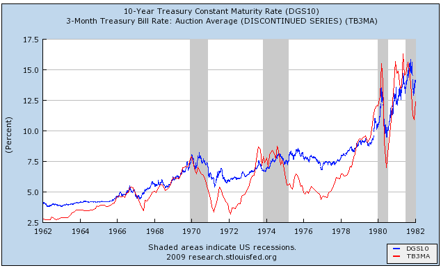
A strategy to exit the market on the ECRI's recession call is better than nothing, yet it leaves a lot on the table compared to a strategy of getting the hell out of the way when the yield curve inverts.Actually, while the yield curve is generally a good predictor of the economy, in times of inflation it actually has a better record giving "all clear" signals than when it inverts. Mish doesn't supply the actual graphs, but I will. Here's the 10 year vs. the 3 month from 1961-1980:
....
it's important to be fair. Inverted treasuries only predict recessions, they do not give "all clear" signals.
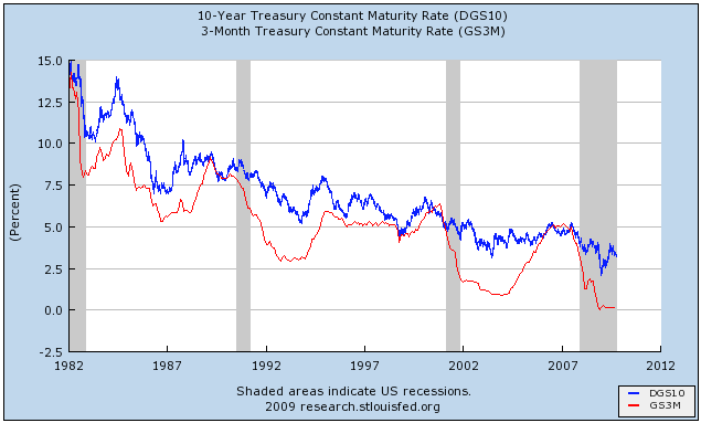
and here it is from 1980 to the present:
Had you predicted recession one year later every time the yield curve inverted, you would have had a false signal in 1966 and again in 1968. On the other hand, in times of inflation had you predicted recovery one year later every time the yield curve reverted to normalcy with at least a 1% difference between the long and the short bond, you would have had a perfect record.
In deflation the picture is more complicated -- an inverted yield curve, as in 1928-29 and 2007, means death, whereas a positively sloped curve only predicts recovery in the presence of abating deflation -- as in 1933 and now. (and no, deflation isn't deepening, not just as measured by the regular CPI. I debunked Mish's claim about the Case Schiller-CPI, showing that the CS-CPI also shows abating deflation compared with the bottom early this year, here).
So, why did Mish claim that the yield curve can't give the "all clear" sign? Maybe because it completely undercuts the narrative that caused him to miss a 3500 point (+55%) bull move in the DJIA during the last 7 months.
So what indicators does Mish think are worth following? Here's his conclusion:
This is what I see now: In spite of the change in the stock market, unemployment is high and rising, foreclosures are high and rising, banks are not lending, consumers are not spending, and the government is the buyer of only resort for mortgages. The deleveraging process continues while banks continue to tighten credit and finally, commercial real estate is imploding.Well, since Mish is interested in debunking poor indicators, how about we return the favor and look at his?
Those "real economy" conditions are not the makings of a strong recovery, perhaps not any recovery.
1. "unemployment is high and rising"
Gee, just like at the end of every prior recession and at the beginning of every prior recovery. Leading indicator? Ummm, no.
2. "foreclosures are high and rising"
Well, there aren't good national charts going way back, but here's a nice one from California:
Gee, I wasn't aware that 1995 was the peak of the recession. Leading indicator? Ummm, no.
3. "banks are not lending"
Again, exactly like at the end of every prior recession and frequently well into the subsequent recovery. Leading indicator? Ummm, no.
4. "consumers are not spending"
Now this graph of Personal Consumption Expenditures shows that usually consumer spending does uptick before the end of recessions, but now it's ... ummm ... also upticking. Leading indicator? Ummm, well actually, yes. It's just showing the opposite of what Mish claims.
5. "finally, commercial real estate is imploding"
Again, exactly like the end of every prior recession and at the beginning of a number of prior recoveries, including the last two.
Leading indicator? Ummm, no.
Mish's conclusion: "Those "real economy" conditions are not the makings of a strong recovery, perhaps not any recovery"
The truth: Mish is 0 for 5. A whopping 4 out of 5 are proven lagging indicators! The fifth, which is a leading indicator, he gets completely wrong. He's also flat out wrong about the implications of a positive yield curve as well. If he were right, recessions would have continued in 1975, 1983, 1992, 2002, and on and on -- instead of the recoveries which actually happened.
And let's not forget this classic bad call about rail traffic from June of this year in which Mish claimed: "Year over Year Percent Change - 13 Week Rolling Averages … are still moving lower, with no apparent end in sight", a call which almost exactly marked the bottom of that very* trailing indicator (*which was also borne out by the week over week averages on the very same page).
Like I said at the beginning: Is there anything about economic indicators that Mish can get right? Apparently not.
(Sigh....)
Meanwhile, Prof. Paul Krugman has jumped on the bandwagon, saying:
[I]n a zero-interest rate world ... conventional indicators don’t mean what they usually mean..... So historical correlations, to the extent that they exist ... can’t be counted on to prevail. There’s really no alternative to making fundamental analyses of the macro situation.
Huh?!? Even Homer nods, and here, the good Nobel-prize-winning professor has not just nodded, but completely lost his memory. To begin with, as I've reminded the professor on his own blog, the available data indicate that it is likely that the LEI's would have functioned correctly during the Great Depression, including the 1929-32 collapse.
Further, the LEI's are supposed to call turns in the economy 3-6 months out. The LEI's began to turn in April, when the economy was still in free-fall. Now most economists agree that the recession ended (even if employment still stinks) sometime during the summer -- i.e., 3-5 months later. But don't take my word on it -- take the word of a guy named ... Prof. Paul Krugman. Here's what he said just one week ago:
it’s fairly clear that the official records will eventually say that the recession ended in the summer of 2009.In other words, Krugman's assertion that the LEI's don't work in a zero-interest rate world isn't just undercut by looking at the likely LEI results from the 1930's. It is undercut by his own analysis of the present, which he reiterated only one week ago!
Jobless Claims Drop

From the DOL:
In the week ending Oct. 10, the advance figure for seasonally adjusted initial claims was 514,000, a decrease of 10,000 from the previous week's revised figure of 524,000. The 4-week moving average was 531,500, a decrease of 9,000 from the previous week's revised average of 540,500.
This was one of the first economic numbers that caught my attention regarding the idea of recovery. Notice that the 4-week moving average has been dropping since late March/early April.
This is more good news for the economy. It indicates the recovery is underway.
New York Fed Manufacturing Index At Highest Level in Five Years

From the New York Federal Reserve:
The Empire State Manufacturing Survey indicates that conditions for New York manufacturers improved significantly in October. The general business conditions index climbed 16 points to 34.6, its highest level in five years. The new orders index rose 11 points, and the shipments index shot up 30 points, to 35.1. Both employment indexes were positive for the first time in more than a year. Price indexes were little changed, with the prices paid index remaining positive while the prices received index hovered just below zero. Future indexes advanced to relatively high levels, indicating that respondents expect conditions to improve further in the months ahead.
.....
Future indexes rose from the already high levels observed in September. The future general business conditions index climbed 3 points, to 55.7, and the new orders and shipments indexes advanced to similarly elevated levels. Future price indexes remained above zero, suggesting that both prices paid and prices received were expected to increase in the months ahead. The pace of input price increases was expected to slow, with the future prices paid index declining 12 points to 24.7, while the prices received index was little changed at 10.4. Employment was expected to rise over the next six months. Future employment indexes remained well above zero, with the future index for number of employees climbing 10 points to 18.8. The capital expenditures index rose 4 points, to 18.2, and the technology spending index advanced to 13.0.
I am particularly pleased with the employment readings in this report. This is the first in a series of Fed manufacturing reports. We'll have to wait and see if this trend continues in other regions.
Thursday Oil Market Round-Up

1.) Oil prices were in a upward trend since early March.
2.) Prices moved into a downward sloping channel.
A.) Prices are now below trend line 1 and above trend line 2.

The above chart is a close of of the current price action.
A.) Notice that prices have gapped higher but the prices have not printed a strong candle, instead printing candles with short bodies and long shadows.

1.) Prices have been in an uptrend for the last 6 days.
A.) Notice the gaps higher on three different days, indicating a strong demand situation.
Wednesday, October 14, 2009
FOMC Minutes in a Minute
There was a wee bit of good -- or should I say "less bad" -- news in today's FOMC minutes. You can read about it elsewhere.
Here's the section that caught my eye:
"Nonetheless, most participants anticipated that slack in both labor and product markets would be substantial over the next few years, leading to subdued and potentially declining wage and price inflation."
"Substantial" slack in both labor and product markets over the next few years, leading to "subdued" and "potentially declining wage and price inflation" (read: deflation?).
Today's Markets

A.) Prices have hit a recent high. But it is a hanging man candle pattern. However, this is not the most predictive of candles.
B.) The EMAs are in a very bullish configuration: the shorter EMAs are above the longer, all the EMAs are rising and prices are above the EMAs.
Volume is a bit weak on this break-out. This is not fatal as no situation is ever technically perfect. But it is something to be aware of going forward.

A.) Prices broke out on strong volume. This indicates there was stronger demand than supply.
B.) Prices find support around the 20 day EMA
C.) Prices find support around the 20 day EMA
D.) Prices find support around the 50 day EMA
E.) Prices moved higher at the end of trading on stronger volume. While prices did not end at the absolute high, they did close near the high.

A.) Note the transports are now below their long-term trend line on weaker volume.

A.) Prices are below the trend line and have had difficulty getting above the trend line. Notice that as prices have gotten near the trend line, the candles have formed doji patterns. Also note that prices are below previous highs. In short, prices are not confirming the SPY's high.
A Note On Comments
While we are pleased to have people participate in the blog there are rules. Specifically, please no anonymous comments. They drive me nuts and won't be accepted going forward.
News You (Probably) Didn't See Yesterday
I’d like to second Bonddad and welcome Silver Oz aboard. I’ll also second the notion that there’s some pretty good work being pumped out of the Bonddad Blog.
A couple of second-tier economic releases printed yesterday, and they were both disappointments. First up, the National Federation of Independent Business (NFIB), released its monthly Small Business Economic Trends (SBET) report (usually released on the second Monday of the month). The overall level of small business optimism rose from 88.6 to 88.8 – more noise than signal, if you ask me. Insignificant.
Beneath the surface, however, a couple of items caught my eye:
“Poor Sales” remains far and away the single biggest concern of small business owners (click for larger image).

The ongoing concern over sales likely plays no small part in the second troubling aspect of yesterday’s release: The hook back down in hiring intentions.

Hiring Intentions hooked back down to -4 from 0. This measure has not been above zero since October 2008 -- one year running now, and clearly the worst stretch in the history of the series.
Separately, the IBD/TIPP confidence numbers were released yesterday, and they, too, hooked back down:
NEW YORK, Oct 13 (Reuters) - U.S. consumer confidence fell in October, and after months of fluctuations in sentiment, further negative pressure caused by mounting unemployment could hurt consumer spending, a research group said on Tuesday.
Investor's Business Daily and TechnoMetrica Market Intelligence said their IBD/TIPP Economic Optimism Index slipped to 48.7 in October from 52.5 in September.
Readings above 50 indicate optimism, while those below 50 point to pessimism.
The index is now 0.6 points above its 12-month average of 48.1 and 4.3 points above its reading of 44.4 in December 2007, when the recession began.
As I noted in a previous post, it appears to me that the green shoots have begun to turn a bit brownish, and that the onus is now on the economic bulls to continue making their case. Pulling back the lens a bit, I sense this is all part of the loss of U.S. hegemony, something I hope to explore in more detail in future posts, as I think the consequences will be long-lasting and far-reaching.
Retail Sales, Inventories continue improvement in September
- by New Deal democrat (update by Bonddad)
Retail sales came in unexpectedly strong at -1.5%, reversing only part of the cash-for-clunkers induced +2.7% from August, for a net gain of 1.2% in two months. Ex autos retail sales were up +.5%, for a 1.6% gain in the last two months. This is particularly encouraging, since as the doomers have been incessantly telling us, consumer access to credit has been more limited. In short, this gain has come from consumers spending cold, hard, saved cash.
Since bottoming in April, retail sales are up 2.7%. Ex-autos they are up 1.8%. And no, you can’t just put this down to oil prices either. They’ve been stagnant since April.
Meanwhile, Marketwatch also reported that:
This inventory/sales ratio equals that at the end of 2003, the time by which the last "jobless recovery" had finally morphed into an actual "jobs recovery."
I pointed out a couple of weeks ago that Real Retail Sales are the "Holy Grail" leading indicator of future employment. Simply put, historically, increased consumption has always, always, always, led to jobs. Today's data means that there is both demand strength and supply tightness -- about as good a precursor as you can get for jobs improvement soon.
----
P.S. I pre-emptively submit the above to Invictus as a counter-demonstration of business activity and "green shoots."
From Bonddad: The internals of this report were surprisingly strong. Consider this chart from the report:

Click for a larger image.
Car sales were down 10.4%. This was expected as the cash for clunkers expired. But notice the only other activity to decrease was sales of building materials and garden supplies (think Home Depot and Lowe's), misc. store retailers and non-store retailers. That's a good sign.
Retail sales came in unexpectedly strong at -1.5%, reversing only part of the cash-for-clunkers induced +2.7% from August, for a net gain of 1.2% in two months. Ex autos retail sales were up +.5%, for a 1.6% gain in the last two months. This is particularly encouraging, since as the doomers have been incessantly telling us, consumer access to credit has been more limited. In short, this gain has come from consumers spending cold, hard, saved cash.
Since bottoming in April, retail sales are up 2.7%. Ex-autos they are up 1.8%. And no, you can’t just put this down to oil prices either. They’ve been stagnant since April.
Meanwhile, Marketwatch also reported that:
U.S. businesses reduced their inventories at the fastest pace on record in August ....
....
The inventory-to-sales ratio fell to 1.33 in August from 1.36 in July
This inventory/sales ratio equals that at the end of 2003, the time by which the last "jobless recovery" had finally morphed into an actual "jobs recovery."
I pointed out a couple of weeks ago that Real Retail Sales are the "Holy Grail" leading indicator of future employment. Simply put, historically, increased consumption has always, always, always, led to jobs. Today's data means that there is both demand strength and supply tightness -- about as good a precursor as you can get for jobs improvement soon.
----
P.S. I pre-emptively submit the above to Invictus as a counter-demonstration of business activity and "green shoots."
From Bonddad: The internals of this report were surprisingly strong. Consider this chart from the report:

Click for a larger image.
Car sales were down 10.4%. This was expected as the cash for clunkers expired. But notice the only other activity to decrease was sales of building materials and garden supplies (think Home Depot and Lowe's), misc. store retailers and non-store retailers. That's a good sign.
Today's Markets
Which is actually yesterday's market, but who's counting? Click for a larger image

Yesterday's action was a clear consolidation pattern, with prices moving between upper and lower bands.
A.) Prices sold off hard at the opening -- note the long candles and the heavy volume.
B.) But prices rebounded from low levels and eventually rose to their opening levels.
C.) Prices then sold-off again, this time on far lighter volume. Also note the support that prices received from the EMAs. Prices did not reach the level of previous lows before rallying.
D.) Prices again rallied to opening levels.
E.) Prices sold off at the end of the day, but note that despite increasing volume prices maintained support at the EMAs. Finally prices rose a touch at the end on a large volume spike.
Wednesday Commodities Round-Up

A.) Prices have been consolidating in a triangle pattern
B.) Prices have broken out of that pattern and
C.) Momentum is moving higher. Also note that momentum just crossed the 0 line -- another bullish move.

A and B.) Are the upward sloping trend lines
C, D, and E.) These are consolidation areas. Notice that prices are moving lower and consolidating gains in an organized manner. There is no panic selling.
1, 2, and 3.) Prices have moved higher. 1 and 3 are higher moves that gapped higher instead of gently rising.
Overall, notice the chart is in a pattern of higher highs and higher lows. Simply put, this is a nice looking chart that is very bullish.
Tuesday, October 13, 2009
Were the Luddites Just Too Early?
Introduction from Bonddad: I have asked Silver Oz to contribute to the site. I have known his work for the last few years and have always been impressed with the depth of his research and analysis. He has been posting here for the last year in the comments section and his points are always well-thought out and thought provoking. I will post the market wrap in the morning so you can enjoy this well written piece.
There seems to be more and more talk about our decline in manufacturing prominence and its relation to outsourcing/off-shoring, but these arguments always gloss over (or skip entirely) the relationship of technology/efficiency to the losses in manufacturing employment and every one of these arguments always begins with the assumption that we produce less than in the past (some usually undefined past, but most often refers to sometime between 1950 and 1973). I am going to use this essay to demonstrate how the infamous Luddites may very well have been correct in their fear of technology, but were almost two centuries too early in their conclusions.
First, I want to define that I am going to end my data in 2007 (ie before the recent recession), as the data dramatically skews during the “Great Recession” and it is difficult if not impossible to infer much through this period of time in the data (however, it is my belief that once we emerge from recession, nothing substantial will have changed economically that will alter my conclusions herein).
To begin, I want to state emphatically that industrial production (in actual units of stuff, not dollar value) has continued to increase in the post war period, right up until our most recent recession. We do in fact produce as much (actually quite a bit more) than we ever have and thus the “nothing is made in

So, now that we know industrial production (in units of stuff) was at an all-time high at the end of 2007 what do we know about jobs in goods producing industries (ie manufacturing)? Well, those jobs are at about the same level they were at the beginning of 1992, and although they saw a slight rise during the 90’s (about 11%), they fell again during the 2001 recession and remained around the 1992 level since then. During this same span of time we saw industrial production increase by 50% during the 90’s (so for every one percent rise in jobs we saw a 5% rise in industrial production) and after a shallow drop during the 2001 recession, industrial production moved back to all-time highs while jobs stagnated. Thus, industrial production at the end of 2007 was 65% higher than in 1992, while manufacturing jobs had essentially stagnated since then.

The gap between manufacturing jobs and industrial production is even more evident when we look at the time period between the start of the 2001 recession and the start of the 2007 recession, as manufacturing jobs declined by 10% while industrial production increased by about 10%.

The numbers are even more stark when we look at the value of goods through the personal consumption expenditures component of GDP (in chained 2005 dollars) and back out all imports (this is goods only for both). Doing the simple calculation (http://www.bea.gov/national/nipaweb/TableView.asp?SelectedTable=6&Freq=Qtr&FirstYear=2007&LastYear=2009) shows us that the difference in inferred domestic output between 2000 and 2007 was an increase of 24% (again during a period in which manufacturing jobs declined by 10%).
Concluding, the information above seems to imply that we have reached a point where industrial production can increase at a rate much faster than the need for jobs to produce the goods. In fact, during the period between the 2001 recession and the 2007 recession manufacturing jobs actually declined while industrial production increased substantially. Coupling this data with recent (and by recent I mean at least the last 10 years) productivity increases, which grew at an average annual pace of 3.71% between 2001-2007 (a total increase of 29% during that period) and we can see that perhaps we have indeed reached a point where our ability to improve output with technology is now increasing at a pace faster than new demand can create a need for new manufacturing jobs. If this conclusion is correct then not only were the Luddites right in their fears (albeit 200 years too early), but that we need to begin rethinking all of our economic policies, as they are not designed for a world in which technology can displace jobs faster than new innovation and demand can create them.
Wheat Prices Jump

Click for a larger image
A.) Prices moved though key resistance levels. Prices have also moved above the SMAs.
B.) The MACD is in a very bullish posture. First, it has just crossed 0 -- a buy sign. Secondly, note the MACD can move higher (and has) indicating that we could have some room to run. Tie that in with the fact that prices are now very low and you have a possible bull run in the making.
The Main Threat to the Economy Going Forward
From the WSJ:
That's about the size of it.
I should add, this is Invictus' main concern going forward.
"[L]ack of demand will be the major constraint on output and employment in the American economy for the foreseeable future," Mr. Summers told the annual meeting of the National Association of Business Economics here. "The combination of low capacity utilization and substantial leveraging of household balance sheets raises questions about the sustainability of demand growth going forward."
That's about the size of it.
I should add, this is Invictus' main concern going forward.
Treasury Tuesday's

Click for a larger image
The main issue on the daily chart is the large sell-off that occurred last week. This happened because Bernanke said that at some time the Fed will raise rates. As a result, the Treasury market sold-off as an increase in rates would lower the value of currently issued bonds.

On the daily chart we have some interesting developments. Note that prices have been consolidating in a wedge pattern (see A). Prices broke out of this pattern to the upside (see B). Now prices have moved back through the upper boundary (see C).
What's interesting about all of this is the divergence between technical and fundamental analysis. Fundamental analysis would indicate this is the time to get out of Treasuries -- the stock market is rallying and the economy is healing meaning the flight to quality is not an issue. Yet Treasuries were rallying. Frankly, when I read about suckers rally relative to the stock market, this is the chart that really comes to mind.
Monday, October 12, 2009
Today's Markets

A.) Prices gapped higher at the open on strong volume.
B.) Prices broke down on strong volume.
C.) Prices fell to nearly the closing levels but then rebounded.

A.) Prices have been rising, but notice that prices just printed a spinning top and
B.) Volume has been decreasing over the length of the latest rally.
The Jobs Report, Recovery and Stimulus
As promised, I've been working through the jobs report. There is a key piece of data which is incredibly important:
A few points about this revision. Economic statistics are revised all the time for plenty of reasons. But the big reason is more data becomes available over time. This is standard in economic statistics land. It does not mean the staff of the BLS is involved in a secret plot to cover-up the severity of the recession in order to quell the masses into sleep. It does mean the severity of the economic situation played havoc with everybody including those who compile government statistics.
Secondly, this also does not mean that the unemployment rate will spike up an additional amount when these numbers are added to the survey on February 5, 2010. The unemployment rate is derived from the household report. This was a change to the establishment survey. The two are separate and distinct economic reports; they have nothing to do with one another.
Now, let's turn to the data, especially this chart:
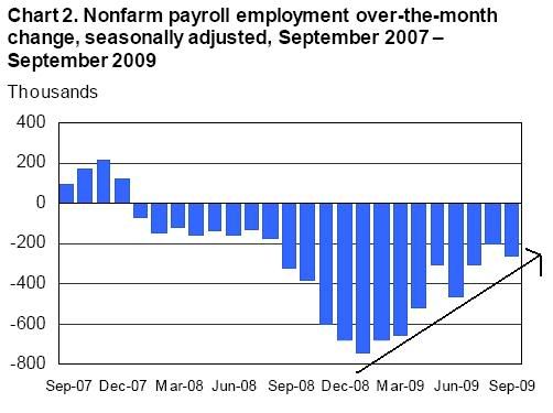
This is from the latest unemployment report and it shows the number of jobs lost per month over the last few years. Pay particular attention to the November - March period when the rate of job losses was over 600,000/month (and in one case was over 700,000). Now we've learned that there were in fact more job losses. In other words, the rate of decline was that much more severe. That leads to a very important conclusion: it's going to take longer for the jobs market to heal.
The primary argument against recovery has been the jobs market. While there are numerous economic indicators that signal the economy is rebounding (here is a list of over 20) there is one that stands out like a sore thumb: jobs. However, those arguing against the idea the economy is recovering do not note that an economy the size of the US's does not simply turn on a dime. When an economy loses over 2.4 million jobs in a 4 month period (as originally thought), it does not turn around and start growing anytime soon. Now we've learned that the severity of job losses was in fact more severe. This means the period from the time of job losses to recovery is in fact longer than originally thought. Additionally -- and just as importantly -- the unemployment rate is a lagging indicator. That means it goes down after the economy starts growing. So to talk of a "jobs recovery" when the economy is still in negative territory (although it will probably print a positive GDP in the third quarter) is premature at best. Simply put, it's not time to talk about a jobs recovery yet.
In other words given the increase in the number of expected job losses, the pace of the decline in the rate of job losses, and the numerous indicators signaling recovery, "recovery on".
Now, let's add another piece to this discussion:
I'm not going to speak to the politics of this. That's for people who actually enjoy that sort of discussion. (Personally I have come to loathe all politicians, whatever stripe) What I can say is this could be a good idea if done properly.
There were two arguments against the first stimulus: it didn't put enough money into the economy fast enough and the method of the stimulus -- which was a combination of tax credits and direct injections -- should have been more weighted more towards straight injections.
Regarding the first point Washington responded there weren't enough "shovel ready" projects. I can't speak to the veracity of this claim. However, I also think the decision was just as much political as it was economic. Washington wanted to inject money into the economy during the 2010 elections so they could say "look what I'm doing for you." However, in retrospect I think spreading the payments out over time is a good idea given the severity of the downturn and the difficulty the economy will have in coming out of the hole it's in.
Regarding the second method, the primary argument against tax credits was it would not go to spending but instead to debt reduction. In other words, the money would not get out in the economy helping it to grow. This was the experience with the Bush rebate checks; there was little reason to think the result would be different with the second round of tax cuts. And, in general, consumer spending has bottomed but not grown at a strong pace since the beginning of this year. But we have seen a large pay down in consumer debt. In other words, consumers are using some of the money they are getting from the government to pay down consumer debt. That is a good thing in the long-term.
However, more money, strategically spent on specific projects would be a good idea. But it must be done properly. By properly, I mean it needs to be narrowly focused on one specific area: job creation as quickly as possible. In addition, this can't be a large bill. There just isn't a lot of room in the national debt package right now. My guess is at the most we can afford another $250 billion at the most.
In accordance with usual practice, the U.S. Bureau of Labor Statistics is announcing its preliminary estimates of the upcoming annual benchmark revision to the establishment survey employment series. The final bench- mark revision will be issued on February 5, 2010, with the publication of the January 2010 Employment Situation news release.
Each year, the Current Employment Statistics (CES) survey employment estimates are benchmarked to comprehensive counts of employment for the month of March. These counts are derived from state unemployment insurance tax records that nearly all employers are required to file. For national CES employment series, the annual benchmark revisions over the last 10 years have averaged plus or minus two-tenths of one percent of total nonfarm employment. The preliminary estimate of the benchmark revision indicates a downward adjustment to March 2009 total nonfarm employment of 824,000 (0.6 percent).
Table B shows the March 2009 preliminary benchmark revisions by major industry sector. As is typically the case, many of the individual industry series show larger percentage revisions than the total nonfarm series, primarily because statistical sampling error is greater at more detailed levels than at a total level.
A few points about this revision. Economic statistics are revised all the time for plenty of reasons. But the big reason is more data becomes available over time. This is standard in economic statistics land. It does not mean the staff of the BLS is involved in a secret plot to cover-up the severity of the recession in order to quell the masses into sleep. It does mean the severity of the economic situation played havoc with everybody including those who compile government statistics.
Secondly, this also does not mean that the unemployment rate will spike up an additional amount when these numbers are added to the survey on February 5, 2010. The unemployment rate is derived from the household report. This was a change to the establishment survey. The two are separate and distinct economic reports; they have nothing to do with one another.
Now, let's turn to the data, especially this chart:
This is from the latest unemployment report and it shows the number of jobs lost per month over the last few years. Pay particular attention to the November - March period when the rate of job losses was over 600,000/month (and in one case was over 700,000). Now we've learned that there were in fact more job losses. In other words, the rate of decline was that much more severe. That leads to a very important conclusion: it's going to take longer for the jobs market to heal.
The primary argument against recovery has been the jobs market. While there are numerous economic indicators that signal the economy is rebounding (here is a list of over 20) there is one that stands out like a sore thumb: jobs. However, those arguing against the idea the economy is recovering do not note that an economy the size of the US's does not simply turn on a dime. When an economy loses over 2.4 million jobs in a 4 month period (as originally thought), it does not turn around and start growing anytime soon. Now we've learned that the severity of job losses was in fact more severe. This means the period from the time of job losses to recovery is in fact longer than originally thought. Additionally -- and just as importantly -- the unemployment rate is a lagging indicator. That means it goes down after the economy starts growing. So to talk of a "jobs recovery" when the economy is still in negative territory (although it will probably print a positive GDP in the third quarter) is premature at best. Simply put, it's not time to talk about a jobs recovery yet.
In other words given the increase in the number of expected job losses, the pace of the decline in the rate of job losses, and the numerous indicators signaling recovery, "recovery on".
Now, let's add another piece to this discussion:
The bleak September jobs report appears to have cracked the political logjam blocking progress on a third stimulus package.
I'm not going to speak to the politics of this. That's for people who actually enjoy that sort of discussion. (Personally I have come to loathe all politicians, whatever stripe) What I can say is this could be a good idea if done properly.
There were two arguments against the first stimulus: it didn't put enough money into the economy fast enough and the method of the stimulus -- which was a combination of tax credits and direct injections -- should have been more weighted more towards straight injections.
Regarding the first point Washington responded there weren't enough "shovel ready" projects. I can't speak to the veracity of this claim. However, I also think the decision was just as much political as it was economic. Washington wanted to inject money into the economy during the 2010 elections so they could say "look what I'm doing for you." However, in retrospect I think spreading the payments out over time is a good idea given the severity of the downturn and the difficulty the economy will have in coming out of the hole it's in.
Regarding the second method, the primary argument against tax credits was it would not go to spending but instead to debt reduction. In other words, the money would not get out in the economy helping it to grow. This was the experience with the Bush rebate checks; there was little reason to think the result would be different with the second round of tax cuts. And, in general, consumer spending has bottomed but not grown at a strong pace since the beginning of this year. But we have seen a large pay down in consumer debt. In other words, consumers are using some of the money they are getting from the government to pay down consumer debt. That is a good thing in the long-term.
However, more money, strategically spent on specific projects would be a good idea. But it must be done properly. By properly, I mean it needs to be narrowly focused on one specific area: job creation as quickly as possible. In addition, this can't be a large bill. There just isn't a lot of room in the national debt package right now. My guess is at the most we can afford another $250 billion at the most.
Market Mondays

The markets rose last week. On Monday prices moved in an upward sloping trend line (see number 1). Then on Tuesday prices jumped to a higher level (see point A) on higher opening volume. Prices then moved sideways in for two days (see box 2). Prices again jumped higher on Thursday morning (see point B) and then moved sideways for the remainder of the week (see point 3). Finally prices rose at the end of trading on Friday on good volume (point C). This last point is important as it indicates that traders were comfortable keeping positions over the weekend.

Click for a larger image. Ignore the last candle.
A.) Prices are in a slight uptrend. There are also key points of resistance at points B, C, and D.
E.) Notice the EMAs are in a very bullish posture. The shorter are above the longer, all the EMAs are rising and prices are above the EMAs.

In the latest correction, notice that prices moved downward but used the 50 day EMA for support. Also note the correction was about 5%.
Subscribe to:
Posts (Atom)