- by New Deal democrat
In particular I discussed how data about the duration of unemployment is coincident with payrolls. Well, the same data series has something interesting to show about the unemployment rate as well.
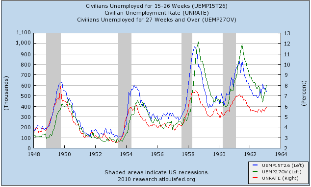
In the graphs below, the blue line is unemployment of 15-26 weeks' duration, the green line unemployment of over 26 weeks, and the red line is the unemployment rate. Here it is for 1948-1963:
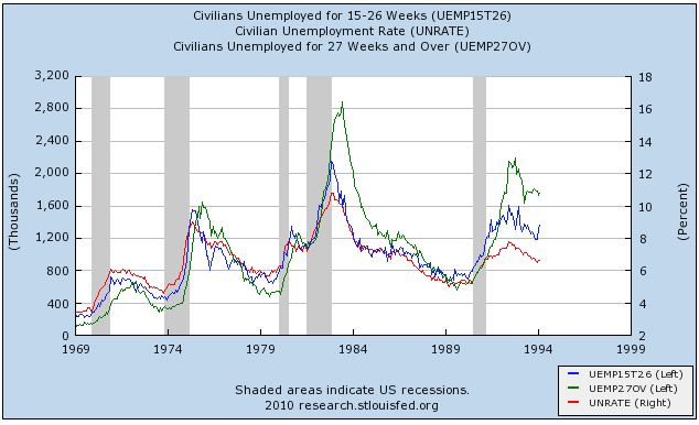
and here it is for 1969-1994:
and here it is for the last 10 years:
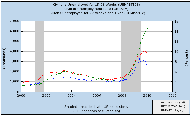
Note that in all prior cases, unemployment peaked before or certainly no later than the green line. As I said yesterday, it is not certain that the February decline in unemployment of 27 weeks' or longer duration means that January was the top, but it certainly suggests that the top is being formed.
In other words, it looks like the 10.2% unemployment of October was the real deal -- the peak unemployment rate. If so, while this may have been a "jobless recovery" up until now, it has been far more like the brief (6 month) 1992 recovery than the terribly long 21 month one of 2002-03.