First, here is a chart of the SPYs:

Prices have broken two uptrends (a and b). Last week prices printed two strong downward bars (c). At (d) are the EMAs, which are slowly turning neutral. While the overall orientation is still bullish (the shorter EMAs are above the longer EMAs), the 10 day EMA is now moving lower and the 20 day EMA is moving in a more horizontal line. Volume (e) picked up last week when the tone was decidedly bearish. There were also a large amount of block trades last week of 1 million plus shares (87 different trades) with some very large blocks of for example 19.1, with the total of these blocks being nearly 2 billion shares. That tells you the institutions are looking to get rid of some shares.
Finally, consider that some of the top performing industries were utilities, consumer staples and health care -- three defensive areas.
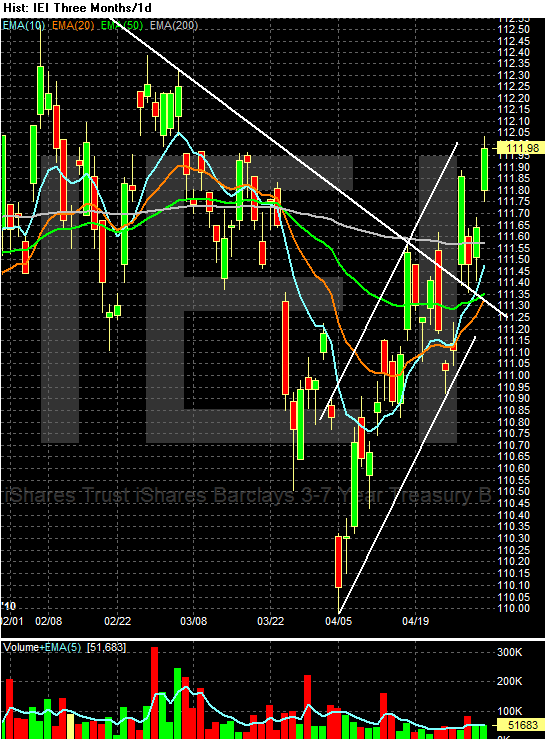
What is very interesting is the continued rallying in the Treasury market. Consider these charts:
Prices broke through resistance on an upward gap (a), fell to the resistance level and are now rallying to the 200 day EMA. The EMA picture is turning bullish, especially with the 10 and 20 day EMAs about to move through the 50 day EMA. Finally, notice the volume spike from last week at (e).
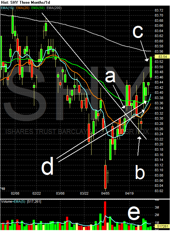
Notice similar patterns across the curve:
The 3-7 year part of the curve is now above the 200 day EMA -- the line the delineates between bull and bear markets.

The IEFs (7-10 years) crossed over the 200 day EMA as well.

The entire Treasury market rallied last week. Also notice the volume spike across the board in all of these indexes. More importantly, the longer end of the market outperformed the shorter end, indicating that inflation expectations are clearly in check for now. This is in the face of a massive Treasury auction last week that went surprisingly well. In short, the safety bid of US Treasuries overcame the problems associated with the Treasury market.

The gold market has caught a good bid. This is the top performing commodity of oil, the DBAs and the DBBs over the last 5, 10 and 30 day periods. There are two trendlines (a and b). There are also periods of rapid increases (usually on higher than normal volume) (a) followed by consolidation (d). The fundamental reason for this increase is the Greek situation, which is spooking investors.

On the daily chart, first notice that gold spent the first quarter of 2010 in a triangle consolidation bordered by lines a and b. But look closely at the A/D line. This indicator is a more advanced version of the on balance volume indicator. The A/D line is defined thusly:
A momentum indicator that attempts to gauge supply and demand by determining whether investors are generally "accumulating" (buying) or "distributing" (selling) a certain stock by identifying divergences between stock price and volume flow. It is calculated using the following formula:
Acc/Dist = ((Close – Low) – (High – Close)) / (High – Low) * Period's volume
The indicator works in the same way as the OBV which either adds or subtracts the day's entire volume to the line. In contrast, the A/D assumes that the closer the close is to the day's high, the more likely the security is being accumulated. Therefore, when a chart prints strong bars (large bodies, small shadows) more volume is either added or subtracted.
The A/D line under gold tells us that traders in general held onto their shares while GLD was consolidating at the beginning of this year. Finally, there were some very large block trades that went through at the end of last week, indicating there is strong fund buying.

Looking a bit more closely at GLD's breakout, we see that prices broke out of the top triangle line at point a, rose to (b), fell back to the top of the triangle at (c) and then broke through previous highs at point (d). Finally, notice that on Tuesday and Wednesday there was tremendous volume surges.