A conundrum I have noted several times in the last several months is the wide divergence between the large percentage increases in YoY tax withholding, consistent with 200,000+ monthly job gains during 2004-05, and the poor nonfarm payrolls reports in the last few months. A note by Econbrowser's Prof. James Hamilton, confirming something I noticed in July's data, appears to solve the riddle.
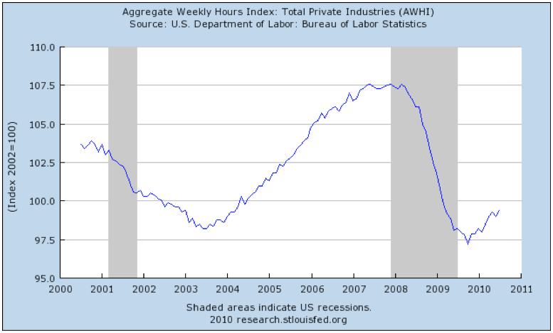
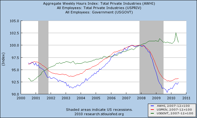
Although July, like June as revised, showed an actual loss in jobs, Prof. Hamilton called attention to the fact that aggregate hours in the private sector have continued to increase, as shown in this graph:
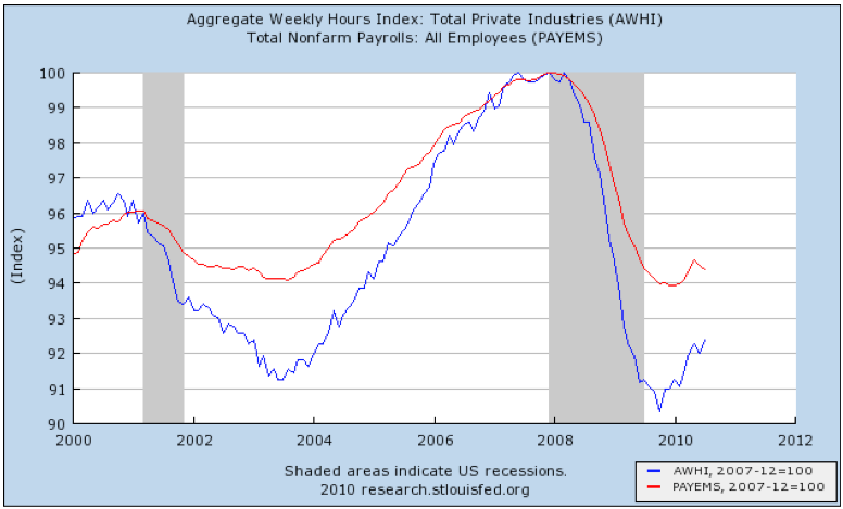
That contrasts with the record of nonfarm payrolls, which have stalled, and declined, in the last several months:
Since state and local employees do not have to pay Social Security, that made me wonder if what we aren't seeing is a sharp divergence between the public and private employment sectors. Indeed, when you measure YoY withholding tax data against YoY changes in private employment only, there is a considerably tighter fit:
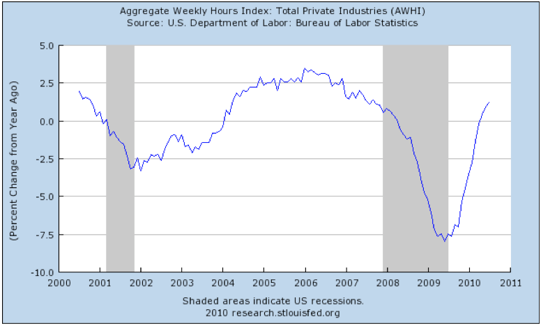
Further, compare the YoY percentage change in aggregate hours in the private sector in this graph:
with the following graph employing a slightly different measure of YoY percentage change in withholding from Matt Trivisonno's tax withholding blog (graph does not show the last 90 days):
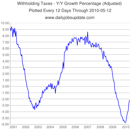
with the following graph employing a slightly different measure of YoY percentage change in withholding from Matt Trivisonno's tax withholding blog (graph does not show the last 90 days):
The trends in the two graphs are almost identical over the entire time period. This is confirmed if for the remaining last 90 days we make use of the 20 day YoY rolling withholding data I track as part of my "Weekly Indicators" column:
4/9 +2.5%
4/16 +7.8%
4/23 +9.6%
4/30 +4.8%
5/7 +7.4%
5/11 +5.2%
5/18 n/a
5/25 +2.3% (18 days)
6/- n/a
6/11 +7%
6/18 +2.3%
6/25 +6.5%
7/2 n/a
7/9 +5.5%
7/16 +6%
7/23 +11%
7/30 +9%
8/5 +9%
Now let's put government employees into the mix (in green):
4/9 +2.5%
4/16 +7.8%
4/23 +9.6%
4/30 +4.8%
5/7 +7.4%
5/11 +5.2%
5/18 n/a
5/25 +2.3% (18 days)
6/- n/a
6/11 +7%
6/18 +2.3%
6/25 +6.5%
7/2 n/a
7/9 +5.5%
7/16 +6%
7/23 +11%
7/30 +9%
8/5 +9%
Now let's put government employees into the mix (in green):
What this graph confirms is that public sector workers are responsible for the entire decline in jobs the last several months. Note that government jobs tend to be lost very late into recessions, or even well into recoveries (note 2003 for example).
This highlights another important fact: the primary reason why nonfarm payrolls as a whole have not kept up with industrial production, or aggregate hours, is that losses in state and local employment, which otherwise would have happened a year ago, were delayed because of the 2009 stimulus package, and are hitting full-force now instead. It remains to be seen how much of a dent the just-enacted supplemental aid to the states will impact these job losses.
Since the strong withholding tax rebound is confirmed by private sector jobs and hours, and state and local jobs have in the past lagged rather than led other job indicators, this all argues significantly against a "double-dip."