I have been trying to compare how economic strength has translated into jobs in recoveries past, vs. the present recovery. After putting up yesterday's post on the ISM index, I found a more dramatic way to illustrate the point. This first graph shows the year over year change in the absolute number of manufacturing jobs over the last 60 years:

As you can see, coming out of recessions, from the end of World War 2 until the early 1980s, it wasn't uncommon at all for 800,000 manufacturing jobs or more to be added in the first year of a recovery. But in real terms it is even more dramatic than that, because in 1950 the US population was half what is is now; in the 1970s two-thirds; in 1982 three-quarters.
Now let's overlay the ISM manufacturing index on that prior graph:
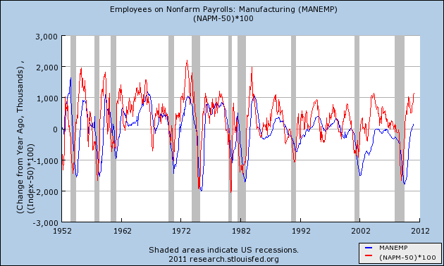
In February we had the highest reading (save for one equal reading in 2004) since 1983. Yet the same amount of manufacturing expansion gave us only 150,000 new manufacturing jobs year over year.
So the comparison of equivalent strength measured by the ISM vs. actual manufacturing job growth, adjusted for population, looks like this:
1950s 1,600,000
1970s 1.200,000
1982 1,067,000
2010 150,000
I'm not exactly sure how the ISM survey phrases its questions, but I do not think they are asking the survey participants if they plan to expand in China. In other words, I believe the questionnaire deals solely with expansion in the US.
This effectively removes offshoring of jobs as a reason for the startling paltry number of jobs added - rather, it looks like this is all about automation. In recessions, manufacturers have been letting people go. In recoveries, they have been hiring new machines.
As a result, despite the great recovery of the US manufacturing sector, in terms of jobs creation it has come up over 1,000,000 jobs short compared with even 30 years ago.