First of all, let me say that I agree with the Krugman/Thoma/DeLong axis along with many others that the employment report essentially has us moving sideways. We added jobs, but not enough to compensate for entry into the work force due to population growth, and the employment to participation ratio sank further.
That being said, in the rush to be negative because the positive surprise wasn't good enough, a substantial amount of positive context was missed. Here are 7 positives from the report:
1. 17 months in a row of actual payroll growth.
First of all, let's state the obvious. Every single month beginning with March 2010 has given us a positive jobs number (ex-census). Here's the graph of private jobs:
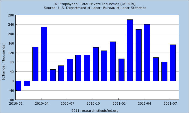
Even subtracting non-census government jobs doesn't make any of those months negative.
2. Prior months' data revised upward.
In recessions, prior data tends to be revised downward. In expansions, prior data tends to be revised upward. Some months ago, I wrote several times about "The Disappointment Syndrome" in which a payrolls report would be deemed "disappointing" only to be revised substantially upward in the final analysis. This happened all through 2010 and earlier this year.
Friday we returned to that pattern, with both May and June employment numbers being revised upward by a total of +56,000 (although May's had previously been revised downward, so the net change since the initial May report was -1,000).
3. Manufacturing employment increased.
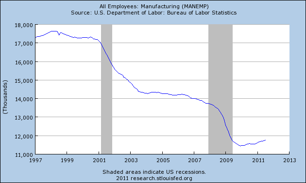
Prof. Geoffrey Moore's original index of leading economic indicators from the pre-WW2 deflationary period through the 1960's included changes in manufacturing jobs. Although on a secular basis, the US has been shedding jobs for decades, if we take into account that secular change (averaging 40,000 a month since the mid-1990's), this series is still very much a leading indicator of the overall jobs market. In July, manufacturing jobs outright increased by 24,000, continuing the trend of actual growth in manufacturing jobs since the end of 2009.
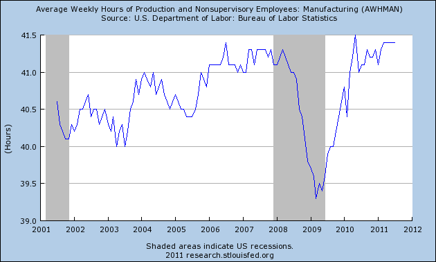
4. Manufacturing hours worked remained steady.
One of the 10 official components of the modern index of leading economic indicators is average weekly hours in manufacturing. It has remained steady in the last 3 months despite the disruptions due to the tsunami in Japan. Except for one month in 2010, this series remains at its post-recession high.
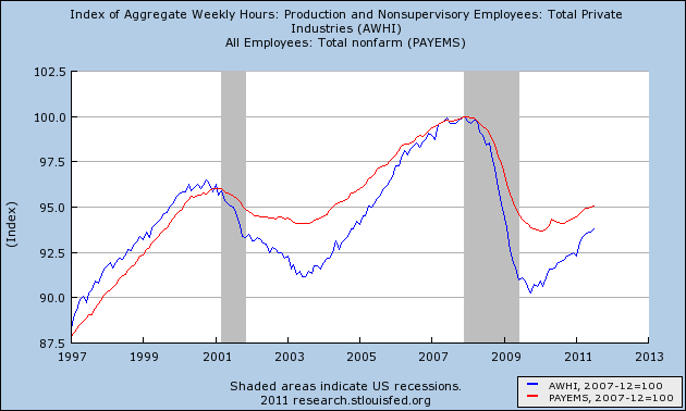
5. The trend in improving aggregate hours worked continues
In the 2008-09 recession, as in the two previous recessions, more hours worked were cut than actual layoffs. The pattern in those two recoveries was that hours worked had to make up their lost ground compared with layoffs first, before job growth would fully accelerate with hours worked. July showed that the trend in improving aggregate hours worked is intact, and remains on track to complete making up its lost ground, compared with layoffs, in the next 12-18 months.
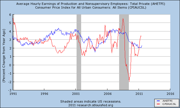
6. Real average hourly income improved
With the exception of the mid 2000's housing bubble credit binge, the trend is that you do not get increased demand via consumer spending unless (1) interest rates decrease, and/or (2) real wages improve.
Leading up to the summer stall of 2010, as well as the stall this year, inflation (mainly due to the price of Oil) outpaced wages. This predictably led to a slowdown if not stall in consumer spending. This has now started to reverse. Average hourly income in July increased, and Oil prices have declined, which means that the pressure on consumers is starting to abate (note: the graph only shows inflation up through June. YoY inflation through July is likely to go back under 3%).
7. July's employment report is not consistent with the onset of a double-dip recession
Here is the update of my scatterplot graph comparing initial jobless claims with job growth/loss. In all cases, as a recession begins, the trend is sharply to the left of the trend when the economy is improving. This comparison was borne out in the "great recession."
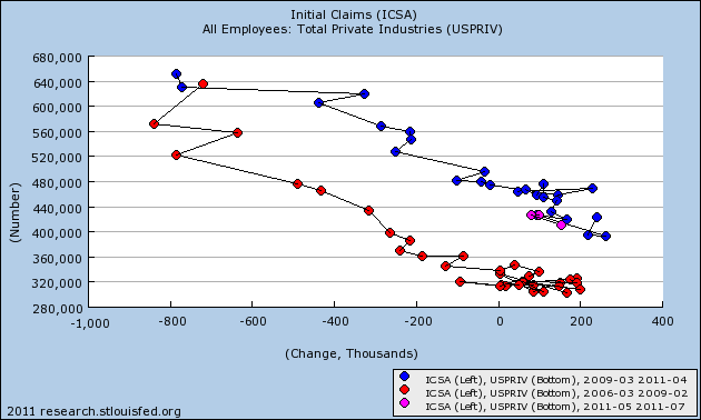
The last three months are shown in pink. They have not broken from the previous blue trend line of the expansion. In the one post-WW2 double dip of 1980-82, the trend broke decisively and quickly back to the left. July's report, at least, is inconsistent with any imminent double-dip.
In summary, Friday's report showed that while once again in the last few months we have been battered with an Oil-and-government-idiocy-induced stall, the trends established during the recovery are intact.