- by New Deal democrat
This was a sparse week for monthly data. Housing permits and starts both increased to near 12 month highs. Partly as a result, the Leading Economic Indicators for June were reported up .3, and May was revised to up .8. This appears to take a near-term economic contraction off the table (idiocy in Washington permitting).
The high-frequency weekly indicators rebounded. Let's take the opportunity to review their recent trends, because there are interesting, but mixed, currents in employment, housing, sales, and money supply:
Employment is stalled:
The BLS reported that Initial jobless claims last week were 418,000. The four week average decreased to 421,250. Jobless claims appear to have stabilized in a range generally between 410,000 - 430,000.
The American Staffing Association Index declined 3 points to 84. The ASA indicates that this reporting week included the July 4 holiday and so reflects seasonal weakness. This trend of this series for the year is distinctly worse than 2007, but slightly better than the early recession of 2008. Unless this report increases significantly in the next few weeks, it will have completely stalled.
Both of these generally have completely stalled since the end of the first quarter.
Housing shows signs of stabilization, or at least getting "less worse":
The Mortgage Bankers' Association reported that seasonally adjusted mortgage applications decreased -0.1% last week. For the 7th time in 8 weeks, however, the YoY comparison in purchase mortgages was positive, up 8.3% YoY. Refinancing also increased 2.3% w/w. The last 8 weeks have been the best for this series since late 2007.
YoY weekly median asking house prices from 54 metropolitan areas at Housing Tracker showed that the asking prices declined -4.1% YoY. The areas with double-digit YoY% declines decreased by one to 9. The areas with YoY% increases in price remained at 7. Except for 3 weeks ago, this is the best showing in 4 years.
Mortgage applications, like permits and sales, show a slow improvement in the housing market over the least few months. Prices show slowing declines. I read a report this week that homeowners had finally thrown in the towel to bearishness, with a large majority believing their houses would decline in price for the next year, and about half believing the decline would go on for up to 5 years. If we saw that kind of sentiment in the stock market, it would be a strong sign of a bottom. Housing brings out strong opinions, but the data is the data.
Gasoline and retail sales show substitution but not overcompensation by consumers:
Oil finished over $99.87 a barrel on Friday. This is decisively back above the level of 4% of GDP which according to Oil analyst Steve Kopits is the point at which a recession has been triggered in the past. Gas at the pump rose another $.04 to $3.68 a gallon. Gasoline usage at 9028 M gallons was -2.2% lower than last year's 9435. This is the fourth week in a row that gasoline usage has been significantly less than last year. Further, with the exception of 3 weeks, this comparison has been negative YoY since the week of March 12.
The ICSC reported that same store sales for the week of July 16 increased 4.5% YoY, and increased 0.4% week over week. This is the second week in a row of the best YoY comparison in months. Shoppertrak reported a 3.2% YoY increase for the week ending July 16 and a WoW increase of 3.1%. YoY weekly retail sales numbers had been slowly weakening for a month or so, but this week is the fourth week of a rebound for the ICSC, now joined by Shoppertrak.
The American Association of Railroads reported that total carloads increased a tiny +0.4% YoY, up 18000 carloads to 511,700 YoY for the week ending July 16. Intermodal traffic (a proxy for imports and exports) was up 2600 carloads, or 1.2% YoY. The remaining baseline plus cyclical traffic was down 800 carloads, or -0.3 YoY%. This series went negative for the first time one week ago after deteriorating all year.
Research by Professor James Hamilton of UC San Diego has shown that in the past, Oil shock recessions are triggered by price increases to levels higher than at least several years past, causing consumers to overcompensate, cutting back spending more than 2 times the amount that is spent because of increased gasoline prices. The wisdom of that research is borne out by the gasoline usage and retail sales statistics above. Contrary to Oil shock recessions, this year consumers appear to have cut back on gasoline sufficiently to continue to make retail purchases. There was a 3 week period in June when gasoline usage went positive YoY, and it was in that same time frame that weekly same store sales recorded their weakest YoY advances. Consumers do not appear to be overcompensating, hence an overall stall rather than a contraction. Rail traffic likewise indicates a stall, but not a contraction at this point.
Money indicators have generally turned outright bullish:
M1 was up 1.1% w/w, up 2.8% m/m, and up 15.1% YoY, so Real M1 was up 11.7%.
M2 was up 0.1% w/w, up 0.1% m/m, and up 7.8% YoY, so Real M2 was up 4.4%.
Both M1 and M2 have surged in the last 3 weeks. Real M2's move has put it solidly in the green zone above +2.5%, meaning that both money supply indicators are bullish.
Adjusting +1.07% due to the 2011 tax compromise, the Daily Treasury Statement showed that for the first 13 days of July 2011, $97.9 B was collected vs. $88.2 B a year ago. For the last 20 days, $137.2 B was collected vs. $124.9 B a year ago, for an increase of merely $12.3 B, or 9.9%. Use this series with extra caution because the adjustment for the withholding tax compromise is only a best guess, and may be significantly incorrect. In the past few weeks, this comparison has improved considerably.
The only weak spot in the money picture is that weekly BAA commercial bond rates declined -.13% to 5.71%. Yields on 10 year treasury bonds decreased .18% to 2.94%. Over the last 3 months, both yields have come down, but BAA corporates have gone generally sideways for the last 2. This indicates slowly increasing deflationary fears, and a slight increase in relative distress in the corporate market.
Overall, the picture that emerges is that of improving money conditions, and virtually everything else close to flatlining. The trend, however, has been from positive to stall in employment and transportation, vs. negative to flat in the housing market. The negative trend in gasoline sales is being offset by the positive trend in other retail sales. Since housing is a long leading indicator, and money supply a shorter term leading indicator as well, I continue to believe that the stall will not lead to a meaningful contraction (idiocy in Washington permitting), and we may be at the beginning of the ultimate bottoming process in the housing market.
Saturday, July 23, 2011
Friday, July 22, 2011
How The Debt Debate Is Hurting the Economy
From Slate:
This Northern Virginia consulting firm, for instance, has recommended that companies "collect any fees owed your company by the government as soon as contractually possible, just in case" and "anticipate delayed program starts (for the limited number of new programs), and delayed acquisitions for upcoming solicitations." If the Federal Reserve is doing contingency planning for a potential default, shouldn't you be too?Wall Street is also preparing for the possibility that the government might miss its deadline. According to a New York Times story, investment banks and boutique firms alike are looking for ways to reduce exposure to a possible default—and even to make money off of it. For example, at Wells Fargo "executives said they had been keeping close tabs on the bond market and making sure they had ample cash on hand." The Times report adds: "[E]ven if a deal is reached in Washington, some in the industry fear that the dickering has already harmed the country's market credibility."
Hedge funds and venture capital firms—major investors in new and growing businesses—have also changed their ways, just in case. George Soros' $25.5 billion Quantum Endowment Fund has pulled back trading and is now holding a whopping 75 percent of its assets in cash—just hanging onto them, not investing them, not using them to help the economy grow. Why? In part the debt crisis in Europe, in part China's tamping down on inflation, and in part the "debate over the U.S. debt ceiling," Bloomberg reports. Many other money managers, like the giant asset manager BlackRock, are doing the same.
The almighty American consumer has also started getting worried, according to a Goldman Sachs note this week. Goldman attributes the recent hit to consumer confidence to a few things, including high unemployment and the failure of the recovery to pick up steam. But it says that all the news reports coming from Capitol Hill about the world's biggest economy teetering on the verge of an unnecessary default are starting to have an impact too.
"A sharp drop in measures of consumer confidence in recent weeks coincides with a surge in news coverage on the debt ceiling," the company notes. "A model incorporating lags of the unemployment rate, the year-over-year change in the unemployment rate, real average hourly earnings, the S&P 500 index, home prices, and consumer lending standards … explains only about half of the recent drop," it says, suggesting worry over the debt ceiling makes up much of the rest. "Confidence in government economic policies" has fallen to the lowest level in 50 years.
Not that any of this matters to the Yahoos in Congress...
Lack of Demand Is Big Problem

Above is a chart of the percentage change from a year ago in real personal consumption expenditures. Notice that the current pace of YOY percentage change is directly analogous to the 2001-2003 period -- a time of very slow growth where we again heard the phrase jobless recovery. It was also during this time that the Fed kept interest rates very low out of concern for a possible deflationary environment. In short -- YOY percentage changes of this lower magnitude are associated with periods of lower growth.
It could also be argued that the US consumer is starting to change his spendthrift ways. Remember that the previous expansions in consumer spending were fueled by easy credit and the ever increasing accumulation of household debt -- which eventually reached over 130% of disposable personal income at the national level a few years ago. Over the last few years, we've seen a big bump in the savings rate and a decline in the household financial obligations ratio, indicating consumers are paying down debt in a meaningful way. We've also seen an overall slowdown in spending. In short, it's beginning to look like we could argue the US consumer is changing to a slower spending model.
Thursday, July 21, 2011
Friday Dollar Analysis
Last week, I wrote the following about the dollar:
All the EMAs are in a tight bunch, indicating a lack of overall direction from the market. This means last weeks break-out was a false break-out, and we're left waiting to see that happens.
The dollar has been consolidating for the last few months in a classic triangle consolidation pattern. The EMAs are tightly bunched, indicating a lack of conviction from traders. In addition, we've already seen one false break-out to the upside over the last few weeks.
The dollar has been buffeted by the EU and Washington debt talk situation. The closer Europe has come to a deal, the less people want the dollar relative to the euro. In addition, the recent noise from the various ratings agencies about the negative impact of a budget stalemate has led to downward pressure on the dollar.
Let's take a look at the chart:

The chart shows the dollar has broken out to the downside on strong volume. However, we have yet to see the EMAs follow through -- which they wouldn't be doing at this point.
Ideally, we'd see the dollar in a relief rally sometime over the next week or so to provide confirmation of the downside break-out. This is when I'd go short.
Apple Stoers and pent-up housing demand
- by New Deal democrat
I got nothing at the moment, but here are two more items well worth reading:
1. BirdAbroad spots an Apple Stoer. No, that isn't a typo. Chinese counterfeiting is being taken to a whole new level.
2. Karl Smith at Modeled Behavior discusses pent up housing demand. When the turnaround happens, it is likely to be very sharp.
Thursday Reads
- The GOPs Fuzzy Math.
- Is Consumer Spending the Problem?
- Debt Ceiling Debate Already Hurting Consumer Sentiment
- Why Employers Are Slow to Fill Jobs
- Gas Prices Are Still High
- Consumer Sentiment and Oil Prices
- All Recoveries Are Now Jobless
The Dow Jones Bond Average and pre-WW2 recessions
- by New Deal democrat
This continues my look at potential leading indicators as they may apply to pre-WW2 deflationary recessions. I have already looked at BAA bonds, housing starts, commodity prices, the stock market, the yield curve, and money supply. Today I will look at bond prices generally.
Laksham Achuthan of ECRI is on record saying that their index does not make use of the yield curve. On the other hand, they may make use of information from the bond market. One little-known source of this information that goes back at least to the 1890s is the Dow Jones Bond Average (renamed the DJ Corporate Bond Average about 15 years ago). The DJBA consists of 30 bonds of varying types and maturities, and was designed to give an overall view of the bond market. Its value is and has always been computed daily.
I would love to be able to show you a simple graph covering the pre-WW2 era, but I've never been able to find one. Entering the daily or even monthly prices would take more time than I have available for this exercize, but what I can do is give you the below chart which shows significant highs and lows from 1920 through 1940. Where there are no entries, the up or down trend continued from the last chronological entry. Note that sometimes the yearly low in the right column comes before the yearly high in the left column. The most significant highs and lows are bolded:
The most important conclusion is that the DJBA did accurately lead all three of the big recessions in the era - the 1920-21 recession (which was similar to the 1981-82 recession in that it killed the WW1 inflation), the 1929-32 collapse, and the 1937-38 deep recession.
Of the five recessions, highs in the DJBA preceded the 4 onset in our period by 8, 4, 19, and 5 months. The 5 troughs were preceded by 12, 16, 13, 9, and 3 months. Note that for the first year of the Great Depression, bonds did not decline steeply. Only after the depression deepened severely did they cliff-dive.
At the same time, this fits very well with the DJBA or a similar bond average being a "long leading indicator" in ECRI's model.
This continues my look at potential leading indicators as they may apply to pre-WW2 deflationary recessions. I have already looked at BAA bonds, housing starts, commodity prices, the stock market, the yield curve, and money supply. Today I will look at bond prices generally.
Laksham Achuthan of ECRI is on record saying that their index does not make use of the yield curve. On the other hand, they may make use of information from the bond market. One little-known source of this information that goes back at least to the 1890s is the Dow Jones Bond Average (renamed the DJ Corporate Bond Average about 15 years ago). The DJBA consists of 30 bonds of varying types and maturities, and was designed to give an overall view of the bond market. Its value is and has always been computed daily.
I would love to be able to show you a simple graph covering the pre-WW2 era, but I've never been able to find one. Entering the daily or even monthly prices would take more time than I have available for this exercize, but what I can do is give you the below chart which shows significant highs and lows from 1920 through 1940. Where there are no entries, the up or down trend continued from the last chronological entry. Note that sometimes the yearly low in the right column comes before the yearly high in the left column. The most significant highs and lows are bolded:
| Year | High | Low | Recession dates |
|---|---|---|---|
| 1920 | 81.40 Jan | 71.64 May | - | 1921 | 84.13 Dec | - 7/21 |
| 1922 | 92.12 Sep | - | |
| 1923 | 85.77 Mar | 5/23- | |
| 1924 | 91.32 Apr | -7/24 | |
| 1925 | 91.20 Apr | - | |
| 1926 | 95.52 Jun | 94.69 Oct | 10/26- |
| 1927 | -11/27 | ||
| 1928 | 99.48 Jan | - | |
| 1929 | 96.32 Jan | 91.76 Sep | 8/29- |
| 1930 | 97.68 Sep | 92.83 Dec | cont. |
| 1931 | 96.76 Jan | cont. | |
| 1932 | 83.26 Aug | 63.78 Jun | cont. |
| 1933 | 89.07 Jul | 73.21 Mar, 78.62 Nov | -3/33 |
| 1934 | - | ||
| 1935 | - | ||
| 1936 | 106.01 Dec | - | |
| 1937 | 5/37- | ||
| 1938 | 83.39 Mar | -6/38 | |
| 1939 | 92.22 Mar | 83.06 May | - |
| 1940 | 91.01 Dec | - |
The most important conclusion is that the DJBA did accurately lead all three of the big recessions in the era - the 1920-21 recession (which was similar to the 1981-82 recession in that it killed the WW1 inflation), the 1929-32 collapse, and the 1937-38 deep recession.
Of the five recessions, highs in the DJBA preceded the 4 onset in our period by 8, 4, 19, and 5 months. The 5 troughs were preceded by 12, 16, 13, 9, and 3 months. Note that for the first year of the Great Depression, bonds did not decline steeply. Only after the depression deepened severely did they cliff-dive.
At the same time, this fits very well with the DJBA or a similar bond average being a "long leading indicator" in ECRI's model.
Thursday Oil Market Analysis
Last week, I wrote the following about the oil market:
Let's take a look at the charts

The 5-minute daily chart shows prices moving between 95.5 and 99.25. There is no indication of a rally, although the price action looks like a consolidation.

The daily chart really shows the consolidation. Over the last few weeks, prices have formed a consolidating triangle and are hitting resistance at the 50 day EMA. The 10 and 20 day EMA are moving higher, and prices have found a center of gravity around the 200 day EMA. The MACD has given a buy signal, although the fact it is still negative tells us the 12 signal line is below the 26 signal line, although with the lines approaching a "0" crossover will soon occur -- which will give us another buy signal.
Give the fundamental supply/demand situation, I still expect prices to be moving higher. But right now, we're seeing the standard issues of prices moving through a large number of technical resistance levels on their move higher, which is to be expected given the chart.
Overall, prices are moving about how I thought they would after the sell-off. Remember -- there is a tremendous amount of resistance to move through right now which takes time. However, I still see prices moving higher for the next month or so.This is in addition to the fact I see the supply/demand situation driving prices higher -- a position which I feel is bolstered by China's recent printing of a 9/5% GDP.
Let's take a look at the charts

The 5-minute daily chart shows prices moving between 95.5 and 99.25. There is no indication of a rally, although the price action looks like a consolidation.

The daily chart really shows the consolidation. Over the last few weeks, prices have formed a consolidating triangle and are hitting resistance at the 50 day EMA. The 10 and 20 day EMA are moving higher, and prices have found a center of gravity around the 200 day EMA. The MACD has given a buy signal, although the fact it is still negative tells us the 12 signal line is below the 26 signal line, although with the lines approaching a "0" crossover will soon occur -- which will give us another buy signal.
Give the fundamental supply/demand situation, I still expect prices to be moving higher. But right now, we're seeing the standard issues of prices moving through a large number of technical resistance levels on their move higher, which is to be expected given the chart.
Wednesday, July 20, 2011
More on Food Inflation
Earlier today, I noted that fundamental supply and demand issues are keeping food prices high. That got me thinking about the actual price index of some food groups, so I want to the St. Louis Fed and found these charts:

The YOY percentage change in cereals and grains has been pretty steady for the last 20 years except for a massive spike right before the last recession. Also note that the YOY change is now increasing pretty sharply.

We've also seen a pretty big increase in sugar prices over the last few years, with is also reflected in the above chart. Notice that sugar prices spiked during the last recession.

Meat, poultry and fish increases have actually been pretty steady for the last 30 years. But notice that current increases are near the top of the YOY range for the last 30 years as well.
While energy prices get all the headlines, increases in food inflation are also causing problems for consumers.
Real long term interest rates and recessions
- by New Deal democrat
One Salient Oversight is a kindred blogger who also dissects historical patterns of economic expansion and contraction. He tracks three series, two of which are virtually identical to the "Kasriel Recession Warning Indicator." Based on those, he believes that a recession will start between Q4 of this year and Q4 of next year.
Like Kasriel, he relies upon the yield curve (inverted vs. positive), and real inflation-adjusted money supply (except he uses real monetary base vs. Kasriel's real M1).
His third indicator is real long term interest rates. Specifically, whether 10 year treasuries are yielding more or less than the inflation rate. It is specifically this indicator which has, according to his model, turned negative, presaging a recession. Here's his graph showing the real 10 year treasury yields for the last several years, showing it has been below the rate of inflation for the last 3 months:

One Salient Oversight's point is that a negative real long term interest rate doesn't always occur before a recession, but rather since 1954, whenever the rate does turn negative, a recession has always followed. You can see his in-depth graphic parsing of this indicator here.
To better look at this relationship, I have broken the relationship down to its two component parts. Here are 10 year treasury rates vs. inflation from 1964 to 1987:

and here is the continuation from 1987 to the present:

One Salient Oversight is indeed correct that during this time, whenever the inflation rate has exceeded the yield in 10 year treasuries, a recession has followed.
But what about before 1954? The "great recession" and its aftermath appear more like pre-WW2 recesions than postwar inflationary recessions brought about by Federal Reserve tightening. Since 10 year treasury data only goes back to the early 1950s, to go back further, you need a proxy that yields the same or similar results.
Indeed, such a proxy exists, in the form of the series LTGOVTBD (long term government bonds) that runs from 1925 to 2000.
First of all, here is the same relationship using LTGOVTBD over the post 1954 era and it almost exactly tracks the 10 year bond series, and makes the same predictions, so we know it is a good proxy:

But here is the problem: from the great depression until 1954, you get almost the exact OPPOSITE result as in the more modern era. Negative real long term rates occur during most of the New Deal, WW2, and immediate post-war era. In fact, they are at their trough at about mid-expansion. And these were the biggest expansions of the entire 20th century:

If we believe that our current situation is more akin to the pre-WW2 situation, negative real interest rates are of no help at all.
Nevertheless I think One Salient Oversight is on to something, especially as ECRI has vehemently denied that an inverted yield curve is part of their analysis, but appears to acknowledge that bonds are a component of their "black box." One big difference is that in the post WW-2 inflationary recessions where the indicator works, bond yields as well as inflation have both spiked higher compared with their 2-5 year average. By contrast, in the New Deal, WW2, and immediate post-war era, interest yields did not spike at all compared with inflation.
One Salient Oversight is a kindred blogger who also dissects historical patterns of economic expansion and contraction. He tracks three series, two of which are virtually identical to the "Kasriel Recession Warning Indicator." Based on those, he believes that a recession will start between Q4 of this year and Q4 of next year.
Like Kasriel, he relies upon the yield curve (inverted vs. positive), and real inflation-adjusted money supply (except he uses real monetary base vs. Kasriel's real M1).
His third indicator is real long term interest rates. Specifically, whether 10 year treasuries are yielding more or less than the inflation rate. It is specifically this indicator which has, according to his model, turned negative, presaging a recession. Here's his graph showing the real 10 year treasury yields for the last several years, showing it has been below the rate of inflation for the last 3 months:
One Salient Oversight's point is that a negative real long term interest rate doesn't always occur before a recession, but rather since 1954, whenever the rate does turn negative, a recession has always followed. You can see his in-depth graphic parsing of this indicator here.
To better look at this relationship, I have broken the relationship down to its two component parts. Here are 10 year treasury rates vs. inflation from 1964 to 1987:
and here is the continuation from 1987 to the present:
One Salient Oversight is indeed correct that during this time, whenever the inflation rate has exceeded the yield in 10 year treasuries, a recession has followed.
But what about before 1954? The "great recession" and its aftermath appear more like pre-WW2 recesions than postwar inflationary recessions brought about by Federal Reserve tightening. Since 10 year treasury data only goes back to the early 1950s, to go back further, you need a proxy that yields the same or similar results.
Indeed, such a proxy exists, in the form of the series LTGOVTBD (long term government bonds) that runs from 1925 to 2000.
First of all, here is the same relationship using LTGOVTBD over the post 1954 era and it almost exactly tracks the 10 year bond series, and makes the same predictions, so we know it is a good proxy:
But here is the problem: from the great depression until 1954, you get almost the exact OPPOSITE result as in the more modern era. Negative real long term rates occur during most of the New Deal, WW2, and immediate post-war era. In fact, they are at their trough at about mid-expansion. And these were the biggest expansions of the entire 20th century:
If we believe that our current situation is more akin to the pre-WW2 situation, negative real interest rates are of no help at all.
Nevertheless I think One Salient Oversight is on to something, especially as ECRI has vehemently denied that an inverted yield curve is part of their analysis, but appears to acknowledge that bonds are a component of their "black box." One big difference is that in the post WW-2 inflationary recessions where the indicator works, bond yields as well as inflation have both spiked higher compared with their 2-5 year average. By contrast, in the New Deal, WW2, and immediate post-war era, interest yields did not spike at all compared with inflation.
The Federal Budget Problem In A Few Simple Graphs
I originally posted this a little over a year ago, but considering the current budget debate, it seems to be a good time to post it again.
Click on all images for a larger image
 Mandatory spending has been steadily increasing as a percentage of all spending.
 Mandatory spending has been steadily increasing as a percent of GDP

While social security has been dropping as a percentage of total spending, both medicaid and medicare have been increasing -- offsetting the decrease is social security spending.

In addition, while social security spending as a percent of GDP has held remarkably steady over the last 30 or so years, the increase in medicaid and medicare spending has increased.
These charts show that the real problem we face is in the area of medical spending -- that we need to get it under control somehow.
Click on all images for a larger image
 Mandatory spending has been steadily increasing as a percentage of all spending.
 Mandatory spending has been steadily increasing as a percent of GDP
While social security has been dropping as a percentage of total spending, both medicaid and medicare have been increasing -- offsetting the decrease is social security spending.

In addition, while social security spending as a percent of GDP has held remarkably steady over the last 30 or so years, the increase in medicaid and medicare spending has increased.
These charts show that the real problem we face is in the area of medical spending -- that we need to get it under control somehow.
Tuesday, July 19, 2011
Wednesday Commodity Round-Up
Before we look at charts, consider the following points.
First, here is a graph of the YOY percentage change in the food component of CPI:

Notice that -- in contrast to oil's price drop -- this price index is still increasing.
Also consider this from Time Magazine (which should sound familiar to regular readers of this blog):
In short -- food prices are still at high levels, despite the sell-off we've seen in some other commodities. And the primary reason is basic supply and demand: as the world's population sees an overall increase in their standard of living (especially in India, China and Brazil), demand increases at the same time that supply is tightening up.
That being said, notice that all grain charts show sideways consolidation rather than drops in price over the economic slowdown:

Soybeans rallied from July of last year until the late Spring, gaining a little over 50%. After breaking trend, they have moved sidewards in a range between 1300 and 1400.
 After more than doubling in price (from about 325 to 750), corn is now trading in a range between ~650 and 775.

Wheat has been moving sideways for almost a year. It has strong support right around 625 bushel.
Fundamental supply and demand issues are keeping a floor under prices.
First, here is a graph of the YOY percentage change in the food component of CPI:

Notice that -- in contrast to oil's price drop -- this price index is still increasing.
Also consider this from Time Magazine (which should sound familiar to regular readers of this blog):
Ironically, the roots of our food crisis lie in what is otherwise a great leap forward for humanity: the alleviation of poverty in the developing world. As the poor in China, India and other emerging economies escape destitution, they can afford to load up their plates more than ever. Grain consumption in the developing world has increased 80% over the past 30 years, compared with a rise of only 22% in the advanced economies. And, more important, the nouveaux riches of Beijing and Rio de Janeiro are changing their diets, adding more meat and other luxuries that were once out of their financial reach.The amount of meat each person consumes has doubled over the past three decades. That puts extra pressure on agriculture. To raise enough cows and pigs to supply the steaks and chops people demand, corn and other grains are diverted from people to animals. On a U.S. feedlot, it can take about 6 kilos of grain to produce 1 kilo of beef, plus thousands of liters of water. Adding to the increased demand for corn is the growing popularity of biofuels. In 2000 only 6% of America's corn harvest was used to manufacture ethanol; now about 40% is — enough to feed at least 350 million people, according to the Earth Policy Institute.
In short -- food prices are still at high levels, despite the sell-off we've seen in some other commodities. And the primary reason is basic supply and demand: as the world's population sees an overall increase in their standard of living (especially in India, China and Brazil), demand increases at the same time that supply is tightening up.
That being said, notice that all grain charts show sideways consolidation rather than drops in price over the economic slowdown:

Soybeans rallied from July of last year until the late Spring, gaining a little over 50%. After breaking trend, they have moved sidewards in a range between 1300 and 1400.
 After more than doubling in price (from about 325 to 750), corn is now trading in a range between ~650 and 775.
Wheat has been moving sideways for almost a year. It has strong support right around 625 bushel.
Fundamental supply and demand issues are keeping a floor under prices.
Housing and the economic stall
- by New Deal democrat
This morning's good news on housing permits (624,000) and starts (629,000) is particularly welcome because, in my opinion, housing has been an unnoticed contributing factor to this year's economic stall.
It has done so because in comparison with the bust of 2006-2009, it's a mere squiggle on the graphs. For example, here is a graph showing the last 10 years of housing permits and starts:

Since WW2, a sustained decline of at least 200,000 from a recent peak has been required to be consistent with actual economic contraction. As the above graph shows, from the 2006 peak until early 2009, housing permits and starts declined over 1.5 Million! This is one of the three worst declines on a population-adjusted basis in the last 85 years (the others being 1926-33 and 1973-75).
In the graph above, the last 2+ years looks like a sideways squiggle. But look what happens when we zoom in, as in the below graph which shows housing permits since 4Q 2008, averaged per quarter to smooth out the results (note: graph ends with Q1 2011):
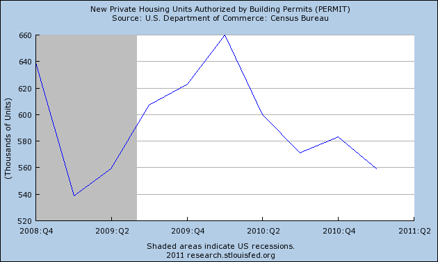
Now we can see that after a 125,000+ improvement in permits from Q1 2009 to Q1 2010, 100,000 of that was entirely given back in the next year. While this loss isn't enough to be consistent with a housing-caused recession, it IS enough to put quite a dent into growth.
Further, all post-WW2 experience indicates that it takes 4 to 6 quarters for the full effect of a housing decline to appear. In 2010, housing permits fell from 688,000 in March to 582,000 in May. Housing starts fell from 687,000 in April to 539,000 in June. Thus, we are close in time to the peak effect of that sudden decline.
Today's good housing numbers mean that for 2Q 2010 housing permits and starts will average over 600,000, the best quarter in over a year. Unlike the 2009 advance, this one does not depend on the artificial stimulation of an $8000 housing credit. It might be a one-off quarter, or it might be the start of the slow resurrection of the new housing market. If so, the effects will boost the economy significantly beginning in 2012.
This morning's good news on housing permits (624,000) and starts (629,000) is particularly welcome because, in my opinion, housing has been an unnoticed contributing factor to this year's economic stall.
It has done so because in comparison with the bust of 2006-2009, it's a mere squiggle on the graphs. For example, here is a graph showing the last 10 years of housing permits and starts:
Since WW2, a sustained decline of at least 200,000 from a recent peak has been required to be consistent with actual economic contraction. As the above graph shows, from the 2006 peak until early 2009, housing permits and starts declined over 1.5 Million! This is one of the three worst declines on a population-adjusted basis in the last 85 years (the others being 1926-33 and 1973-75).
In the graph above, the last 2+ years looks like a sideways squiggle. But look what happens when we zoom in, as in the below graph which shows housing permits since 4Q 2008, averaged per quarter to smooth out the results (note: graph ends with Q1 2011):
Now we can see that after a 125,000+ improvement in permits from Q1 2009 to Q1 2010, 100,000 of that was entirely given back in the next year. While this loss isn't enough to be consistent with a housing-caused recession, it IS enough to put quite a dent into growth.
Further, all post-WW2 experience indicates that it takes 4 to 6 quarters for the full effect of a housing decline to appear. In 2010, housing permits fell from 688,000 in March to 582,000 in May. Housing starts fell from 687,000 in April to 539,000 in June. Thus, we are close in time to the peak effect of that sudden decline.
Today's good housing numbers mean that for 2Q 2010 housing permits and starts will average over 600,000, the best quarter in over a year. Unlike the 2009 advance, this one does not depend on the artificial stimulation of an $8000 housing credit. It might be a one-off quarter, or it might be the start of the slow resurrection of the new housing market. If so, the effects will boost the economy significantly beginning in 2012.
Bonddad's $i$ter in Law in the WSJ
Bonddad's hister in law is Heather MacCallister, who is a romance writer. She is in today's WSJ at this link on how to dress a Victorian Lady.
Congrats!
You can find out more about her at her webpage.
Congrats!
You can find out more about her at her webpage.
With Taxes This Low, Where's the Growth?

The above chart from Calculated Risk. Here are his conclusions which I agree with:
Both income (blue) and corporate taxes (red) are near record lows. Combined income and corporate taxes could rise almost 50% (as a percent of GDP) and receipts would still only be at the median for the 50 years from 1946 through 1996.
With taxes this low, where is the explosive supply side growth? The answer is tax rates are but one variable in a complex set of equations that create macro level economic growth. But tax cuts are not the be all and end all of economic policy making.
And no, this is not a call to return to the 90% marginal tax rates of the 1950s. It is an explanation of why I have no problem with the idea of raising taxes as part of the answer to solving the budget problem.
For Those of You Who Think A Default is "No Big Deal"...
There are people who are telling us that a US default would be "no big deal." To those people, I would offer the following:
Treasuries are widely used as collateral for cash loans in the repurchase, or repo, market. On Friday, the Securities Industry and Financial Markets Association held a meeting with staff from the big banks to discuss operational issues that could arise in the event of a default.Folks, this is not a game. The US Treasury market is the backbone of international finance. To let the US get this close to default is beyond irresponsible.Analysts at Bank of America Merrill Lynch estimate 74 per cent of primary dealer repo financing, about $2,100bn, involves Treasury collateral. Money market funds also place significant amounts of cash in the repo market, and a default scenario would create strains for this sector if investors start to pull out their cash.
A downgrade of Treasuries from their triple A or haven status could well ripple through the financial system. “I think people view that as a risk, I know for a fact that we do consider it a risk in terms of all financial assets”, said Rick Rieder, chief investment officer for fixed income at BlackRock.
Modern financial theory starts from the premise that there is a risk-free rate of return available, backed by the “full faith and credit” of the world’s superpower. It is the reference point for pricing other assets.
However, practical consequences would soon follow a downgrade. Investors who had lent cash against Treasuries as collateral on the loan would require more bonds to back the loan. Such a move would in effect force borrowers to cut their trades and spark a deleveraging wave through markets, as was seen in the wake of Lehman Brothers filing for bankruptcy in September 2008.
Monday, July 18, 2011
Treasury Tuesdays
Last week I wrote the following about the Treasury market:

The IEFS rallied the previous week, but have since been consolidating in a tight price range between 97.20 and 97.90.

The daily chart shows prices have rallied, but to below the previous trend line. The shorter EMAs are all moving higher and are now below prices. Prices are using the EMAs as technical support. The fact prices have stalled and are hitting resistance at the previous trend line are both important developments. Also note the decreasing volume over the last few days, indicating a less than enthusiastic feeling about the rally.

The longer end of the curve rallied, consolidated between 96.20 and 97.40 and is now moving lower.

The daily chart of the TLTs shows the price action in more detail. Note that prices have hit resistance and fallen into the EMAs for technical support. Currently, prices are also at key Fibonacci levels.
The treasury market is still caught between conflicting trends. On one hand, the US is the "least dirty shirt in the hamper," meaning it is still considered a safe haven play in relation to the goings on in Europe. But there are big problems at home, especially as the debt ceiling drama plays out. The latest inflation data is pretty benign, indicating that won't be a reason for a sell-off. However, I'm still concerned that Wall Street has their collective fingers on the sell button.
Overall, the last two days' price action is more a fundamental reaction to the EU situation, which is interesting, as this has occurred at exactly the same time as the Fed backing away from the market lowering demand. And then there is the possible impact of the debt negotiation deal. It's my opinion this is a temporary bounce, caused by the EU situation.In short, fundamental factors were driving the market higher. Let's take a look at the charts.

The IEFS rallied the previous week, but have since been consolidating in a tight price range between 97.20 and 97.90.

The daily chart shows prices have rallied, but to below the previous trend line. The shorter EMAs are all moving higher and are now below prices. Prices are using the EMAs as technical support. The fact prices have stalled and are hitting resistance at the previous trend line are both important developments. Also note the decreasing volume over the last few days, indicating a less than enthusiastic feeling about the rally.

The longer end of the curve rallied, consolidated between 96.20 and 97.40 and is now moving lower.

The daily chart of the TLTs shows the price action in more detail. Note that prices have hit resistance and fallen into the EMAs for technical support. Currently, prices are also at key Fibonacci levels.
The treasury market is still caught between conflicting trends. On one hand, the US is the "least dirty shirt in the hamper," meaning it is still considered a safe haven play in relation to the goings on in Europe. But there are big problems at home, especially as the debt ceiling drama plays out. The latest inflation data is pretty benign, indicating that won't be a reason for a sell-off. However, I'm still concerned that Wall Street has their collective fingers on the sell button.
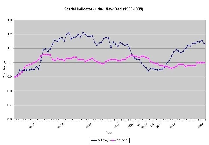
Money supply and pre-WW2 recessions
- by New Deal democrat
This continues my look at potential leading indicators as they may apply to pre-WW2 deflationary recessions. I have already looked at BAA bonds, housing starts, commodity prices, the stock market, and the yield curve. Today I will look at money supply.
Fortunately, the heavy lifting has already been done for me, as this is the subject of Milton Friedman's "A Monetary History of the United States" for which he won the Nobel Prize in Economics. I previously examined this issue also in two installments of a series of posts looking at the "Kasriel Recession Warning Indicator", here and here, to see if it worked during the Roaring Twenties and Great Depression.
To cut to the chase, here are three graphs showing YoY% changes in M1 (blue) and CPI (red).
First, here are Roaring Twenties:

Here is a close-up on 1928-29:

Here is the 1929-32 "great contraction":
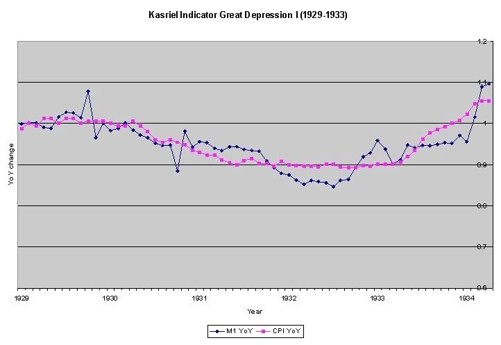
And here is the New Deal era of the 1930s:
Here is a chart showing the periods of negative real M1 during the Roaring Twenties and Great Depression:
Although the monetary indicator of M1 vs. CPI generally behaves well during most of the 1920s, it was generally zero but not negative during the 1926-27 downturn, and it most emphatically does not predict the Mother of All Deflationary Contractions in 1929. There is a brief spurt of M1 in late 1929 at the time of the stock market crash. M1 again exceeds CPI all during 1931; and even worse, M1 lags CPI thoughout the crucial last 9 months of 1933 when economic expansion had again begun. Beyond that, generally during this period Real M1 was generally a coincident rather than leading indicator.
And yet, in the Great Contraction, like all of the other deflationary recessions, there is a clear pattern of M1 and CPI on the graphs --both turn down, then sometimes sideways, before simultaneously or with M1 leading the way before CPI, both turn back up near the end of the deflationary recession.
With deflationary busts, it appears, the signal of real M1 is different. When real M1 is positive both nominally and in real terms, it is a valid indicator of expansion.
When there is deflation, however, the basis of the indicator is different - it is the second derivative that is important. When both YoY CPI and M1 are negative, real M1 is irrelevant. Instead, when the second derivative of CPI and M1 are both declining (i.e., decreasing at an increasing rate), a recession is near or is occuring. When the second derivative turns positive - i.e., YoY CPI and M1 are declining, but at ever-slower rates (as they were beginning in late 1932) - that is the indicator that the deflationary bust is at or near its bottom.
Indeed, that held true in 2009 after I published the original posts above. Once it became clear that that wage-deflationary spiral was not imminent, and Oil had fallen to under $40 a barrel, it was clear that the YoY bottom in CPI was likely to occur in the summer or early autumn. As the below graph (YoY CPI in blue, monthly in red) shows, that is exactly what happened:

YoY deflation bottomed in June 2009 - which was the trough of the "great recession."
This continues my look at potential leading indicators as they may apply to pre-WW2 deflationary recessions. I have already looked at BAA bonds, housing starts, commodity prices, the stock market, and the yield curve. Today I will look at money supply.
Fortunately, the heavy lifting has already been done for me, as this is the subject of Milton Friedman's "A Monetary History of the United States" for which he won the Nobel Prize in Economics. I previously examined this issue also in two installments of a series of posts looking at the "Kasriel Recession Warning Indicator", here and here, to see if it worked during the Roaring Twenties and Great Depression.
To cut to the chase, here are three graphs showing YoY% changes in M1 (blue) and CPI (red).
First, here are Roaring Twenties:
Here is a close-up on 1928-29:
Here is the 1929-32 "great contraction":
And here is the New Deal era of the 1930s:
Here is a chart showing the periods of negative real M1 during the Roaring Twenties and Great Depression:
| Year | Negative Real M1 | Recession dates |
|---|---|---|
| 1921 | - March | - 7/21 |
| 1922 | - | |
| 1923 | September - | 5/23- |
| 1924 | - March | -7/24 |
| 1925 | - | |
| 1926 | 10/26- | |
| 1927 | -11/27 | |
| 1928 | - | |
| 1929 | April-May, November - | 8/29- |
| 1930 | - October | cont. |
| 1931 | November - | cont. |
| 1932 | - October | cont. |
| 1933 | July - | -3/33 |
| 1934 | - February | - |
| 1935 | - | |
| 1936 | - | |
| 1937 | June - | 5/37- |
| 1938 | - August | -6/38 |
| 1939 | - | |
| 1940 | - |
Although the monetary indicator of M1 vs. CPI generally behaves well during most of the 1920s, it was generally zero but not negative during the 1926-27 downturn, and it most emphatically does not predict the Mother of All Deflationary Contractions in 1929. There is a brief spurt of M1 in late 1929 at the time of the stock market crash. M1 again exceeds CPI all during 1931; and even worse, M1 lags CPI thoughout the crucial last 9 months of 1933 when economic expansion had again begun. Beyond that, generally during this period Real M1 was generally a coincident rather than leading indicator.
And yet, in the Great Contraction, like all of the other deflationary recessions, there is a clear pattern of M1 and CPI on the graphs --both turn down, then sometimes sideways, before simultaneously or with M1 leading the way before CPI, both turn back up near the end of the deflationary recession.
With deflationary busts, it appears, the signal of real M1 is different. When real M1 is positive both nominally and in real terms, it is a valid indicator of expansion.
When there is deflation, however, the basis of the indicator is different - it is the second derivative that is important. When both YoY CPI and M1 are negative, real M1 is irrelevant. Instead, when the second derivative of CPI and M1 are both declining (i.e., decreasing at an increasing rate), a recession is near or is occuring. When the second derivative turns positive - i.e., YoY CPI and M1 are declining, but at ever-slower rates (as they were beginning in late 1932) - that is the indicator that the deflationary bust is at or near its bottom.
Indeed, that held true in 2009 after I published the original posts above. Once it became clear that that wage-deflationary spiral was not imminent, and Oil had fallen to under $40 a barrel, it was clear that the YoY bottom in CPI was likely to occur in the summer or early autumn. As the below graph (YoY CPI in blue, monthly in red) shows, that is exactly what happened:
YoY deflation bottomed in June 2009 - which was the trough of the "great recession."
2011 1H state tax revenues near nominal record, but stall in real terms
- by New Deal democrat
The Census Bureau has reported on state and local tax revenue collected in the first calendar quarter of 2011, and the Rockefeller Institute has also reported on preliminary collections from the second quarter.
The best data point is that combined state and local tax revenue collections in the first calendar quarter of 2011 set a record for first quarter collections, $321.6 Million, compared with previous record of $311.6 Million collected in the first calendar quarter of 2008.
Leaving aside local revenues, state tax revenues for the first calendar quarter were $179.8 Million, only $1.6 Million, or -0.9% less than the record $181.4 Million in first quarter 2008. As to the second calendar quarter of 2011, the Rockefeller Institute says:
Some other highlights from the Rockefeller Institute's report:
(p*=preliminary)
In summary, while in nominal terms state tax revenues have made back almost their entire shortfall, measured in real terms they have stalled in the last several quarters. Meanwhile population has increased, and states have been facing record unemployment payouts. Local governments, which rely on property taxes, are suffering from decreased revenues as well as decreased aid from the states. In short, there has been improvement, but it still isn't enough.
The only silver lining here is that, with federal aid ended, any layoffs this summer and September are likely to be about the last due to budget constraints - unless high Oil prices and contractionary idiocy in Versailles bring on a double-dip.
The Census Bureau has reported on state and local tax revenue collected in the first calendar quarter of 2011, and the Rockefeller Institute has also reported on preliminary collections from the second quarter.
The best data point is that combined state and local tax revenue collections in the first calendar quarter of 2011 set a record for first quarter collections, $321.6 Million, compared with previous record of $311.6 Million collected in the first calendar quarter of 2008.
Leaving aside local revenues, state tax revenues for the first calendar quarter were $179.8 Million, only $1.6 Million, or -0.9% less than the record $181.4 Million in first quarter 2008. As to the second calendar quarter of 2011, the Rockefeller Institute says:
Overall collections in 45 early reporting states showed growth of 12.5 percent in the April-May months of 2011 compared to the same months of 2010, and growth of 14.7 percent compared to the same months of 2009. With these figures, however, collections were still 8.9 percent below the April-May months of 2008..... While state tax collections are now strengthening, they have yet to fully make up for the deep losses brought by the Great Recession. We expect that milestone to be passed when we report more complete second quarter data later this summer.(my emphasis)
Some other highlights from the Rockefeller Institute's report:
Total state tax revenue in the first quarter of 2011 increased by 9.3 percent relative to a year ago, before adjustments for inflation and legislated changes.... Despite gains in the last five quarters, however, collections are still ... 0.9 percent lower in the first quarter of 2011 compared to the same quarter of 2008. The decline is deeper if we adjust the numbers for inflation - 4.7 percent lower than three years ago in real terms....This is all to the good. Local governments, by contrast, which rely heavily on property tax payments, are in worsening shape:
Personal income tax revenue increased 12.8 percent in the January-March 2011 quarter compared to the same period in 2010.... [W]ithholding for the January - March 2011 quarter continued to improve for the fifth quarter in a row, increasing by 8.3 percent for the 40 states for which we have withholding data. Withholding for the same states was up by 13.8 percent compared to the January-March quarter of 2009....
State sales tax collections in the January-March 2011 quarter showed growth of 6.3 percent from the same quarter in 2010, but
were still down by 2.5 percent from the same period three years earlier.
[T]he fiscal picture for local governments is quite different. The real, year-over-year decline in local taxes was an average of 0.6 percent over the last four quarters, compared to a 0.4 percent decline for the preceding year and 3.0 percent growth of two years ago. Inflation over the year, as measured by the gross domestic product deflator, was 1.6 percent. For most of the period during and after the last recession, local tax collections remained relatively strong. However, the trends are now shifting due in part to the lagged impact of falling housing prices on property tax collections.Here is an updated graph of state tax revenues, seasonally adjusting by .775 for the second quarter (which includes April 15), beginning with the first fiscal quarter of 2008 (or the third calendar quarter of 2007) :
| Fiscal Quarter | Revenues* ($ billions) | Inflation- adjusted Revenues | % off of peak |
|---|---|---|---|
| 1Q 2008 | 176.4 | 183.8 | -1.5% |
| 2Q 2008 | 178.7 | 183.6 | -1.6% |
| 3Q 2008 | 181.4 | 184.6 | -1.1% |
| 4Q 2008 | 240.8 (186.6) | 186.6 | 0 |
| 1Q 2009 | 181.2 | 179.9 | -3.6% |
| 2Q 2009 | 171.4 | 176.2 | -5.6% |
| 3Q 2009 | 159.2 | 162.7 | -12.8% |
| 4Q 2009 | 200.4(155.3) | 157.3 | -15.7% |
| 1Q 2010 | 160.5 | 161.5 | -13.5% |
| 2Q 2010 | 164.6 | 164.7 | -11.7% |
| 3Q 2010 | 163.3 | 163.0 | -12.6% |
| 4Q 2010 | 204.5(158.5) | 158.8 | -14.9% |
| 1Q 2011 | 168.1 | 167.2 | -10.4% |
| 2Q 2011 | 178.7 | 175.5 | -5.9% |
| 3Q 2011 | 179.8 | 174.2 | -6.7% |
| 4Q 2011 | 230.1(178.3) (p)* | 170.8(p)* | -8.5%(p)* |
(p*=preliminary)
In summary, while in nominal terms state tax revenues have made back almost their entire shortfall, measured in real terms they have stalled in the last several quarters. Meanwhile population has increased, and states have been facing record unemployment payouts. Local governments, which rely on property taxes, are suffering from decreased revenues as well as decreased aid from the states. In short, there has been improvement, but it still isn't enough.
The only silver lining here is that, with federal aid ended, any layoffs this summer and September are likely to be about the last due to budget constraints - unless high Oil prices and contractionary idiocy in Versailles bring on a double-dip.
Economic Week in Review
Consumer Spending: retail sales were up .1%, which is actually a negative number when you consider inflation. The internals were mixed with auto sales up .7% but home furnishings down .8 and electronic stores down .2. Sporting goods were also down .7 and food service were down .4 -- all of which indicates consumers are pulling in their recreational/discretionary spending habits. In addition, consumer sentiment -- which has been in a lower, weaker position for the entire recovery -- dropped again. In short, last week we saw further evidence that consumer is pulling in his spending and hunkering down because of concern. This is a terrible development, as this accounts for 70% of economic growth.
Manufacturing: overall industrial production edged up .2% last month. While auto disruptions caused by Japanese fallout were part of the reason, there were other drops in appliances, furniture and carpeting which hurt the production of consumer goods. Business equipment was also lower, which could indicate that the business investment component of GDP will take a hit. Interestingly, construction supplies increased for the fourth month. For the Empire State manufacturing index, "[t]he general business conditions index remained below zero, at -3.8. The new orders index also remained negative, while the shipments index increased to a level slightly above zero." In addition, future expectations were down as well. Both of these numbers indicate that manufacturing -- which has led the recovery for the last 18 months -- is slowing as well.
Prices: There was good news on the price front as both PPI and CPI declined. Producers prices decreased .4%. The primary issue here was a decrease in energy prices, whose crude component decrease 2.8% and whose intermediate rate only increased 1.5%. A decrease in the upward pace of food prices also helped. CPI decreased .2%, largely as the result of a big dip in gas prices and the slowest increase in food prices in a year.
The above data continues to point to a slowdown or near stall in the economy. The biggest concern is the consumer, who is clearly holding back on purchases of all types. Confidence is low, unemployment is high and Washington is playing utter brinksmanship to the very end. As such, there is little reason to cheer -- or to start purchasing lots of things. In addition, the manufacturing sector is still slowing, partly as a result of Japan, but other areas of the sector are also showing signs of deceleration.
In short, last week's economic news highlighted more signs of an economic slowdown at the worst possible time. The good news is that inflation appears to be topping.
Sunday, July 17, 2011
Equity Week in Review and Preview of the Upcoming Week/Month
Last week, I wrote the following about the market:

The above chart shows the rally from the beginning in early 2009. Notice that prices are above key Fibonacci levels. Additionally, prices have consolidated in a sideways pattern before -- actually, a little over a year ago. Most importantly, prices are approaching key, multi-year support levels.

Above is a chart of the 2010 consolidation, which also occurred during a time of EU economic concern. Prices used the 200 day EMA as a center of gravity, vacillating around the EMA but not moving too high or low in relation to it. Also note the shorter EMAs followed prices in the same manner.

Above is a chart for the price consolidation that has occurred over the last few months. Unlike the 2010 consolidation, this is so far occurring about the 200 day EMA, which was until recently not involved in any manner. Instead, notice the 20 day EMA is now taking the center of gravity role occupied by the 200 day EMA in the previous consolidation.


The IWMs and QQQs are also in a sideways consolidation.
With all three major ETFs, I'd use the 200 day EMA as a lower support target. I'd place upside resistance for the SPYs at 137, the QQQs at 59 and the IWMs at 86.5 - although I don't expect any of the averages to hit those levels soon. For now, the markets are still waiting out the EU situation and the determination of the US' economic trend.
Part of last week's action could simply be a consolidation of gains after a strong advance. This is standard market behavior. However, Friday's employment report should put the kabash on any strong upside rally in anticipation of economic acceleration in the third and fourth quarter. The pace of job growth is slowing, not advancing, and indicates there are problems underneath the economic surface. Any advance beyond resistance levels should be viewed suspiciously at this point until the fundamental picture improves.In short, the market's recent price action reflects concerns about the broader economy and the accompanying slowdown in overall activity. Nothing has changed in the last week to allay my concerns about the economy. Last week's economic news pointed to more signs of a slowdown (see the upcoming economic week in review), adding further downward pressure on the markets.

The above chart shows the rally from the beginning in early 2009. Notice that prices are above key Fibonacci levels. Additionally, prices have consolidated in a sideways pattern before -- actually, a little over a year ago. Most importantly, prices are approaching key, multi-year support levels.
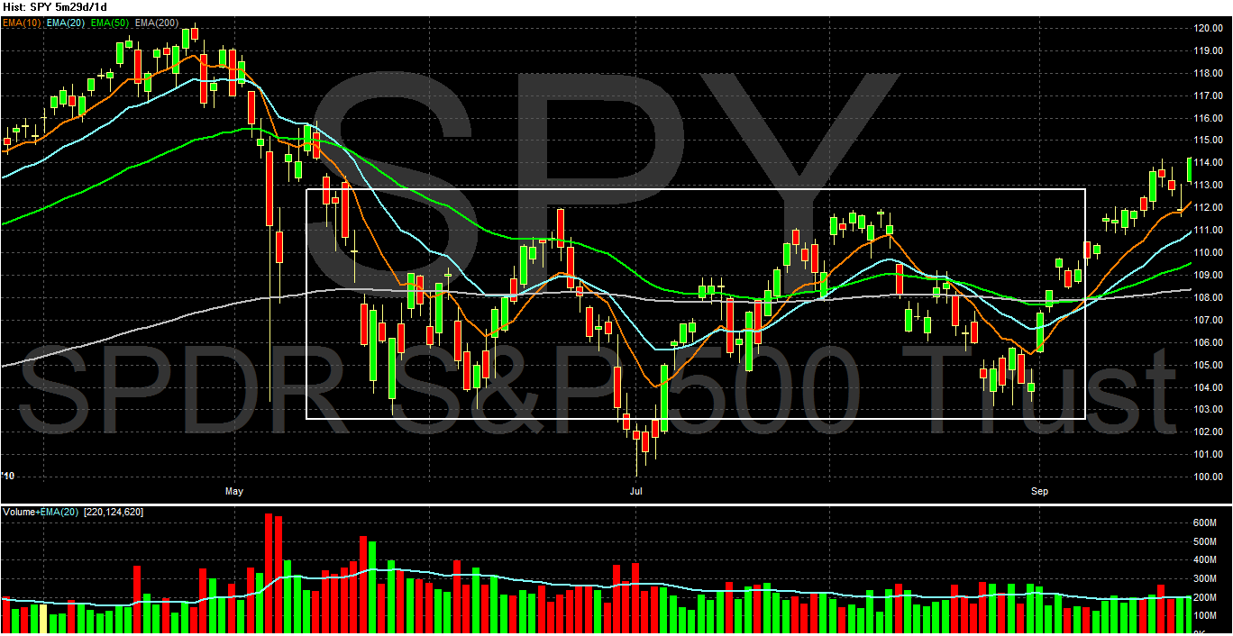
Above is a chart of the 2010 consolidation, which also occurred during a time of EU economic concern. Prices used the 200 day EMA as a center of gravity, vacillating around the EMA but not moving too high or low in relation to it. Also note the shorter EMAs followed prices in the same manner.

Above is a chart for the price consolidation that has occurred over the last few months. Unlike the 2010 consolidation, this is so far occurring about the 200 day EMA, which was until recently not involved in any manner. Instead, notice the 20 day EMA is now taking the center of gravity role occupied by the 200 day EMA in the previous consolidation.


The IWMs and QQQs are also in a sideways consolidation.
With all three major ETFs, I'd use the 200 day EMA as a lower support target. I'd place upside resistance for the SPYs at 137, the QQQs at 59 and the IWMs at 86.5 - although I don't expect any of the averages to hit those levels soon. For now, the markets are still waiting out the EU situation and the determination of the US' economic trend.
Subscribe to:
Posts (Atom)