I haven't updated some of my employment trend graphs in a couple of months. Let's take a look at a few of them.
First, here is the scatterplot comparing initial jobless claims vs. payrolls since 6 months before the last recession began (orange), rising to the worst level (red), recovering from that level (blue), and the last two months (brown):
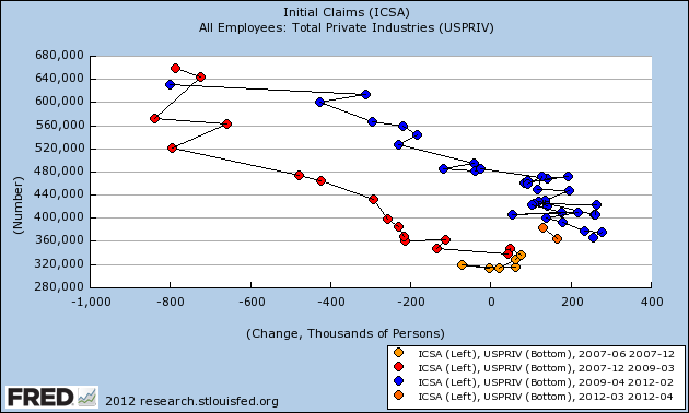
To refresh your memory, typically heading into a recession, first hiring stops (moving the scatterpoints to the left in the graph) before significant firing begins. Similarly, as a recovery starts from the depths of a recession, new hiring begins in selected fields before the overall firing slows (moving the scatterpoints to the right). The last couple of months haven't decisively moved us off trend, certainly not as compared with the six months in 2007 just before the last recession began.
Next let's compare aggregate hours worked (red) with payroll growth (blue):
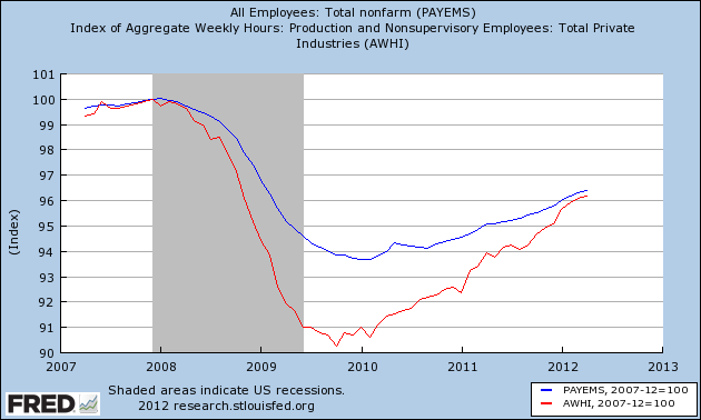
The idea here is that aggregate hours fell more during the recession than actual jobs lost, and those will catch up before the two move in tandem. This explains why job growth in the last couple of years was relatively subdued. As you can see, there is good news and bad news. The good news is that aggregate hours have finally caught up. The bad news is that both have softened in the last couple of months.
Next let's look at the initial jobless claims rate (i.e., layoffs adjusted for population growth) vs. the unemployment rate:
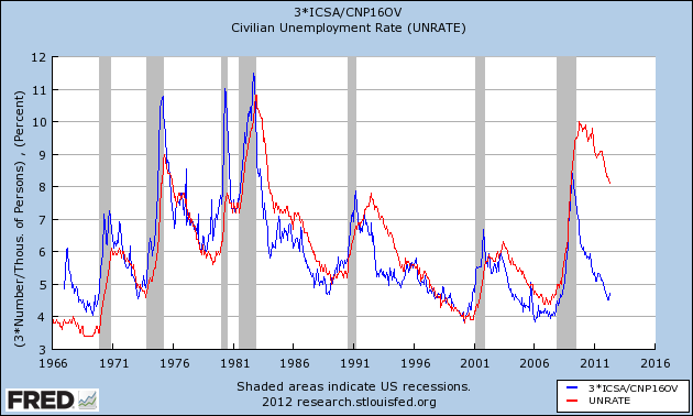
The population-adjusted layoff rate leads the unemployment rate, and over the long term the relationship has been tight. In 2009 that relationship blew out, but since then the two have moved in tandem again, as shown in this close-up of the last couple of years:
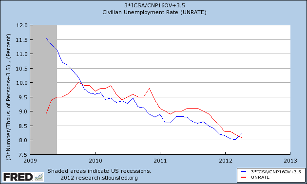
This suggests that the unemployment rate will continue to decline for the next month or two, probably dipping under 8%, before turning up again.
Finally, let's look at the bifurcated nature of the jobs recovery (h/t Karl Smith). The below graph divides payroll losses in the recession into private sector service jobs (blue), and goods-producing (mainly manufacturing and construction) plus government jobs (red):
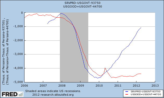
Both sectors lost about 4.5 million jobs in the recession. Private service jobs have recouped all but 1 million of those losses. Goods plus government have regained almost none. The uptick in the last six months comes, believe it or not, from manufacturing. State and local governments are still shedding jobs.