- by New Deal democrat
The employment report is the ultimate coincident indicator. Along with income, the status of jobs are what says YOU ARE HERE to the vast majority of Americans. Here are three signposts from the jobs report.
First of all, here is the YoY% change in jobs growth. Note that it has generally stagnated between 1.3% and 1.4% for the last 4 months.

Typically under a correlary to "Okun's law", which posits a linear relationship between GDP and jobs and the unemployment rate, it takes about 2% or so positive growth in GDP to generate growth in jobs over the rate of population growth. We've had that 2% YoY GDP for about a year now, and the rate of job growth YoY has neither been improving nor deteriorating significantly.
Secondly, the rate of initial jobless claims being made continues to lead the unemployment rate by 1 or 2 months. It suggess that we probably won't see any further improvement in the unemployment rate between now and election day:

Finally, here is an update on the scatter graph I posted yesterday, showing the relationship between initial jobless claims (left scale) and job growth (bottom scale). Today's number is shown in orange:
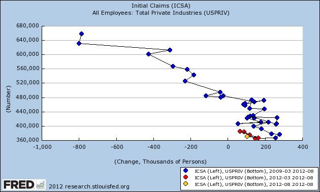
This shows that we continue to have poor hiring for a given level of firing compared with earlier in this recovery. That this new trend has persisted for 6 months suggests that we are moving closer to a new recession.