Saturday, April 21, 2012

Weekly Indicators show important transitions in housing and energy sectors

- by New Deal democrat

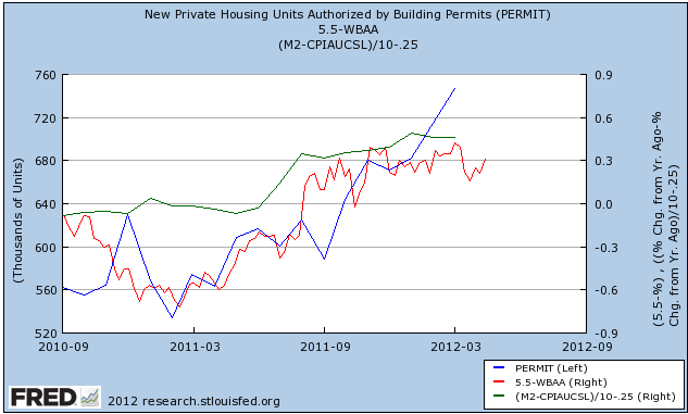
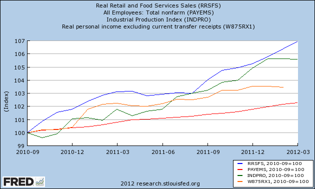
 The monthly data releases this week included a continuing if small advance in the Leading Economic Indicators of +0.2. While the Conference Board's spokesman isn't all over the cable news networks promoting its views, it is important to note that this series, after declining slightly late last summer (forecasting weakness now), has consistently increased since then. Retail sales and real retails sales both came in strongly positive. So did housing permits, rising to a 3 1/2 year high and no longer "bouncing along the bottom." Housing starts, however, did decline significantly. Industrial production remained flat. Existing home sales showed slight weakness.

The high frequency weekly indicators this week give important evidence of two areas of the economy going through fundamental transitions. Of particular interest are the H8 FRB series of real estate loans and house price indexes, and also the very important coincident indicator of rail traffic, not only for what is happening, but why it is happening.

 Let's start with the Housing reports :

The Mortgage Bankers' Association reported that the seasonally adjusted Purchase Index decreased -11.2% from the prior week, and was also off -13.9% YoY. Looking at the MBA's database, this may be a calendar quirk, as purchase mortgages declined strongly in the next week one year ago. The Refinance Index reversed course with a strong increase of +13.5% from the previous week. Because the MBA's index was substituted for the Federal Reserve Bank's weekly H8 report of real estate loans in ECRI's WLI, I've begun comparing the two. This week for the second third week in a row after 4 years of relentless decline, real estate loans held at commercial banks were up, +1.0% on a YoY basis. On a seasonally adjusted basis, these bottomed in September and are now up +1.7%.

YoY weekly median asking house prices from 54 metropolitan areas at Housing Tracker were up +3.1% from a year ago. YoY asking prices have been positive now for close to 5 months. This week Realtor.com reported that asking prices for their entire database were up 5.6% YoY in March. Further, the NAR reported that a 2.5% YoY increase in median home sale prices for March. At this point virtually the only house price indexes that haven't turned positive YoY are the repeat sales indexes like Case-Shiller.

Now let's turn to the effects of the Oil choke collar:

Gasoline prices fell slightly for the first time in months, to $3.92. Oil, however, rose slightly to $104.02. Both of these remain above the point where they can be expected to exert a constricting influence on the economy. Gasoline usage, at 8775 M gallons vs. 9062 M a year ago, was off -3.2%. The 4 week moving average is off -2.8%. These are among the best YoY comparisons in months, but on the other hand one year ago gasoline usage was beginning its big decline.

The American Association of Railroads reported a -2.9% decline in traffic YoY, or -15,300 cars. Ex-coal, overall traffic was up by 8,400 cars, or +1.6% YoY. Intermodal traffic was up 3700 carloads, or +1.6%, but other carloads decreased -19,000, or -6.4% YoY. Railfax's graph of YoY traffic continued to show that rail hauling of cyclically sensitive materials remains in strong improvement. Beyond coal, the other groups suffering declines have to do with corn-related agricultural products, and this in turn has everything to do with American consumer's single-minded quest for energy efficiency. CSX was the first railroad to report Q1 earnings, and as reported by ABC News:
CSX said the market for utility coal is likely to be even weaker in the second quarter, but the Jacksonville, Fla., company said it's on track to top 2011 earnings this year. Shipments of agricultural products dipped 1 percent as demand for ethanol, which is made from corn, dropped because motorists have been buying less gasoline. Ethanol is added to much of the gasoline used in the U.S.
Employment related indicators were mixed:

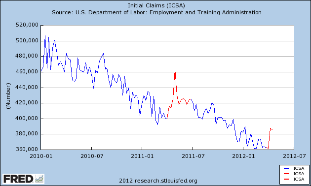
The Department of Labor reported that Initial jobless claims rose another 2,000 to 382,000 last week*, the highest report since January, thus continuing to mirror the big increase in April one year ago. The four week average also rose by 6250 to 374,750. (*In these summaries I always compare the raw number from the week prior to the raw number this week, avoiding the w/w distortion that takes place when we know that late reports will increase the prior week's number usually by 2000 to 6000).

The Daily Treasury Statement showed that for the first 14 days of April, $103.6 B was collected vs. $104.4 B a year ago, the second week in a row showing an absolute decline. In the last 20 reporting days, however (a more valid measure), $138.2 B was collected vs. $132.3 B a year ago, an increase of $5.9 B, or +4.5%.

 The American Staffing Association Index rose held steady at 90. It remains close to its pre-recession readings of 2007.

Sales remained a positive.

The ICSC reported that same store sales for the week ending April 14 fell -1.0% w/w, but rose +3.2% YoY. Johnson Redbook reported a 3.0% YoY gain. Shoppertrak reported a -1.0% YoY loss, probably having everything to do with the timing of Easter this year vs. last year. The 14 day average of Gallup daily consumer spending remained favorable at $74 vs. $68 in the equivalent period last year.

Money supply was mixed on a weekly and monthly basis: M1 fell -0.2% last week, but was up +1.0% month over month. Its YoY level increased to +18.1%, so Real M1 is up 15.5%. YoY. M2 fell -0..1% for the week, but was up +0.4% month over month. Its YoY advance rose slightly to +9.9%, so Real M2 was up 7.3%. Real money supply indicators continue slightly less strongly positive on a YoY basis.

Bond prices rose and credit spreads widened again: Weekly BAA commercial bond rates fell -.10% t0 5.19%. Yields on 10 year treasury bonds fell +.17% to 2.04%. The credit spread between the two, which had a 52 week maximum difference of 3.34% in October, rose again to 3.15%, suggesting a weakening in economic conditions.

 Turning now to high frequency indicators for the global economy:

The TED spread rose .02 to 0.400. This index remains slightly below its 2010 peak, generally steady for the last 7 weeks, and has declined from its 3 year peak of 3 months ago. The one month LIBOR remained at 0.240. It is well below its 12 month peak set 3 months ago, remains below its 2010 peak, and has returned to its typical background reading of the last 3 years.

The Baltic Dry Index at 1067 was up 95 from 928 one week ago, and up 397 from its 52 week low, although still well off its October 52 week high of 2173. The Harpex Shipping Index rose 15 to 410 in the last week, and is up 35 from its February low of 375.

Finally, the JoC ECRI industrial commodities index fell from 123.74 to 122.31. It has resumed its fade, at a pace about equal to exactly one year ago. This indicator appears to have more value as a measure of the global economy as a whole than the US economy.

This week the monthly and weekly indicators together showed an important transition in the real estate market. Housing permits are THE leading indicator for that sector, and they have broken out of a 3 year bottom to the upside, now more than 200,000 units on an annual basis above their 2009 lows. The rapid turnaround in real estate loans by banks to the upside is also a leading indicator, confirming the story told by permits. That more and more price index series have turned up lends even more credence to the (relative) firming of the real estate market.

Secondly, consumers' laser-like focus on saving on energy costs is now affecting mining, rails and utilities in addition to gasoline usage in vehicles. The decline in those indicators is a negative for the economy, but I suspect it is more than offset by the efficiency gains and the cash freed up for other spending by energy consumers, as is evident in the continuing strength of retail sales.

Friday, April 20, 2012

Weekend Weimar, Beagle and Pit Bull

It's that time of the week. I'll be back on Monday; NDD will have weekly indicators on Saturday. Until then ....


1955: Balance of Payments

This is part of the Bonddad Economic History Project.  For more information, please see the right side of the blog.


The above chart from the 1955 Federal Reserve Report shows that the US was a net exporter for the year, with total exports of about $20 billion (SAAR) and imports of about $18 billion (SAAR).  This was largely due to Europe getting back on its feet after WWII, but also due to developments in Latin America.

The above chart shows the same information, but also includes US military expenditures.  This is important to remember; by this time the cold war was heating up, so the US would spend a fair amount of money on military exports.  Total military expenditures were a little over $2.6 billion, so they accounted for about 10% of exports.


The above table gives us total imports and exports for the year on a BoP basis.

The following excerpts are from the annual Federal Reserve report and the Economic Report to the President:


Is the Oil choke collar creating a new seasonality?

In the last two weeks there has been a sudden and significant increase in first time jobless claims. Last week Prof. Dean Baker wrote that the the increase is due to the non-winter winter distorting seasonal patterns.

Except that we had the exact same sudden and significant increase in first time jobless claims during the exact same two weeks last year, as is shown in the below graph which highlights April through June last year and claims since April 1 of this year in red:


That suggests that the our recent non-winter winter is not the reason for the difference.

Another suggestion has been that the BLS's seasonal adjustments were thrown off by the pattern during the severe recession, causing first quarter adjustments to bee too low, and second quarter too high. While that may be true, the BLS just a few weeks ago revised the entire series back several years to deal with that exact issue. Also, as the above graph shows, there was no significant increase in Q2 2010.

I propose another explanation. It may well be that the seasonal increase in gasoline prices from January through May or June of both last year and this year to nearly $4 per gallon, thereby tightening the choke collar on the economy, is reflected in an increase in layoffs. In other words, this is a new seasonal pattern that is only showing up in those years where the seasonal increase in gas prices sufficiently tightens the Oil choke collar -- as in 2008, 2011, and 2012.

If my speculation is correct, we will see a pattern very much like last year. Once gasoline prices begin to decline seasonally after midyear, the Oil choke collar will be loosened again, and layoffs will again decline.

A quick note on this week's ECRI WLI

- by New Deal democrat

I haven't had the time to post my beta testing in the last few weeks, but I did want to note before the time of its release that I expect this week's WLI to be significantly negative. Only one component - corporate bond prices - increased. Everything else - credit spreads, real M2, initial jobless claims, the JoC ECRI commodities index, the S&P 500, and purchase mortgage applications - decreased.

That being said, the WLI growth index may increase anyway, since last April the index was beginning a sharp decline, so a lesser rate of decline this week may be recorded as a net positive, and also because the general trend for the last few months in the weekly data has been positive, and this is apparently especially weighted in the growth index.

Morning Market Analysis


After breaking support over the last two weeks, the French market is not again at importance technical support levels; the EWQ ETF is trading right above the 20 handle, which has been support for a little more than a week.  Also note the declining status of the shorter EMAs, CMF and MACD.  A move through 20 would make the 19.5 level the next likely target.


The Italian market is also in technically bad shape.  The ETF has fallen nearly 18% (14 to 11.52), has bearish EMAs, A/D and CMF and has prices below the 200 day EMA.


The Italian market is now in bear market territory (it's down over 20%) and shares all of the bearish characteristics of the markets above. 

The above three markets are the weakest of the EU ETFs.  More importantly, they are bearish, and are therefore more likely to continue moving lower, dragging down the other, stronger EU economies.  This will, in turn, have a bearish impact on the US markets.


All three US treasury  ETFS -- the IEIs (5-7 years), the IEFs (7-10 years)  and TLTs (20+ years), have all rebounded and rallied, two to Fib levels (the IEIs and IEFs).  Of particular importance is the fact the TLTs bounced off the 200 day EMA -- the line between bull and bear markets.  What's also important here is the renewed safety bid.


Thursday, April 19, 2012

Bonddad Linkfest

  1. The two paycheck family is an economic necessity (WaPo)
  2. Poll shows opening for Obama and Romney (NYT)
  3. Spain's bank problems present EU challenge (NYT)
  4. Alarm bells about speculators shorts in wheat (Agrimoney)
  5. US soy beans exports to test record (Agrimoney)
  6. India's star is falling (Marketwatch)
  7. Jobless claims still at 4-week high (Marketwatch)
  8. Spain has a decent government bond auction (FT)
  9. US leading indicators rise (Marketwatch)
  10. Chinese inventories undermine copper price (FT)

Hey -- Maybe We Could, Y'Know, Invest In Our Aging Infrastructure ....


From Yahoo:
Driven by high gas prices and an uncertain economy, Americans are turning to trains and buses to get around in greater numbers than ever before. But the aging transit systems they're riding face an $80 billion maintenance backlog that jeopardizes service just when it's most in demand.

The boost in ridership comes as pain at the gas pump and the sluggish economic recovery combine with a migration of young adults to cities and new technology that makes transit faster and friendlier than in the past. The number of transit trips over a 12-month period will likely set a new record later this month or next, say Federal Transit Administration officials. The current peak is 10.3 billion trips over a year, set in December 2008.

But decades of deferred repairs and modernization projects also have many transit agencies scrambling to keep trains and buses in operation. The transit administration estimated in 2010 that it would take $78 billion to get transit systems into shape, and officials say the backlog has grown since then. In some places, workers search the Internet for spare parts that are no longer manufactured. In others, trains operate using equipment designed, literally, in the horse-and-buggy era.

In Philadelphia, for example, commuters ride trains over rusty steel bridges, some of them dating back to the 19th century. The Southeastern Pennsylvania Transportation Authority — which operates subway, trolley, bus and commuter rail systems — is responsible for 346 bridges that are on average 80 years old. Officials said they may be forced to slow trains or even stop them from crossing one bridge that's 1,000 feet long and 90 feet above the ground if it deteriorates further, leaving stations on the other side without service.

A key power substation relies on electrical equipment manufactured in 1926. There's no hope for acquiring spare parts, so workers try to open the boxes housing the equipment as infrequently as possible to prevent damage from exposure to the environment.

"We're operating on a prayer on that line," Joseph Casey, the transportation authority's general manager, said in an interview. "If that fails, half of our commuter rail system would shut down." The system carries 125,000 passengers on weekdays.
The above scenario is right out of the Russia under communist rule.  But it's not -- it's here in the US.

Also consider this:
With much of its 1 million miles of pipes reaching end of life, the mounting costs associated with the repair of the U.S. drinking water infrastructure needs to be countered with innovative solutions in funding and technology. This need was highlighted when the American Water Works Association delivered sobering news in the form of its report, Buried No Longer: Confronting America's Water Infrastructure Challenge. This report states that over the next 25 years the cost of repairing the existing infrastructure will reach upwards of $1 trillion dollars and this figure is only to maintain current levels of service. Other highlights from the report include:
And then there is this:
  • 33% of America’s urban and rural roads are in poor, mediocre or fair condition, according to the Federal Highway Administration.
  • Driving on roads in need of repair costs U.S. motorists $54 billion per year in extra vehicle repairs and operating costs — $275 per motorist.
  • Outdated and substandard road and bridge design, pavement conditions and safety features are factors in 30% of all fatal highway crashes.
  • Between 1970 and 2002, passenger travel nearly doubled in the United States. Road use is expected to increase by nearly two-thirds in the next 20 years.
  • As of 2003, 27% of the nation’s 160,570 bridges were structurally deficient or functionally obsolete.
More on this topic here.

And an example from Texas:

For Hutto and the 1,264 other public school districts in Texas, this has been the year of doing without. Texas lawmakers cut public education financing by roughly $5.4 billion to balance the state’s two-year budget during the last legislative session, with the cuts taking effect this school year and next.

The budget reductions that districts large and small have had to make have transformed school life in a host of ways — increasing class sizes, reducing services and supplies and thinning the ranks of teachers, custodians, librarians and others, school administrators said.

Like chief executives of struggling corporations, superintendents have been cutting back on everything from paper to nurses and have had to become increasingly creative about generating revenue. They are selling advertising space on the sides of buses and on district Web sites, scaling back summer school, charging parents if their children take part in athletics or cheerleading and adding periods in the school day so fewer teachers can accommodate more students.

In suburban Fort Worth, the Keller Independent School District started charging parents for bus service. The fee, which ranges this year from $185 to $355 for one student, is expected to bring in about $1 million, no small amount for a district that eliminated 100 positions and some sports teams and no longer has uniformed officers providing security after it canceled contracts with local police agencies. 

One Central Texas district, Dripping Springs, reduced its custodial staff and has relied on teachers to pick up the slack. Janitors now visit the classrooms every other day, leaving teachers to clean and sweep their rooms on the off days. Off day or on, teachers also must collect their trash and set it in the hallway, part of custodial changes aimed at saving the district $149,000.
The evidence about the terrible shape of the US infrastructure is beyond overwhelming.  Denial of the situation is caused by either pure political motivation or willful blindness; either way, it's fair to characterize it as abjectly stupidity.

We could invest a ton of money in this (as in trillions of dollars), improve the US economic position and help the economy.  For example, we could re-invest in public education at the local university level, lowering the overall cost and developing the workforce of tomorrow.  Or we could improve our physical infrastructure, thereby lowering transportation costs of getting goods from point A to point B from decreasing repairs and increased traffic efficiency.

The problem with this is it's not a hot topic among talking heads in the US news establishment, who seem more concerned about moving from fake outrage to fake outrage rather than discussing real problems.  It's also not helped by our hyper-political culture where anti-government stupidity runs rampant at the extent of long-term investment.   At this point, I have incredibly deep concerns about the future of the US given the current high level of object ignorance and abject stupidity at the national level.

----------------
P.S. from NDD:  There are some things you can only appreciate over the arc of time. Well, I am an old enough fossil to be able to tell you young whipper-snappers that our roads and bridges WERE NOT IN DISREPAIR LIKE THIS in the 1960s and even the miserable 1970s.  Lots of money was ploughed into building and maintaining new and pristine roads. 

Now even the interstate highways - once our crown jewel - are full of potholes and patches (not to mention many of them used to have streetlights that were taken down many budget cuts ago).  Major railroad commuter service into major cities was not disrupted by nearly daily power failures, as it is now.

That our transportation system is rapidly deteriorating towards third-world quality is not something that always was.  IT IS NEW AND DIFFERENT.

From the days of the Erie Canal (that made NYC the world city it became) and the state-sponsored railroads of the 19th century through the interstate highway system of the 1950s and 1960s, our political system took pride in improving the US' infrastructure.  Its wholesale neglect is a byproduct of the "government-is-the-problem" political culture since 1980.


Morning Market Analysis


The 60 minute SPY chart shows the most recent price action in the best detail. At the beginning of the month, we see prices drop from 142.25 to 135.75 -- which is only a drop of about 5%.  Since then, prices have been moving higher in a slightly upward sloping channel.  They are currently at the 50% Fib level.


The daily chart shows the action in a wider detail.  Prices are floating around price price levels established at the end of February.  However, notice the declining momentum and weakening volume indicators. 


On the weekly chart, we see that prices have broken through key resistance areas (right around 135), and are now at the 10 week EMA.  What's important to note is the Bollinger Bank Width (the lowest graph) which shows that prices are in a period of increased volatility.

Right now, the most logical price target for the SPYs is 135.  The top chart shows that prices are having a difficult time making technical higher levels and are currently mired at Fib levels.  The daily and weekly chart confirm this analysis., as they show prices making a counter-trend rally on declining or weakening momentum.


The weekly gold chart is interesting.  Prices have broken the trend line started in early 2010.  But, we haven't seen a big downward move.  Instead, prices are moving slightly lower using the 50 week EMA as technical support.  However, the shorter EMAs are both declining.

Wednesday, April 18, 2012

Bonddad Linkefest

  1. US industrial production (FRB)
  2. Bank of England Minutes (BoE)
  3. EU construction down 7.2% in February (Eurostat)
  4. BoE increasingly concerned with inflation (FT)
  5. France should be a concern, too (FT)
  6. A good look at Spain's banking problems (BB)
  7. Balance sheet that shows Spain's banks deterioration (Bank of Spain)
  8. Balance sheet that shows Spain's banks deterioration (Bank of Spain)
  9. India considering increased sugar exports (BB)
  10. Chile keeps rates at 5% (BB)

Why Aren't Banks Making More Business Loans, Pt. III


The above graph shows the loans/leases and securities as a percentage of total bank assets.  Like other FDIC charts, you need to read this one right too left.  However, we see a few interesting points.

1.) Simply eyeballing the chart, we see that loans typically total about 60% of total bank assets and securities/investments typically comprise about 20% of total assets.

2.) However, starting in roughly 2004, the percentage of securities as a percentage of total assets starting to drop.  This figure dropped from a high of 20.35% in the 1Q04 to 14.61% in the 1Q08.  It currently stands at 20.53%. 

3.) In 2008 -- when we start to see the rise in securities as a percentage of -- we also start to see a decrease in loans as a percentage of assets.  This percentage his 61% in 4Q05, remained at high levels (58%-59%) until 2008, when the percentage started to drop.  It is currently at 52.4%.

The above chart indicates the following in happening.

1.) Banks are letting bad loans run off the books.
2.) Banks are increasing their securities portfolios of take advantage of the interest rate spread and rebuild their capital. This is also a far safer play; if banks invest in high quality bonds, they'll simply take the yield differential as profit as a way to rebuild capital.


Leading, Coincident indicators support forecast of weakness now, strength in the second half

- by New Deal democrat

With the release of real retail sales Monday and industrial production yesterday, we now know the numbers for 3 of the 4 big coincident indicators for the economy. Payrolls were reported two weeks ago and personal income hasn't been reported yet. With housing permits being reported yesterday, we also know what the most important long leading indicators are forecasting through early next year.

Let's start with the long leading indicators. These include real M2 (green) and corporate bond interest rates (inverted)(red) as well as housing permits (blue) :


Long leading indictors forecast the economy 12+ months later. Many people also include the yield curve in this group. The problem with the yield curve is that it does not function well in times where deflation is a real possibility (it never inverted between 1930 and 1950, for example). In any event, 12+ months ago was just as these indicators were approaching a nadir. Hence my belief that the weakness shown in several series in the last few weeks is real.

But note that beginning in spring 2011 all three turned up. This tells me the weakness will be short lived and we should expect relatively strong growth as we go into the second half of this year.

Next let's look at shorter leading indicators, which forecast the economy 6 to 8 months later. The raw ECRI WLI is a good index of these. In the graph below it is shown in orange (h/t Kirk Lindstrom):


The big downdraft in the WLI occurred last September, 7 months ago. This confirms the forecast for weakness in the next few months.

Finally, here are the 4 big coincident indicators -- real retail sales (blue), payrolls (red), industrial production (green), and real personal income ex transfer payments (orange):


Through March, two are rising and one is flat. We don't know about real personal income yet, although it has declined slightly in the last couple of months. Two of the three that we do know are weaker than they were a few months ago, but notice that the trends were much worse last spring.

Digging a little deeper, let's look at one of my favorite comparisons, real retails sales vs. payrolls:


As this graph plainly shows, consumption leads jobs. With real retail sales strongly positive through March, it is likely that payrolls will continue positive through the second quarter.

Next, here's the same relationship on a YoY% basis (with retail sales divided by 2):


Real retail sales do a decent job of forecasting amplitude as well as direction, although obviously not perfect. With real retail sales continuing to run at about 5% YoY, it is likely that payrolls will not deviate much from their current 1.5% YoY rate.

The bottom line is that, barring extreme revisions, the first quarter of 2012 showed continued growth, and it is likely that jobs growth persists in second quarter as well.

Per my recent commentary, I do think there will be a slowdown in that growth for the next several months, but I do not see anything strong enough to take us into actual contraction at this time. To the contrary, the upturn of the long leading indicators last spring and the short leading indicators since the beginning of this year buttress the argument that we should see relatively better growth in the second half of this year.

Morning Market Analysis


After hitting a high in the 71 price area, prices closed yesterday at 62.2 -- a drop of 12.39%.  Prices are in the middle of a disciplined sell-off.  However, prices are now below the 200 day EMA and all the shorter EMAs are moving lower with the shorter below the longer.  Prices have also been using the EMAs as technical resistance since early/mid March.  Also note the declining momentum and CMF, although the A/D line is still a bit positive.


After hitting a high just shy of 34, prices are now at 29.76, for a drop of of about 12.5%.  Like the Indian market, the Russian market is in the middle of a disciplined sell-off, with the shorter EMAs moving lower and declining momentum.  Prices are now at important Fib levels as well.

The indian ETF has dropped from 62.21 to 56.12 -- a drop of nearly 10%.  Again, prices are below the 200 day EMA, although the shorter EMAs are hardly in an extremely bearish position.  Also note that prices are in a downward sloping pennant pattern.


The Chinese market has rebounded over the last week, with a big spike occurring last Thursday -- which is still a drop of 8%,  The shorter EMAs have rebounded and are now providing technical support for prices.  While the MACD has given a buy signal, it is still in negative territory, although the A/D and CMF lines are also positive.

The Chinese rebound is welcome news, assuming that this market is still a leader.  The other markets are in the middle of a disciplined sell-off -- something to watch, but certainly not a cause for panic.


Tuesday, April 17, 2012

Bonddad Linkfest

  1. Senate blocks buffet rule vote (NYT)
  2. Empire State Manufacturing (NYFed)
  3. Retail Sales (Census)
  4. US TIC data (Treasury)
  5. Housing starts at 5-month lows (BB)
  6. Bank of India's policy statement (RBI)
  7. Edible oil demand up sharply (BB)
  8. A closer look at the housing recovery meme (BP)

No, REALLY, Austerity is a Stupid Strategy

From Bloomberg:
Prime Minister David Cameron’s austerity policies, which helped U.K. debt beat world peers in 2011, are backfiring in the bond market with the economy on the brink of a recession and borrowing needs approaching records.

Gilts lost 1.92 percent in the first quarter, the worst start since 1996, after returning 17 percent last year, according to Bank of America Merrill Lynch indexes. Falling revenue means government bond sales in the next 12 months will be 64 percent higher than the average over the past decade.

While Cameron came to power almost two years ago saying recovery from the worst financial crisis since the Great Depression depended on eliminating the budget deficit and preserving the nation’s AAA credit rating, his Conservative Party now trails opposition Labour in opinion polls. Gross domestic product is projected to shrink for a second quarter and reducing upper-income tax rates amid the biggest government spending cuts since World War II has traders leaving gilts.

“The government policies in the U.K. have succeeded in implementing more austerity than in stimulating growth,” Ed Yardeni, president and chief investment strategist at Yardeni Research Inc., said in a telephone interview on April 11. “Bond markets do well in weak economies, but not if weak economies are weak because they are saddled with huge, unsustainable debt.”

Let's review some UK stats:

The UK economy has contracted in three out of the last five quarters.   While one of those contractions was mild (-.1%) one was actually worse than two quarters during the world wide recession (-.5%).  This, or course, begs the observation: this was a really stupid time to think about austerity policies.

 Total UK GDP is sill lower than at the height of the previous expansion.

The above chart shows UK debt/GDP.  While it has been increasing, it's hardly at crisis levels.


The government budget deficit increased as as a result of the recession, during which two things happened: the UK aided the financial sector and increased social welfare spending.

However -- and this is the big rub -- the UK, so far, is missing the boat.  What needs to happen is for the government to borrow cheap and then (drum roll please) invest.  This does two things.  First, it sustains growth during the slowdown.  Second, it provides the platform from which future growth springs.

For example, see this article I wrote on my home town of Houston, Texas as a great study on the importance of infrastructure.  Without public highways, Houston would be a shadow of itself.  Instead, it's the 4th largest city in the US with a very strong local economy.  However, the road system is key to the city; without it we'd be much smaller and far less important.  And, the basic road system was built over the last 30 years and continually improved upon.  Think about the return on that investment in terms of economic growth and development.

Why Aren't Banks Lending, Pt. II

Last week, I posted a piece on the low rate of bank lending.  I wanted to follow-up on that by looking at various aspects of the overall US corporate balance sheet to get a better idea where corporate funding comes from.


Let's start with total time and savings deposits -- or, more generically -- cash. Right now, there is a total of nearly $600 billion in times and savings deposits sitting on US corporate balance sheets.  Now, there is some skew here caused by a few large companies, but that doesn't explain all of this figure.


The above chart is a logarithmic chart of total corporate debt outstanding.  Right now, there is about $5 trillion in corporate debt out there.  Consider the low rate environment, this is where the medium and large sized companies should go to get funds.


Interestingly enough, corporate paper fell out of favor after the end of the early 2000s recession.  I think part of this is due to the then large amount of cash on hand (see chart of savings deposits); put another way, by the early 2000s, corporations have a total of $300 billion in time and savings deposits on hand.  There is no need to get short-term funding when you can essentially self-fund.


Money market funds have seen a net outflow of cash because, since the beginning of this expansion, these funds have a negative yield.


Trade receivables can usually be quickly cannibalized through factoring; hence, I'm including them, but with the caveat that these are a bit more fact and circumstances specific.


The above chart shows the total amount of corporate financial assets, which now are around $15 trillion.  That is before we take commercial and industrial loans into account as a source of funding.


The above chart is of the total C and I loans outstanding issued by US banks.  The total figure is about $1.4 trillion.   Total C and I loans account for about 9% of total financing available to companies ($1.4 trillion in loans/$15 trillion in total financial assets available to companies).

So, taking all of the above information into account, we get the following.

1.) Corporations have a tremendous amount of cash on hand; the figure currently stands at $600 billion.
2.) Corporations also have issued about $5 trillion in bonds, providing additional financing.
3.) Some businesses also have access to trade receivables for factoring;
4.) Corporations are tapping the commercial paper market less; this figure topped out in the late 1990s at just less than $280 billion; it now stands at $120 billion and has probably been used less because of the high cash balances that corporations began to accumulate.

Morning Market Analysis


The Russell 2000 is one of the indexes that has caused me concern for the last few weeks.  It didn't really get seriously beyond previously established resistance around the 83 level and also had declining momentum.  Now, prices have support slightly above 78, which is also just above a Fib level.


The QQQs have also broken trend and are now targeting the 50 day EMA for support.  The shorter EMAs are moving lower and momentum is declining pretty strongly.

The QQQs have led the market higher, so their sell-off is very important from a technical perspective.


The copper ETF -- which was in a trading range between 41.5 and 51 -- is now moving lower.  Prices are below the 200 day EMA and near a three month low.  The shorter EMAs are all moving lower and momentum is weak.


Interestingly enough, the JNK ETF has not sold off, indicating that the need to chase yield is still strong.  However, the 40 price level is still offering a fair amount of support, despite the declining momentum.  But -- also notice the declining volume indicators, which tells us that traders are moving out of this market.  I wouldn't be surprised to see a move lower on this average based on the declining technicals.


The high quality bond fund has risen from just below the 114 level to a little over 116.  Prices are trading between two Fib fan levels.  Again, this chart tells the importance of yield in the current environment.


Monday, April 16, 2012

Bonddad Linkfest

  1. A good look at the UK situation (BB)
  2. EU prints a trade surplus in February (Eurostat) 
  3. US CPI up .3% (Marketwatch) 
  4. US consumer sentiment declines in April (Marketwatch)
  5. Copper at 3-month lows (Yahoo)
  6. The dollar is setting up for a rally (Market Anthropology)
  7. Inflation may drive Germany out of the eurozone (WSJ)
  8. Spanish bonds cross 6% (FT)
  9. USGS ties earthquakes and fracking waste water together (FT)
  10. China widens Yuan trading band (FT)

How Keynesian Econ Works

With all the talk about austerity -- and the immense fail thereof -- it's pretty obvious that the political and economic world has forgotten how Keynesian policies work.  So, consider this an entry-level primer.

1.) The economy slows down.  In other words, GDP growth turns negative and unemployment increases.  Also of importance during this step of the process: interest rates drop.  Why?  Lack of demand.  Who wants to take out a loan when the economy is in a recession?  This is why the yield curve inverts just before a recession

(Actually, what really happens is traders realize that risk based assets are at minimum going to tread water and at worst are going to fall.  Hence they sell equities and buy bonds.  Also note that in a recession, there is lower inflation, so interest rate payments from bonds are going to have a higher rate of return.)

2.) Now, the government borrows money to invest in two things, the first of which is social welfare payments such as unemployment benefits, food assistance etc... Why?  Because people lost their jobs in a recession and they need money.  This also adds to the amount of money in the economy, keeping some movement of funds moving, thereby at minimum limiting downside economic movement.  Also note that PCEs comprise about70% of  GDP, so bolstering this number helps.

Next, the government invests in infrastructure like roads, power grids, public works projects etc...  Why?  Because investment pays amazingly large dividends over an extended period of time like decades In this article, I highlight how Houston, Texas could not be the fourth largest city in the US without major infrastructure investment, but here's the short version. 

There are four areas around Houston that are growing strongly: the Woodlands, Cy-Fair, Katy and Sugarland.  All are located on major highway arteries (45N, Highway 290, Highway 10 and highway 59, respectfully).  All are now their own little communities with the requisite tax base to go with it.  All have developed over time and now feed into the downtown area in some way, thereby creating a metroplex.  And none of these developments would have happened without the highways.  Also note -- the development took decades.  (The same thing is happening between San Antonio and Austin, along highway 35).

Now -- let's look at what we've done by borrowing money, paying unemployment and building useful public works projects, by looking at the GDP equation: C+I+X+G=GDP.

C, or consumer spending: by providing unemployment insurance we've probably kept this figure barely positive or slightly negative thereby contributing some to growth or preventing a massive contraction.  Obviously, PCEs  will decrease as people start to limit their purchases, but, at minimum, they have to spend on basic things like food and shelter.

I, or investment: Since private investment will be negative during this time, we've at minimum bolstered this number somewhat by building infrastructure.  But, we've also added paychecks to the economy since we're hiring people to do this work.  That increases C.

Exports -- aren't part of this.

G, or government spending: first, according to the CBO, government spending has comprised about 20% of US GDP for the last 30 years. Yes, this whole project will probably increase this percentage for 3-5 years (maybe longer).  But, who else is going to do it?  Private demand is slowing down or negative.  By filling the vacuum, we're preventing a much worse economic situation from developing.  We're also preventing a deflationary spiral from taking hold.

Now, the standard response to this plan is this: you're borrowing money we don't have to increase the size of government.  Yes, we are borrowing money.  But --

We're doing it when interest rates area cheap: remember what I mentioned above about the inverted yield curve before a recession?  That allows this to be done at cheap rates.  That means when we calculate the return on investment (ROI), we're doing it from a pretty low base.   Also note that the payoff period for this type of investment is decades, as demonstrated by the Houston, Texas example.  So, we borrow today at cheap rates, build the infrastructure from which future growth will occur, and then let it payoff over decades.  Done property, there is no way this does not prove beneficial in the long run.

Now, here's the payoff.  In the short run, we're increasing the debt/GDP ratio.  However, once we get growth back to the 3%+/year rate, the denominator of the equation (GDP) starts to grow faster than the rate of growth of the debt (the numerator).  In short, over the medium term, the debt/GDP ratio stabilizes and then decreases.

That's the short version.

How do I know this works?

During the Depression, we see the first use this theory?  Let's look at GDP growth:


By 1937, we see that GDP has returned to pre-recession levels.

In the 1950s, the government starts to build the inter-state highway system.  Let's look at total real GDP in the 1960s, then the payoff started:


Since goods can now more efficiently move through the US, the economy can grow faster.

Class dismissed.

From the comments (some great points about construction projects during recessions):


Also, when you pay for infrastructure development during a recession, the costs are significantly lower.

There's more bid competition, contractors will take any job just to keep busy, their workers will work for less, and the cost of raw materials (e.g. steel, copper, concrete) is a lot lower - both due to lowered demand and the recession's destruction of the speculative premium.

So it actually makes strong fiscal sense for governments to concentrate infrastructure development in recessionary troughs.