Saturday, October 13, 2012
Weekly Indicators: different seasons (transportation vs. consumption) edition
- by New Deal democrat
There was almost no monthly data released this past week. Producer prices increased sharply, almost entirely due to gasoline. Consumer confidence for the second half of September reached a new post-recession high. The expectations component of consumer confidence also made a new post-recession high, and this is a component of the LEI.
A reminder: I watch high frequency weekly indicators not because they lead the economy, but because they are a snapshot of the virtual present, as opposed to looking in the rear view mirror. While there is plenty of noise, they should show turns or continuations in a trend before they show up in monthly or quarterly data.
Let's start this week with Employment related indicators, which feeatured the biggest surprise of the week.
The Department of Labor reported that Initial jobless claims at 339,000 declined 28,000 from the prior week's unrevised figure. The four week average fell 8,000 to 367,000, only 1% above its post-recession low. Although the huge drop is suspect, it is likely that there was a significant decline even leaving aside California. We'll see next Thursday.
The American Staffing Association Index was again level at 95. The index is equal to its high reading for the year. The red flag from this indicator which was in place a few weeks ago remains off.
The Daily Treasury Statement showed that 8 days into Ocotber, $61.5 B was collected vs. $ 58.8 B a year ago, a $2.5 B increase. For the last 20 days ending on Thursday, $136.5 B was collected vs. $130.1 B for the comparable period in 2011, a gain of $6.4 B or 4.9%. The YoY comparison in tax collections has improved markedly since midyear.
Same Store Sales and Gallup consumer spending varied from weakly to solidly positive:
The ICSC reported that same store sales for the week ending October 5 were up 0.2% w/w but were up +2.8% YoY. Johnson Redbook reported a weak 1.6% YoY gain. The 14 day average of Gallup daily consumer spending as of October 11 was $78, compared with $67 last year for this period. Gallup's YoY comparison has been strongly positive for 10 of the last 12 weeks. This contrasts with the yellow flag in the Johnson Redbook number.
Bond yields declined and credit spreads narrowed:
Weekly BAA commercial bond rates fell .03% to 4.69%. Yields on 10 year treasury bonds fell .01% to 1.67%. The credit spread between the two decreased at 3.02%, which matches its 14 month low. This continues an excellent trend.
Housing reports were all positive:
The Mortgage Bankers' Association reported that the seasonally adjusted Purchase Index rose about 2% from the prior week, and is up 12% YoY. These are now back in the upper part of their 2+ year range. The Refinance Index fell -2% for the week, retreating slightly from a new 3 1/2 year high set last week.
The Federal Reserve Bank's weekly H8 report of real estate loans this week rose 5 to 3534. The YoY comparison increased to +1.6%, which is also the comparison from the seasonally adjusted bottom.
YoY weekly median asking house prices from 54 metropolitan areas at Housing Tracker were again up +2.2% from a year ago. YoY asking prices have been positive for over 10 months.
Money supply has been mixed in the last few weeks but remains quite positive on a yearly basis:
M1 gained +0.1% for the week, but was off -0.8% month over month. Its YoY growth rate fell to 10.1%. As a result, Real M1 also fell to +8.4% YoY. This is the least YoY gain in well over a year, but is still very positive. M2 gained +0.7% for the week, and was up 0.9% month over month. Its YoY growth rate stayed even at 6.9%, so Real M2 remained at 5.2%. The growth rate for real money supply is still quite positive.
Rail traffic was very negative YoY, but still due primarily to coal, while the diffusion index improved considerably:
The American Association of Railroads reported that total rail traffic was down -1.9% YoY. Non-intermodal rail carloads were again off a huge -6.3% YoY or -18,100, once again entirely due to coal hauling which was off -24,700! Negative comparisons rose back from 6 to 10 types of carloads. Intermodal traffic was up 8,100 or +3.8% YoY.
Finally, the price of oil rose last week, and gasoline prices and usage still show the choke collar engaged:
Gasoline prices rose $.05 last week to $3.85. This is extremely unusual and bodes ill for the impact of energy prices on the economy next spring. Oil prices per barrel also rose from $89.88 to $91.66. Gasoline usage remained negative on a YoY basis. For one week, it was 8587 M gallons vs. 9010 M a year ago, down -4.7%. The 4 week average at 8656 M vs. 8948 M one year ago, was down -3.3%. This YoY decline is on top of the YoY decline last autumn. For example, the 4 week average is -4.8% compared with two years ago and is a yellow flag suggesting more weakness.
Turning now to the high frequency indicators for the global economy:
The TED spread continued to fall to year another new 52 week low of 0.234. The one month LIBOR also fell to a new 52 week low of 0.2140. Both are well below their 2010 peaks and in the middle (TED) or low end (LIBOR) of their respective 3 year ranges.
The Baltic Dry Index rose sharply again from 875 to 926, well above its recent 52 week low of 662. The declining trend in shipping rates for the last 3 years remains fully intact. The Harpex Shipping Index fell 4 to 374, however, establishing a new 52 week low.
Finally, the JoC ECRI industrial commodities index fell sharply from 125.24 to 121.63. It is once again slightly negative YoY.
Once again there is a divergence between transportation and other measures of the economy. Total rail traffic is down the most it has been in close to 3 years. Gasoline usage is also down significantly YoY, which is a further decline from last year's big YoY declines. Prices are close to choke collar range when they should be close to annual lows. The Harpex shipping index set a new low.
Outside of that, however, a large majority of the high frequency data is positive. Housing continues to be positive. Money supply, and especially M2, which is not under the control of the central bank, remains quite expansionary. Credit prices and spreads are positive, spreads the best in over a year. Bank lending rates are at new 52 week lows. Tax withholding continues its recent strong streak. Rail shipping ex-coal is actually quite positive. Most measures of consumer spending still show strength, although one is in yellow flag territory, at least this week. Only commodity prices, more a measure of the global vs. US economy, were down sharply this week. I'll set aside jobless claims till I see what happens next Thursday.
Have a nice weekend.
Friday, October 12, 2012
Weekend Weimar, Beagle and Pit Bull
It's that time of the week again. I'll be back on Monday and NDD will be here tomorrow. Until then ....


Population-adjusted initial jobless claims and the unemployment rate
- by New Deal democrat
The St. Louis FRED recently updated their population data through August, so this is a good time to update my graphs of population-adjusted initial claims, which for 50 years have almost always moved in close tandem with the unemployment rate. Fist of all, here's the updated graph showing population-adjusted new jobless claims in blue compared with the unemployment rate in red:
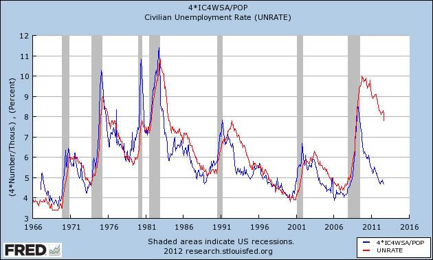
Seen in this perspective, the sharp decline in the unemployment rate over the last year is hardly surprising.
Now here's the closer view dating from mid-2009, showing how closely the two series have moved in tandem since that time:
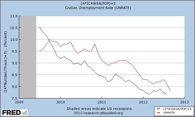
Since the population series ends in August, yesterday's suspect sharp decline in first time unemployment claims, as well as September's numbers are not shown. If, as I pointed out yesterday, there would have been a significant decline (e.g., to ~360,000) even with California's correct numbers, then population-adjusted claims will hit a new low shortly, which would be strong evidence that at very least the 7.8% unemployment rate in September is fully in line with the expected trend.
Morning Market Analysis

Oil remains trapped under the resistance of the shorter EMAs. The underlying technicals are sending mixed messages. The MACD is about to give a buy signal, but the CMF is negative and the shorter averages are moving lower.

After breaking through resistance at the 162/164 level, gold is consolidating gains between the 170 and 174 price level. This action is confirmed by the declining MACD and prices using the EMAs are technical support.

The weekly gold price chart places recent consolidation in perspective. Prices have rallied to levels established earlier this year. For the last few weeks, prices have printed spinning tops. However, notice the bullish CMF and MACD readings, indicating that long-term, GLD is likely to move higher.

The weekly copper chart shows that copper continued to consolidate in a symmetrical triangle pattern.

Additionally, the industrial metals chart (which includes copper) shows that prices are still depressed. This is a direct result of the weak manufacturing sector.
Thursday, October 11, 2012
The Dept of Labor has some 'Splainin' to do
- by New Deal democrat
This couldn't have happened at a worse time. After last Friday's BLS truther conspiracy idiocy was catapulted by Jack Welch, the DoL spokesperson who handed out this morning's initial jobless claims to the press single-handedly handed the tin foil hat brigade some ammunition.
Instead of letting the data speak for itself, or issuing a public statement that everyone could digest equally, s/he told the members of the press *privately* that unique factors explained much, perhaps most, of this week's precipitous decline of over 30,000 claims. As a result, Bloomberg, CNBC, and the Wall Street Journal have all reported separately on what their reporters have said they overheard.
One state was responsible for either (a) much or (b) most of the decline. That was either because the state (a) did not report or (b) reported fewer claims when higher claims were expected on a (a) non-seasonally adjusted or (b) seasonally adjusted basis.
The answers to these three questions impact a great deal on how much we should read into the decline this week. Whichever reporter heard and reported most accurately and completely has the equivalent of very large and market-moving insider information. The public at large has no way to know what the truth is. With less than a month before the presidential election, and the BLS having already been accused of cooking the books, the truth Matters. Already there are claims that the state must have been Obama's home state of Illinois.
If *most* of the decline was due to an decline vs. a rise in NSA claims, then the culprit is almost certainly California. California's claims surged from 56.1 to 70.0 thousand claims in the reference week last year, a 13,900 gain. The state with the next largest number of claims, New York, only saw claims jump from 20.1 to 28.7 thousand claims, a gain of 8,600. The seasonal adjustment this week is very small. So even with an undercount, it is very unlikely New York could have swung the seasonally adjusted number by 15,000 or more. But even if California is the culprit, it is likely that this week's claims did drop by about 10,000 -- still a significant decline, and possibly setting up a new low in the 4 week average next week.
If on the other hand, if the state did not report at all, then about another half dozen states such as Texas, Florida, Illinois, Pennsylvania, and North Carolina might be the culprit. Those states could have NSA claims up to 20,000 for the reference week, and thus the seasonally adjusted 4 week average might not decline at all after next week's number is known.
In other words, next week we might know that unemployment claims really haven't improved at all. Or we might know that, despite the issue, a new post-recession 4 week average low was made.
But the reporter who most completely and accurately remembers the spokesperson's statement - and any investor s/he shared the information with - likely knows that information now.
Sharing this kind of information privately with reporters is a Big Mistake. Since the BLS can't put the genie back in the bottle, they owe it to the public to clarify which state was involved, whether it was a non-report or simply an unexpected report, and what the change in jobless claims would have been comparing the other 49 states last week vs. this week.
UPDATE: Henry Blodget of Business Insider spoke with a source in the DoL who has confirmed the California version of event I independently deduced above, including the fact that there almost certainly would have been a very substantial drop in initial claims this week anyway. The DoL needs to issue a press release explaining this so that all investors and members of the public are on an even playing field. It's not a matter of courtesy, we are entitled to the information.
Agricultural Prices Are Still High


All three members of the grain complex spiked earlier this year due to drought conditions. Notice that we've seen a gradual fall off in corn (top chart) and wheat (middle chart) over the following months. However, wheat (bottom chart) is still at high levels. In addition, the sell-offs in the top chart are very disciplined and look more like traders simply taking profits as opposed to
Morning Market Analysis


The weekly chart of the Chinese market (top chart) shows that prices are still consolidating in a year long triangle pattern. The lower chart shows that prices are still struggling to get about resistance at the 35.5 area. This is also where the 200 day EMA is located, another area that has provided upside resistance for prices.

The Brazilian market is moving higher, but at a very subdued rate. This is more of a "traders nibbling at technically low levels" rally than a big build from retail traders. Prices hit the 200 day EMA a few weeks ago and fell back, indicating a lack of overall relative strength. Also note the weak MACD and CMF positions, adding further evidence that this is a weak rally.

The Russian market is somewhat stronger than the Brazilian market. Prices have rallied over the 200 day EMA and have twice fallen back to it for technical support. The current MACD reading is standard for a post-rally sell off, but the weak (read negative) reading of the CMF adds a big question market mark regarding the strength of this rally.
Wednesday, October 10, 2012
Household deleveraging continues
-by New Deal democrat
The Federal Reserve's report on household debt burdens was released a week ago Friday, covering the April - June quarter. According to the bank,
The household debt service ratio (DSR) is an estimate of the ratio of debt payments to disposable personal income. Debt payments consist of the estimated required payments on outstanding mortgage and consumer debt.Both measures declined substantially again, after a relative pause in the last couple of quarters (which had shown less deleveraging before this quarter's revisions). I've combined the two measures into a single graph:
The financial obligations ratio (FOR) adds automobile lease payments, rental payments on tenant-occupied property, homeowners' insurance, and property tax payments to the debt service ratio.
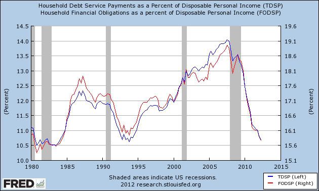
Debt service payments (blue line) are now less than all but one quarter - 4Q 1993 - since 1984. Total financial obligations (red line), are now less than at any since the second quarter of 1984.
If this rate of decline continues, then households will have lower debt burdens than at any time since both series started in 1980 in about 6 more months.
The New York Federal Reserve's Quarterly Report on Debt and Credit for the second quarter of 2012 showed that
Household indebtedness declined to $11.38 trillion, a $53 billion decline from the first quarter of 2012. Outstanding household debt has decreased $1.3 trillion since its peak in Q3 2008. The reduction was led by a decline in real estate-related debt like mortgages and HELOC....
"The continuing decrease in delinquency rates suggests that consumers are managing their debts better," said Wilbert van Der Klaauw, vice president and economist at the New York Fed. "As they continue to pay down debt and take advantage of low interest rates, Americans are moving forward with rebalancing their household finances."
The seemingly conflicting data on the relatively modest decline of overall debt, vs. the steep decline in financial obligations, is explained in large part by refinancing. Here is a graph, courtesy of Mortgage News Daily, of the volume of refinancing measured weekly in the past 5 years:
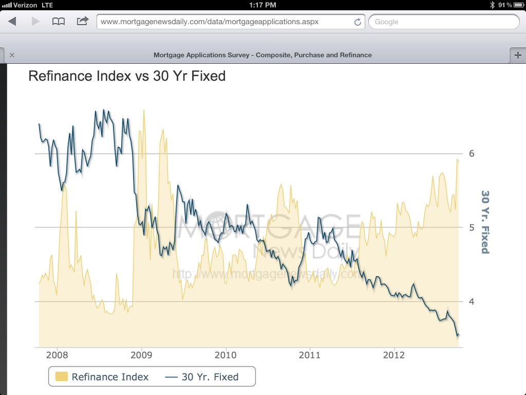
There has been a surge of refinancing as mortgage rates fell to and then under 4%. I continue to believe this is one of the main props holding up the economy, despite the decline in real wages.
----------------
UPDATE from CNBC this afternoon:
U.S. home owners are refinancing their mortgages at the fastest clip since 2005, but the difference now is they are putting cash in, not taking it out.This equates to about 0.6% of all retail spending per month.
At the going rate, 25 percent of all first-lien U.S. mortgages will be refinanced this year, according to LPS Applied Analytics. That represents about $7.1 billion —just through June of this year — in savings on monthly payments, according to economists at Freddie Mac, who ran the numbers for this report.
Remarkable Stability in the Currency Markets
Consider the following charts:


Notice the overall lack of serious movement in the Australian Dollar, British Pound and Canadian Dollar.

The yen has been fairly steady since the spring.


Notice the overall lack of serious movement in the Australian Dollar, British Pound and Canadian Dollar.

The yen has been fairly steady since the spring.
Morning Market Analysis


The top chart shows the daily Canadian market, which has moved through resistance, but has since sold off in a disciplined, downward sloping channel. Note the horizontal nature of the 10 day EMA. Expect prices to retreat to at least the levels established in late April. The lower chart shows that the Canadian market has been trading between the 24 and 29 price level for the last year.

Interestingly, the above weekly chart of the Canadian dollar tracks the weekly Canadian stock market.

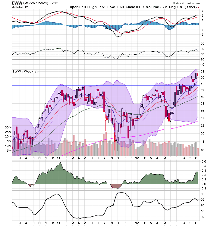
The daily and weekly Mexican market chart has rallied above resistance areas. On the daily chart, notice the positive EMA picture while the lower chart has a strong MACD reading. This is a chart with strong upside potential.
Tuesday, October 9, 2012
Bonddad Linkfest
- Our typical post-crisis recovery (BP)
- Fact-checking financial recessions (Krugman)
- Reading the debate (Ezra Klein)
- In Germany, workers help run companies -- and it's going great! (Wonkblog)
- German exports up (SB)
- UK retail sales up 1.5% (BRC)
- UK IP down 1.2% (ONS)
- UK trade deficit at 4.2 billion points (ONS)
- IMF sees alarmingly high risk of global slump (BB)
- Japan's current account rises for the first time in 18 months (BB)
IMF Lowers Growth Forecast
From the IMF:
The International Monetary Fund (IMF) presented a gloomier picture of the global economy than a few months ago, saying prospects have deteriorated further and risks increased. Overall, the IMF’s forecast for global growth was marked down to 3.3 percent this year and a still sluggish 3.6 percent in 2013.
In its latest World Economic Outlook, unveiled in Tokyo ahead of the IMF-World Bank 2012 Annual Meetings, the IMF said advanced economies are projected to grow by 1.3 percent this year, compared with 1.6 percent last year and 3.0 percent in 2010, with public spending cutbacks and the still-weak financial system weighing on prospects.
Growth in emerging market and developing economies was marked down compared with forecasts in July and April to 5.3 percent, against 6.2 percent last year. Leading emerging markets such as China, India, Russia, and Brazil will all see slower growth. Growth in the volume of world trade is projected to slump to 3.2 percent this year from 5.8 percent last year and 12.6 percent in 2010.
“Low growth and uncertainty in advanced economies are affecting emerging market and developing economies through both trade and financial channels, adding to homegrown weaknesses,” said IMF Chief Economist Olivier Blanchard.
Debunking the "It's only part time jobs" trope
- by New Deal democrat
One of the tropes trotted out to disregard Friday's good unemployment report is that all of the jobs created were part time jobs. It is claimed that the economy is not creating any full time jobs. This could hardly be further from the truth.
One relationship I have been harping about for a couple of years now is the relatinship between aggregate hours worked in the economy vs. the number of jobs in the economy. It is thought that the former is a series the NBER consults to verify whether the economy is expanding or contracting. As I've pointed out many times, measured in terms of hours, the economy underwent a far more serious contraction than in terms of simply jobs lost. Since bottoming in 2009, aggregate hours worked had increased consistently more strongly than the number of jobs added to the economy, as shown in the graph below:
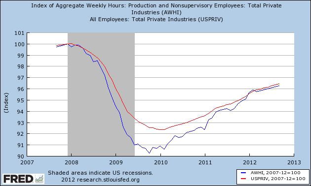
Note that this year, aggregate hours finally made up their shortfall. Since that time, aggregate hours worked and the number of payrolls added to the economy have matched quite closely.
This suggests that full time workers, who had had their hours cut during the recession, had their hours increased again before their employers hired new employees. If so, then coming out of the recessin, as part time workers became full time, hours would increase faster than new jobs would open up. Finally, this year, the number of full time would be created without the interim step of part time hours, so we should see part time jobs stall out relative to full time time jobs.
And that's exactly what has happened. Below is a graph of the YoY change in part time jobs (blue) and full time jobs (red). The series are measure YoY because the data is not seasonally adjusted, so the YoY measure avoids the seasonal distortions:
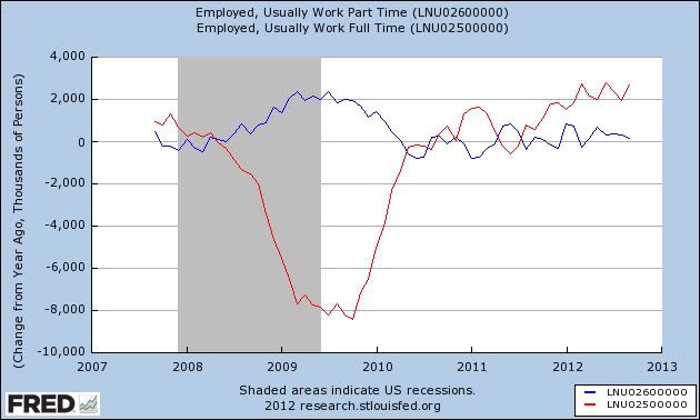
Notice that the number of part time jobs in the economy actually rose significantly during the recession while, naturally, the number of full time jobs fell far more. This is pretty dispositive evidence that many workers' full time jobs were cut down into part time jobs during the recession. Since that time, the number of part time jobs added YoY has tended towards zero, while the number of full time jobs added has grown consistently.
Here's the same data, but measured as the total number of part time jobs (red) and full time jobs (red), normed to zero just before the beginning of the last recession five years ago:
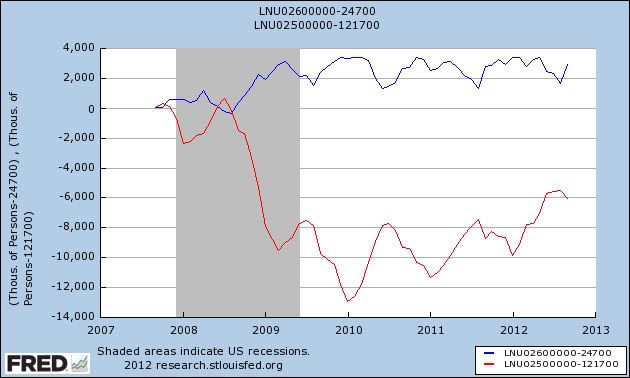
Remember that the data is not seasonally adjusted. Notice that in the longer view it's pretty clear that the recovery in full time jobs has actually accelerated. So now let's zoom in on the past year. This is the same data as directly above, but now normed to zero as of one year ago:
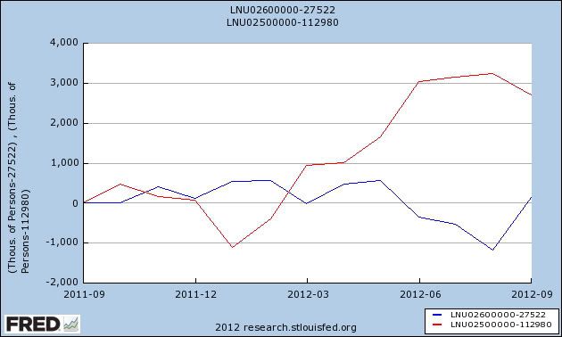
Since September of last year, almost no part time jobs have been added to the economy. But close to 3 million full time jobs have been added over that same period. Yes, a lot of the jobs added last year were part time -- making up for the two previous months were an unusual decline in part time jobs. But the big picture remains that the gap in hours worked has been closed, and it is now full time rather than part time jobs that have been added to the economy.
Fed Minutes
Last week, the Fed published the Fed Minutes from the September 12-13 meeting. These provide a near real-time assessment of the US economy and is especially important considering the concern on this blog about a possible recession. So, let's take a look at what the Fed said:
Private nonfarm employment increased in July and August at only a slightly faster pace than in the second quarter, and the rate of decline in government employment eased somewhat. The unemployment rate was 8.1 percent in August, just a bit lower than its average during the first half of the year, and the labor force participation rate edged down further. The share of workers employed part time for economic reasons remained large, and the rate of long-duration unemployment continued to be high. Indicators of job openings and firms' hiring plans were little changed, on balance, and initial claims for unemployment insurance were essentially flat over the intermeeting period.
This was covered last week in several places on the blog -- see here and here. I believe that the weak employment numbers were a primary reason for the Fed adding mortgage back securities to its asset purchase program. In short, although we had a better than expected report last week, this is still the Achilles heel of the economy.
Manufacturing production increased at a faster pace in July than in the second quarter, and the rate of manufacturing capacity utilization rose slightly. However, automakers' schedules indicated that the pace of motor vehicle assemblies would be somewhat lower in the coming months than it was in July, and broader indicators of manufacturing activity, such as the diffusion indexes of new orders from the national and regional manufacturing surveys, generally remained quite muted in recent months at levels consistent with only meager gains in factory output in the near term.
Manufacturing is clearly slowing. While the US economy has enough domestic demand to keep the industry afloat, the weakness abroad in China and the EU is a big reason for continuing concern regarding manufacturing. See here for the latest ISM update.
Following a couple of months when real personal consumption expenditures (PCE) were roughly flat, spending increased in July, and the gains were fairly widespread across categories of consumer goods and services. Incoming data on factors that tend to support household spending were somewhat mixed. Real disposable incomes increased solidly in July, boosted in part by lower energy prices. The continued rise in house values through July, and the increase in equity prices during the intermeeting period, suggested that households' net worth may have improved a little in recent months. However, consumer sentiment remained more downbeat in August than earlier in the year.
Let's take a look at the charts here:

Overall, real PCEs are still increasing. While they stalled for a five month period two months ago, the last two months have seen increases.

Durables goods purchases account for the smallest percentage of PCEs, but they have the largest importance. An increase in these tells us that consumers are at least confident enough in the future to sign for the financing typically associated with these goods. The last three months have seen increases in this area.
 Non-durable goods purchases have bumped higher over the last two months, but these have, in general, been lack-luster for most of the expansion.

This PCE section accounts for the largest percentage of PCEs. Notice that overall trend is still higher. Over the last five months, the number has moved higher at an overall slower pace, but it is still moving up.
These numbers tell us that the consumer is still spending. Also remember that the durables goods numbers tell us that consumers are still confident enoungh (see this post from NDD on the topic overall).
Housing market conditions continued to improve, but construction activity was still at a low level, reflecting the restraint imposed by the substantial inventory of foreclosed and distressed properties and by tight credit standards for mortgage loans. Starts of new single-family homes declined in July, but permits increased, which pointed to further gains in single-family construction in the coming months. Both starts and permits for new multifamily units rose in July. Home prices increased for the sixth consecutive month in July, and sales of both new and existing homes also rose.
This has been a bright spot over the last six months. Let's take a look at some graphs, courtesy of Calculated Risk:


Total existing home sales have been steady at low levels for most of this expansion, but have bumped higher over the last 3-6 months. In addition, the inventory situation is far better, telling us that supply has been dwindling.


The top chart shows that new homes sales have come off of historically low levels and are now showing a bit of life. More importantly, the inventory of new homes available for sale is now at extraordinarily low levels.


The top chart shows that building permits have moved higher at a good rate -- especially considering where they came from. The bottom chart shows housing starts. While we have seen improvement, these figures are still at low levels.

Construction spending in the residential area spiked during the housing bubble and has since fallen. Over the last year, we've seen a gradual increase in both residential and non-residential. Also note the decrease in public investment, which has hurt the recovery.
Real business expenditures on equipment and software appeared to be decelerating. Both nominal shipments and new orders for nondefense capital goods excluding aircraft declined in July, and the backlog of unfilled orders decreased. Other forward-looking indicators, such as downbeat readings from surveys of business conditions and capital spending plans, also pointed toward only muted increases in real expenditures for business equipment in the near term. Nominal business spending for new nonresidential construction declined in July after only edging up in the second quarter. Inventories in most industries looked to be roughly aligned with sales in recent months.
This has been partially dealt with in the manufacturing segment -- durable goods orders have seen a decline -- and a 1.3% drop (sans transportation) in the latest order. However, this is after a good run-up in investment, as evidenced in this chart:

Business investment in equipment and software has been strong, rising slightly above pre-recession levels.
What all of this data shows is that we're in the same place we've been in for a few years -- painfully slow growth.
Private nonfarm employment increased in July and August at only a slightly faster pace than in the second quarter, and the rate of decline in government employment eased somewhat. The unemployment rate was 8.1 percent in August, just a bit lower than its average during the first half of the year, and the labor force participation rate edged down further. The share of workers employed part time for economic reasons remained large, and the rate of long-duration unemployment continued to be high. Indicators of job openings and firms' hiring plans were little changed, on balance, and initial claims for unemployment insurance were essentially flat over the intermeeting period.
This was covered last week in several places on the blog -- see here and here. I believe that the weak employment numbers were a primary reason for the Fed adding mortgage back securities to its asset purchase program. In short, although we had a better than expected report last week, this is still the Achilles heel of the economy.
Manufacturing production increased at a faster pace in July than in the second quarter, and the rate of manufacturing capacity utilization rose slightly. However, automakers' schedules indicated that the pace of motor vehicle assemblies would be somewhat lower in the coming months than it was in July, and broader indicators of manufacturing activity, such as the diffusion indexes of new orders from the national and regional manufacturing surveys, generally remained quite muted in recent months at levels consistent with only meager gains in factory output in the near term.
Manufacturing is clearly slowing. While the US economy has enough domestic demand to keep the industry afloat, the weakness abroad in China and the EU is a big reason for continuing concern regarding manufacturing. See here for the latest ISM update.
Following a couple of months when real personal consumption expenditures (PCE) were roughly flat, spending increased in July, and the gains were fairly widespread across categories of consumer goods and services. Incoming data on factors that tend to support household spending were somewhat mixed. Real disposable incomes increased solidly in July, boosted in part by lower energy prices. The continued rise in house values through July, and the increase in equity prices during the intermeeting period, suggested that households' net worth may have improved a little in recent months. However, consumer sentiment remained more downbeat in August than earlier in the year.
Let's take a look at the charts here:

Overall, real PCEs are still increasing. While they stalled for a five month period two months ago, the last two months have seen increases.

Durables goods purchases account for the smallest percentage of PCEs, but they have the largest importance. An increase in these tells us that consumers are at least confident enough in the future to sign for the financing typically associated with these goods. The last three months have seen increases in this area.


This PCE section accounts for the largest percentage of PCEs. Notice that overall trend is still higher. Over the last five months, the number has moved higher at an overall slower pace, but it is still moving up.
These numbers tell us that the consumer is still spending. Also remember that the durables goods numbers tell us that consumers are still confident enoungh (see this post from NDD on the topic overall).
Housing market conditions continued to improve, but construction activity was still at a low level, reflecting the restraint imposed by the substantial inventory of foreclosed and distressed properties and by tight credit standards for mortgage loans. Starts of new single-family homes declined in July, but permits increased, which pointed to further gains in single-family construction in the coming months. Both starts and permits for new multifamily units rose in July. Home prices increased for the sixth consecutive month in July, and sales of both new and existing homes also rose.
This has been a bright spot over the last six months. Let's take a look at some graphs, courtesy of Calculated Risk:


Total existing home sales have been steady at low levels for most of this expansion, but have bumped higher over the last 3-6 months. In addition, the inventory situation is far better, telling us that supply has been dwindling.


The top chart shows that new homes sales have come off of historically low levels and are now showing a bit of life. More importantly, the inventory of new homes available for sale is now at extraordinarily low levels.


The top chart shows that building permits have moved higher at a good rate -- especially considering where they came from. The bottom chart shows housing starts. While we have seen improvement, these figures are still at low levels.

Construction spending in the residential area spiked during the housing bubble and has since fallen. Over the last year, we've seen a gradual increase in both residential and non-residential. Also note the decrease in public investment, which has hurt the recovery.
Real business expenditures on equipment and software appeared to be decelerating. Both nominal shipments and new orders for nondefense capital goods excluding aircraft declined in July, and the backlog of unfilled orders decreased. Other forward-looking indicators, such as downbeat readings from surveys of business conditions and capital spending plans, also pointed toward only muted increases in real expenditures for business equipment in the near term. Nominal business spending for new nonresidential construction declined in July after only edging up in the second quarter. Inventories in most industries looked to be roughly aligned with sales in recent months.
This has been partially dealt with in the manufacturing segment -- durable goods orders have seen a decline -- and a 1.3% drop (sans transportation) in the latest order. However, this is after a good run-up in investment, as evidenced in this chart:

Business investment in equipment and software has been strong, rising slightly above pre-recession levels.
What all of this data shows is that we're in the same place we've been in for a few years -- painfully slow growth.
Morning Market Analysis

The daily chart of the Australian dollar shows that it has been consolidating between the 102 and 106 level for the last two months. But last week the central bank lowered interest rates. We've also seen reports issued about the potential for slowing global growth, especially for commodity exporters. Hence, we now see prices resting right at the 200 day EMA.
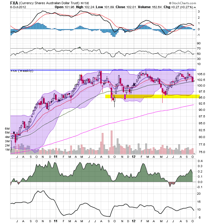
On the weekly chart, the Australian dollar has support at the 95 price level.

The daily SPY chart shows prices are sill in an uptrend, but they have consolidated in a rectangle consolidation pattern over the last month. We see support around 143 and resistance around 146. Overall, this looks like a standard consolidation after a rally.

The QQQs have broken their upward sloping trendline and have support around the 68 price level. However, also note the 50 day EMA -- which provides key support for this chart. The declining MACD indicates we'll probably see a test of this level soon.


Finally, we have two other charts of broad markets -- the mortgage back market (top chart) and the municipal market (bottom chart). Despite the trend break we saw in the US treasury market yesterday, these two markets are still rallying. This tells us that there is still a strong bid for bonds out there.
Subscribe to:
Posts (Atom)