Saturday, November 3, 2012
Weekly Indicators: a hurricane blew through it edition
- by New Deal democrat
The big economic news this week was that 171,000 jobs were added in October, and August and September were revised up substantially. This was the best employment report in over half a year. Unemployment edged up slightly as more people rejoined the labor force. Personal income was up, but spending was up more, so the savings rate went down further. Construction spending was up, although residential spending backed off slightly. House prices as reported by Case-Shiller increased again. Consumer confidence was up for October to a new post-recession high. Factory orders were up, although not enough to completely take back the August decline. Both ISM manfuacturing and the Chicago PMI essentially trod water.
I watch the high frequency weekly indicators not because they lead the economy, but because they are a snapshot of the virtual present, as opposed to looking in the rear view mirror. While there is plenty of noise, they should show turns or continuations in a trend before they show up in monthly or quarterly data.
Same Store Sales and Gallup consumer spending varied from weakly positive to substantially negative, although Gallup is almost certainly due to the hurricane:
The ICSC reported that same store sales for the week ending October 26 rose +0.5% w/w and were up +2.8% YoY. Johnson Redbook reported a 1.8% YoY gain. Johnson Redbook has consistently been lower than the other series for consumer spending. The 14 day average of Gallup daily consumer spending as of November 1 was $66, compared with $71 last year for this period. This is the worst showing in a long time for Gallup, and would probably have been poor anyway, but Hurricane Sandy almost certainly impacted this number.
Bond yields were mixed and credit spreads narrowed further:
Weekly BAA commercial bond rates were not reported this week, presumably due to closures in the financial markets. Yields on 10 year treasury bonds, however, rose .02% to 1.81%. The credit spread between the two decreased to 2.74%, a new 15 month low (using last week's corporate bonds as the comparison). This continues an excellent trend, as it demonstrates a lack of fear of corporate default.
Housing reports were generally positive:
The Mortgage Bankers' Association reported that the seasonally adjusted Purchase Index rose 1% from the prior week, and is up 6% YoY. These remain in the upper part of their 2+ year range. The Refinance Index fell -6% for the week, retreating further from recent multi-year highs.
The Federal Reserve Bank's weekly H8 report of real estate loans this week decreased by 4, or-.01%, to 3526. The YoY comparison, however, increased to +1.4%, and is also 1.4% above its bottom.
YoY weekly median asking house prices from 54 metropolitan areas at Housing Tracker increased +2.6% from a year ago. YoY asking prices have been positive for 11 months.
Money supply has been somewhat mixed in the last couple of months but remains quite positive on a yearly basis:
M1 was off -0.5% for the week, but increased +2.6% month over month. Its YoY growth rate rose again to 13.9%. As a result, Real M1 also rose to +11.9% YoY. M2 was flat for the week, and was up 0.8% month over month. Its YoY growth rate remained even at 7.2%, so Real M2 also remained at 5.2%. The growth rate for real money supply is still quite positive.
Employment related indicators were neutral to positive:
The Department of Labor reported that Initial jobless claims declined 6000 from last week's unrevised 369,000. The four week average fell by 750 to 367,250, a little more than 1% above its post-recession low.
The American Staffing Association Index was again level at 95. The index is equal to its high reading for the year. The trend in this index is similar to last year.
The Daily Treasury Statement showed that for the month of October, $152.5 B was collected vs. $ 137.6 B a year ago, a $14.9 B or +10.9% increase. For the last 20 days ending on Thursday, $130.1 B was collected vs. $127.5 B for the comparable period in 2011, a gain of $2.6 B or +2.0%. This is the weakest 20 day YoY comparison in tax collections in many weeks, although it is certainly still positive.
Rail traffic remained negative YoY, but still due to coal, while the diffusion index decreased considerably:
The American Association of Railroads reported that total rail traffic was down -2.2% YoY. Non-intermodal rail carloads were again off a huge -7.0% YoY or -21,500, almost entirely due to coal hauling which was off -20,600. Excluding coal, carloads were still off -900, but it is possible this was affected by preparations for the anticipated landfalling hurricane in the northeast. Negative comparisons remained even at 11 types of carloads. Intermodal traffic was up 9,400 or +3.9% YoY.
Finally, the prices of oil and gasoline fell, and gasoline usage was again down slightly:
Gasoline prices fell $.12 more last week to $3.57. This is nevertheless still very high. Oil prices per barrel declined from $86.28 to $84.86. Gasoline usage for one week was 8611 M gallons vs. 8767 M a year ago, down -1.8%. The 4 week average at 8493 M vs. 8501 M one year ago, was down -0.1% YoY.
Turning now to the high frequency indicators for the global economy:
The TED spread rose slightly off its 52 week low, to 0.22. The one month LIBOR fell to a new 52 week low of 0.2090. Both are well below their 2010 peaks.
The Baltic Dry Index fell from 1051 to 986, well above its recent 52 week low of 662. The longer term declining trend in shipping rates for the last 3 years remains. The Harpex Shipping Index fell by 1 to 371, another new 52 week low.
Finally, the JoC ECRI industrial commodities index fell again slightly from 118.35 to 118.21, and is negative YoY for the second week in a row.
The recent divergeance between transportation and other metrics reappeared this week. Both shipping rates and rail car loads declined. Commodity prices also declined. Mortgage refinancing declined again, but off multi-year highs. Gallup consumer spending declined substantially, but due to the likely effects of the hurricane, this should be discounted until we have at least one more week of data.
Meanwhile housing, money supply, bank overnight rates, and corporate yields and credit spreads all remained very positive. Jobless claims and same store sales were mildly positive. Gas prices have declined sharply, also very positive.
Generally there are some caution flags, but not enough to cause real concern unless they remain after the hurricane's effects have receded. Have a nice weekend.
Private service sector employment has completely recovered its recession losses
. - by New Deal democrat
With the exception of weekly indicators, normally we don't post over the weekend. But this is too significant in my opinion to wait until Monday.
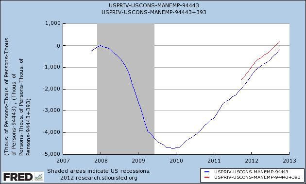
Employment can be broken down into private vs. public sector, and the private sector can be further divided into goods-producing vs. services. The simple fact is, that with Friday's employment report, private service sector jobs have made up their entire losses from the Great Recession. Ninety percent of the remaining job losses are concentrating in the goods-producing construction and manufacturing sectors, with the remaining 10% from government job cuts.
At their last peak in January 2008, there were 94,443,000 private sector service jobs. 4,723,000 were lost in the recession, bottoming in December 2009. As of yesterday's report, there were 94,239,000 such jobs. This is still 204,000 short, but that isn't the end of the story.
A few months ago, the BLS announced its first benchmark revisions through March 2012. These revisions showed that there were 393,000 more private service sector jobs through March than had been previously reported (blue in the graph below). They won't be added on to the official monthly numbers until next February, but when we include them (red), we now have 94,632,000 private service jobs, or 189,000 above the high tide mark at the beginning of the last recession:
We're still about 2,800,000 total jobs below the peak before the last recession, but that entirely consists of government jobs (green), manufacturing (blue), and construction (red):
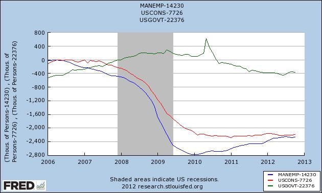
Government jobs are still off 365,000 from their peak of April 2009. Manufacturing employment, which plateaued briefly in the last expansion at 14,230,000 in April 2006, lost 2,772,000 jobs until bottoming at 11,458,000 jobs in January 2010. Construction employment peaked in April 2006 at 7,726,000 jobs and shed 2,270,000 jobs before making a bottom in January 2011.
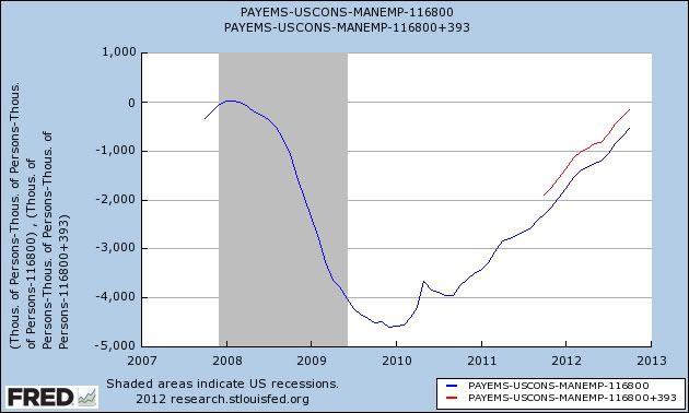
If the current trends continue through November and December, the entire service sector including government will have recovered all jobs lost in the recession. [UPDATE: Just to be even more clear, here is a graph of all nonfarm payrolls, excluding only manufacturing and construction (blue), plus the benchmark revisions (red):]
Manufacturing and construction employment remain the epicenter of an ongoing jobs depression in the goods producing sector.
Friday, November 2, 2012
Weekend Weimar, Beagle and Pit Bull
I've finally got some new pictures of the pups.
I'll be back on Monday; NDD will be here tomorrow.
Until then:


I'll be back on Monday; NDD will be here tomorrow.
Until then:


Not Another Mediocre Empoyment Report
From the BLS:
Total nonfarm payroll employment increased by 171,000 in October, and the unemployment rate was essentially unchanged at 7.9 percent, the U.S. Bureau of Labor Statistics reported today. Employment rose in professional and business services, health care, and retail trade.
Overall, not bad. The overall number is decent considering the current environment.
The household survey has some interesting data points. First, we see that employment increased 410,000, after increasing 873,000 last month. This number typically proceeds the establishment survey. The civilian labor force increased by 578,000, indicating that people reentered the labor force, telling us that people saw an increased potential of getting hired. This number increased by 409,000 the month before -- also a good sign.
The employment to population ratio has ticked up over the last four months, moving from 58.3 in August to 58.8 in October.
Goods producing jobs increased by 21,000. Not great, but considering that the manufacturing landscape has changed to one of automation and that construction is still at depressed levels, it's not bad (largely because it's positive).
The following is directly from the report:
Professional and business services added 51,000 jobs in October.
Health care added 31,000 jobs in October.
Retail trade added 36,000 jobs in October
Employment in leisure and hospitality continued to trend up (+28,000) over the month.
Overall, pretty good.
Now, here's the bad news:
In October, the average workweek for all employees on private nonfarm payrolls was 34.4 hours for the fourth consecutive month. The manufacturing workweek edged down by 0.1 hour to 40.5 hours, and factory overtime was unchanged at 3.2 hours. The average workweek for production and nonsupervisory employees on private nonfarm payrolls edged down by 0.1 hour to 33.6 hours. (See tables B-2 and B-7.)
In October, average hourly earnings for all employees on private nonfarm payrolls edged down by 1 cent to $23.58. Over the past 12 months, average hourly earnings have risen by 1.6 percent. In October, average hourly earnings of private-sector production and nonsupervisory employees edged down by 1 cent to $19.79. (See tables B-3 and B-8.)
Ideally, we'd like to see some of the slack in the labor market get taken up, thereby increasing wages and increasing hiring in the long run. This situation would also increase overall earnings -- something we're not getting.
Now for the best news:
The change in total nonfarm payroll employment for August was revised from +142,000 to +192,000, and the change for September was revised from +114,000 to +148,000
------------------------
NDD here with some additional comments:
This was actually a pretty decent report. With the exception of the unemployment rate rising slightly to 7.9% (because more people entered the work force), and wages falling slightly (more on that below), the numbers were generally good.
This was the best monthly gain in jobs for over half a year. Not only that, but August and September were revised up by a total of 84,000 jobs. You don't get upward revisions like this in recessions.
The broader U6 unemployment rate, which includes discouraged workers, edged down to 14.6%. The more volatile household survey showed 410,000 jobs gained, but 578,000 people entered the work force, so 170,000 of them did not find jobs. That's why the U3 unemployment rate edged up from 7.8% to 7.9&.
Leading indicators in the report were mixed. 13,800 temporary jobs were added, for a new post-recession high. The number of people unemployed less than 5 weeks (a better leading indicator than the weekly initial claims report) increased by 90,000, but was still only about 100,000 off its post-recession low, which is consistent with continued expansion. The manufacturing work week did decline 0.1 hours to 40.5 hours. This will be a negative in the official LEI. Overtime remained constant.
The index of aggregate hours worked in the economy, an excellent coincident indicator, rose 0.1 to 96.8.
Wages, however, fell one cent. YoY wages have only risen 1.6%. This means that real, inflation adjusted wages continue to be flat or slightly negative. This is a continuing red flag for continued economic progress.
Finally, both manufacturing and construction added workers. These were the epicenter of the recession losses, so their slow rebound is a significant positive. Government shed 13,000 jobs. It is possible that, exclusive of these 3 problem sectors (government, construction, and manufacturing) that all of the lost jobs in the great recession have been made up. I'll update once I do the math.
Morning Market Analysis


After consolidating in a two point range for the last month and a half, the homebuilding index has broken through resistance. The MACD has plenty of room to move. Also not the CMF is now flipping positive. On the weekly chart, we see a break-out as well with a strong volume move into the sector. However, the MACD may be weakening a touch.

The semi-conductor sector has broken through resistance as well with a strong bar and high volume print. In one day, we see price moving through the 50 and 200 day EMA. Also note the MACD has come down below the 0 level, giving it room to move higher.

Yesterday, I noted that the Chinese market was at an important technical crossroads. Yesterday, prices jumped higher, moving from support and hitting resistance near recently established highs.

The Brazilian market broke multi-month support last week, but has been trading right below that same support, rather than continue its move lower. Yesterday, prices made a strong move higher, although there wasn't an accompanying move higher in volume. If prices are going to break through the resistance line, they'll need to do it soon; the shorter EMAs and MACD indicate time is running out.
Thursday, November 1, 2012
Bank of Japan Increases Asset Purchases
From the BOJ:
The Bank decided to increase the total size of the Program by about 11 trillion yen, from about 80 trillion yen to about 91 trillion yen in order to make financial conditions for such economic entities as firms and households even more accommodative by further encouraging a decline in longer-term market interest rates and a reduction in risk premiums. The increase in the size of respective assets under the Program is as follows, and the Bank intends to complete the increased purchases by around end-2013 (see Attachment 1 for an overview of the Program).
Japanese government bonds (JGBs): about 5 trillion yen
Treasury discount bills (T-Bills): about 5 trillion yen
CP: about 0.1 trillion yen
Corporate bonds: about 0.3 trillion yen
Exchange-traded funds (ETFs): about 0.5 trillion yen
Japan real estate investment trusts (J-REITs): about 0.01 trillion yen
In addition:
The Bank decided to provide long-term funds -- up to the amount equivalent to the net increase in lending -- at a low interest rate to financial institutions at their request, with the view to promoting their aggressive action and helping increase proactive credit demand of firms and households. There shall be no upper limit -- unlimited -- to the total amount of funds provided by the Bank under this facility.
As always, lack of inflation is what is killing the Japanese economy:

GDP, Part IV: Exports and Net Exports
Let's turn our attention to exports.

One of the untold stories of this expansion has been the strength of US exports, which have rebounded above pre-recession levels.

The year over year percentage change in exports shows that after a sharp rebound from low levels, exports showed strong year over year gains until the end of 2011. But while the pace has decreased, it is still positive.

The above chart shows Q/Q percentage change in GDP, along with the contributions from exports (red bar) and net exports (green bar). notice the following.
1.) Coming out of the recession, net exports were very strong.
2.) The overall effect of net exports (exports minus imports) has been far less than you'd think and occurred largely at the beginning of the recovery.
Morning Market Analysis


Copper's daily chart (top chart) shows a consolidation 42 and 45 that occurred over the summer. Prices broke through resistance at the beginning of September, but the rally didn't have enough momentum. Now prices are back to consolidation levels. However, the weekly chart (bottom chart) shows that overall copper is currently involved in a near year-long consolidation. The next price target is a little about 42.


After rallying since the end of July, the euro recently broke trend and is using the 200 day EMA for technical support. On the weekly chart (bottom chart) notice that prices are right at the 200 week EMA and also hit the 38.2% Fib level about 6 weeks ago.

Even though the grains complex broke through resistance over a week ago, we haven't seen a strong move in either direction. However, the entire complex remains elevated due to drought effects.

The Chinese market has been in a strong rally since the beginning of September. However, yesterday prices hit key support levels at a time when the MACD was about to give a sell signal and money was moving out of the market. These developments puts a big questions market above the rally.
Wednesday, October 31, 2012
Bonddad Linkfest
- Personal income up .4% (BEA)
- Texas manufacturing dips, but still positive (Dallas Fed)
- Taiwan GDP increases weakly (FT)
- Japanese IP decreases (METI)
- Japanese auto production down 12.4% YOY (JAMA)
- EU Economic sentiment still weak (Eurostat)
- EU business climate indicator continues to decrease (Eurostat)
- EU inflation at 2.5% (Eurostat)
- EU unemployment at 11.6% (Eurostat)
- BOJ losing battle for independence (Marketwatch)
A look at the long leading indicators
- by New Deal democrat
In his 1993 book, Prof. Geoffrey Moore, the founder of ECRI, identified 4 data series as long leading indicators - by which he meant that they generally turned, especailly at peaks, over 1 year before the turning point in the economic cycle. Those 4 indictors are corporate bond yields (inverted, i.e., the lower the better), real M2 money supply, housing permits, and corporate profits after taxes. So let's take a look at each of them.
Let's start with housing permits. As readers of this blog well know, housing has been the surprise postive story of 2012:
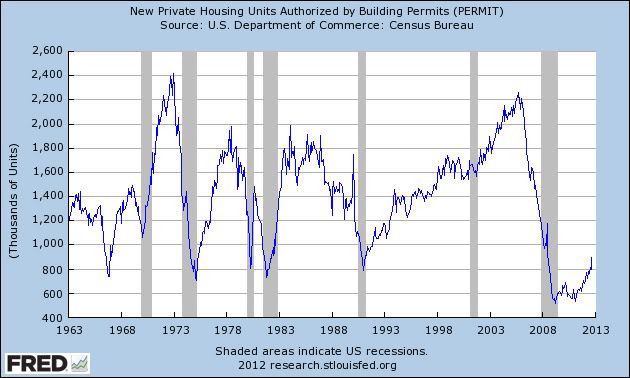
These are in a nearly 2 year old upswing. Since it is the direction, not the level, that is important, these certainly aren't indicating a recession in the near future.
Next, here are bond yields (inverted). I've used BAA corporate bonds, but AAA bonds tell the same story:
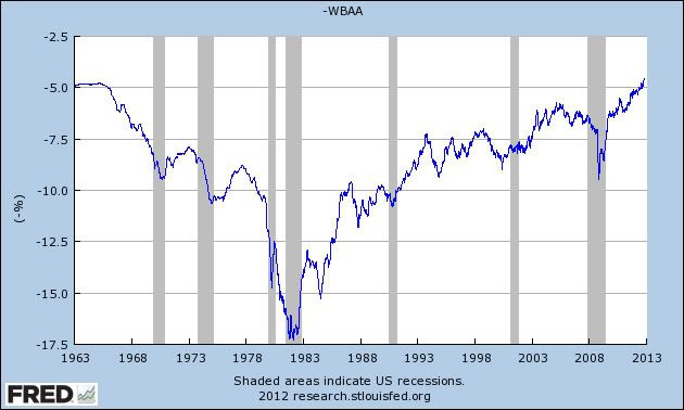
Corporate bonds also support a conclsuing that the economy will continue to expand.
Next, here are corporate profits after taxes:
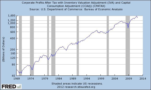
These have indeed turned down in the last couple of quarters. But typically they must turn down for more than a year before a recession starts. While this is certainly a caution looking forward into 2013, they don't support a recession story right now.
Finally, here is real M2. A level of real M2 growth under 2.5% appears to be the most consistent with a recession level:
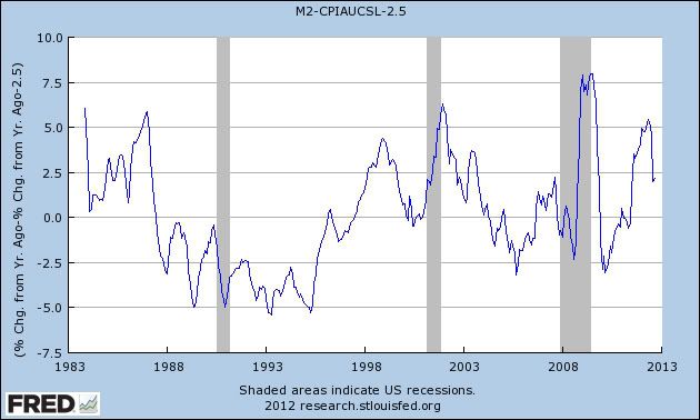
Here the story is much more equivocal. Real M2 has been quite positive for the last year and a half. Before that, however, real M2 had been under +2.5% and even briefly negative YoY. Here's a close-up of the last decade:
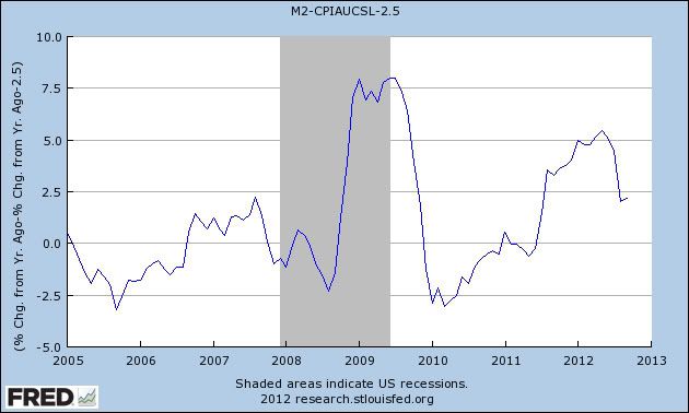
Note that real M2 was negative for about 2 years in 2004 and 2005. The "great recession" did not begin until 2 1/2 years later. On the other hand, real M2 went negative again shortly before the great recession began.
Moore's work was primarily based on post-WW2 recessions. When I exanubed Economic Indicators during the Roaring Twenties and Great Depression, I found that during deflationary periods, real money supply had less of a lead time and sometimes was coincident with expansions and contractions, rather than leading.
Since there are strong deflationary forces at play, I am inclinded to downplay the negaitve readings of 2010 and early 2011. Note, however, that in the last few months real M2, while positive, is much les so than before. If it deteriorate much further, that would also give me a lot of pasuse about 2013.
In summary, 2 of the 4 indicators do not support an end to the expansion anytime soon, while 1 is a negative for 2013, and the final 1 is equivocal but also supports caution as to whether the recovery will continue into 2013.
Housing Rebound Continues
Consider the following charts from the latest Case Shiller release:

The year over year percentage change in prices -- which had been stable at slightly about a 4% decline - has rebounded and is now positive. Moreover:

When we look at the month over month and year over year percentage changes, we see only 4 declines. Also note that previous crash markets such as Las Vegas, Miami and Phoenix are seeing strong increases.
GDP Part III; Investment
Let's turn our attention to investment.

First, the above chart shows gross private domestic investment. While the total amount is below the pre-recession level, remember that this figure includes housing (and the housing bubble). Put another way, the pre-recession number was skewed by the housing bubble in a pretty big way, as demonstrated in this chart:

The red line is total residential construction -- which was seriously out-of-whack during the housing bubble. Also note that residential investment has been at abnormally low levels for the first few years of this expansion in order to clear excess inventory from the market.

The year over year percentage change in GDI shows a quick rebound after the recession ended (which is to be expected), but also a continuing of a pace in line with the preceding expansions YOY pace.
 The chart above shows gross private domestic investment's contribution to GDP growth since the end of the recession. Notice that investment was very strong coming out of the recession (4Q09-3Q10), dropped in 4Q10-1Q11, picked back up in 2011 (2Q11-4Q11) and has dropped again over the last three quarters.
Gross investment accounts for about 14% of US GDP. It is broken down into fixed investment and inventory adjustments (which accounts for a very small percentage). Gross investment is divided into non-residential and residential, with each accounting for 77% and 20%, respectively. Non-residential is further sub-divided into structures (18% of total GPI) and equipment and software (60% of total GPI). Let's look at these figures from largest to smallest (equipment and software, residential investment and non-residential investment).


The top chart shows the total value of equipment and software investment and indicates that this figure has completely rebounded from it's recession lows. The bottom chart shows the YOY percentage change and indicates that the rate of growth quickly rebounded -- within a year of the recession's end.


The top chart of residential investment shouldn't surprise anyone. Notice the extreme over-investment (read: bubble) before the recession, leading to the crash after the recession. The second chart shows that the year over year percentage change in residential investment was negative for a large portion of the latest expansion. However, also notice this has increased into positive territory over the last few quarters.


Finally, we have non-residential investment. The top chart shows that this component has rebounded, but not to pre-recession levels. The bottom chart shows that the YOY percentage change has rebounded, strongly from the recession, but has also dropped in 2012 to slower levels.

First, the above chart shows gross private domestic investment. While the total amount is below the pre-recession level, remember that this figure includes housing (and the housing bubble). Put another way, the pre-recession number was skewed by the housing bubble in a pretty big way, as demonstrated in this chart:

The red line is total residential construction -- which was seriously out-of-whack during the housing bubble. Also note that residential investment has been at abnormally low levels for the first few years of this expansion in order to clear excess inventory from the market.

The year over year percentage change in GDI shows a quick rebound after the recession ended (which is to be expected), but also a continuing of a pace in line with the preceding expansions YOY pace.

Gross investment accounts for about 14% of US GDP. It is broken down into fixed investment and inventory adjustments (which accounts for a very small percentage). Gross investment is divided into non-residential and residential, with each accounting for 77% and 20%, respectively. Non-residential is further sub-divided into structures (18% of total GPI) and equipment and software (60% of total GPI). Let's look at these figures from largest to smallest (equipment and software, residential investment and non-residential investment).


The top chart shows the total value of equipment and software investment and indicates that this figure has completely rebounded from it's recession lows. The bottom chart shows the YOY percentage change and indicates that the rate of growth quickly rebounded -- within a year of the recession's end.


The top chart of residential investment shouldn't surprise anyone. Notice the extreme over-investment (read: bubble) before the recession, leading to the crash after the recession. The second chart shows that the year over year percentage change in residential investment was negative for a large portion of the latest expansion. However, also notice this has increased into positive territory over the last few quarters.


Finally, we have non-residential investment. The top chart shows that this component has rebounded, but not to pre-recession levels. The bottom chart shows that the YOY percentage change has rebounded, strongly from the recession, but has also dropped in 2012 to slower levels.
Tuesday, October 30, 2012
Red Cross Donations Link
Like everyone, my eyes were glued to the TV over the last 48 hours.
If you can, here's a link to donate to the red cross. Please help if you can.
If you can, here's a link to donate to the red cross. Please help if you can.
US GDP, Pt II: PCEs
Let's continue looking at GDP by focusing on PCEs.


First of all, overall PCEs are higher than their pre-recession levels and have been at that level for some time (top chart). We also see a fairly steady increase in PCEs, with the YOY percentage change hovering around the 2% mark (bottom chart).

The chart above shows the percentage change in GDP since the end of the recession and PCEs contribution to that number. Notice that PCEs are responsible for a fair amount of growth since the 3Q09.
Let's break the data down into its components.


Services comprise about 65% of PCEs. The top chart shows steady growth since the recession ended, in addition to a level higher than its pre-recession levels (top chart). However, the lower chart shows a slight slowdown in the pace of growth, with the YOY rate right around 2% coming out of the recession, but with a rate approaching 1% over the last few quarters.


Like services, real PCEs for non-durables are higher than their pre-recession levels (these comprise about 21% of expenditures). However, notice these experienced a stall about a year ago for three quarters (top chart). The rate of YOY growth has also slowed. The pace of growth in this area was strong at the end of 2010 and beginning of 2011, but slowed at the end of last year, to below 1%. It has picked-up over the last two quarters.


Durable goods comprise the rest of PCE expenditures (obviously), accounting for 15%. Like non-durables, these stalled about a year ago, but have since recovered. What's interesting is the high YOY percentage growth rate of over 5% for the last 6 quarters -- a very strong rate of growth.
US GDP, Pt I
The markets were closed yesterday, so there is no market update.


Let's start with the good news: US GDP is now higher than it was before the recession (top chart). Here's the bad news: growth has been weak (bottom chart). While readers of this blog understand that growth from a financial crisis is typically slow, this is obviously a concern to policy makers and fodder for political issues.

Let's look at where growth came from in the 3Q. The above chart shows the contributions to the 2% growth rate. Here, we see two big contributors: personal consumption expenditures and government spending. On the down side, investment was very weak (most likely a result of already strong investment this cycle and the fiscal cliff) and exports provided a mild negative reading.
Subscribe to:
Posts (Atom)