Saturday, January 12, 2013

Weekly indicators: consumers on track, rail loads derailed edition


- by New Deal democrat

There was little in the way of monthly data for December this week. Consumer confidence increased. Import and export prices decreased. The trade balance worsened. None of these are particularly big numbers.

So let's turn to the high frequency weekly indicators:

Housing metrics

Housing prices
  • YoY this week. +2.4%
Housing prices bottomed at the end of November 2011 on Housing Tracker, and have averaged an increase of +2.0% to +2.5% YoY for the last year.

Real estate loans, from the FRB H8 report:
  • +0.2% w.w

  •  +2.3% YoY

  • +2.9% from its bottom
Loans turned up at the end of 2011 and have recently shown more strength.
Mortgage applications
  • +13% w/w purchase applications

  • -8% YoY purchase applications

  • +12% w/w refinance applications
Purchase applications have been going sideways for 2 years. Refinancing applications were very high for most of last year with record low mortgage rates, but with the recent increase in rates, these have declined substantially in the last month or so, despite the increase shown this week.

Interest rates and credit spreads
  • +0.10%% to 4.71% BAA corporate bonds

  • +0.11% to 1.87% 10 year treasury bonds

  • -.01% to 2.84% credit spread between corporates and treasuries
Interest rates have risen in recent weeks, but spreads have declined again and are close to 52 week lows.

Money supply
M1
  • -0.8%% w/w

  • +1.5% m/m

  • +11.0% YoY Real M1

M2
  • +0.7% w/w

  • +1.8% m/m

  • +6.6% YoY Real M2
Both Real M1 and Real M2 remain strongly positive, with M2 in particular improving in the last several months.

Consumer spending
  • ICSC -4.2% w/w +4.2% YoY

  • Johnson Redbook +2.1% YoY

  • Gallup daily consumer spending 14 day average $83 up $15 YoY
This week is close to if not at a 1 year high YoY increase for the ICSC index. Anything over 2% has been better than usual for Johnson Redbook in the last year. Gallup remains the real star, with spending up sharply compared with January last year, and remaining close to holiday season levels.

Oil prices and usage
  •  Oil $93.56 up $0.47 w/w

  •   gas $3.30 flat w/w

  • Usage 4 week average YoY -2.3%
Gas prices are seasonally low. Usage continues to run negative YoY as it has for most of the last year plus.

Employment metrics
Initial jobless claims
  •   371,000 down 1,000

  •   4 week average 365,750 up 5,750
American Staffing Association Index
  • down 5 to 89 w/w
Daily Treasury Statement tax withholding
  •  $183.9 B (adjusted for 2013 tax changes) vs. $171.8 B +7.0% YoY last 20 days

  •  $66.9 B (unadjusted) vs. $69.1 B down -2.2 B 1st 7 days of January monthly YoY
The decline in the ASA Index is normal after Christmas, although in the second half of 2012 the index's performance compared with 2011 declined significantly, although the absolute index was higher. Initial claims have jumped back into their 10 month sidways range. Tax withholding, even adjusted for the increase in the payroll tax, remains very strong.

Transport

Railroad transport
  •  -33,200 or -12.1% carloads YoY

  • -24,800 or -19% carloads ex-coal

  • -15,600 or -8.0% intermodal units

  • -39,800 or -9% YoY total loads

  • 16 of 20 types of carloads down YoY, 1 less than last week
Shipping transport
  • Harpex up 4 at 356

  • Baltic Dry Index up 54 to 760
Rail transport, after being extremely positive YoY 2 weeks ago, has been extemely negative YoY since. It is something that will have to be watched closely.

Bank lending rates
  • 0.24 TED spread flat w/w

  • 0.2057 LIBOR down .002 w/w
The TED spread is near its 52 week low. LIBOR is at a new 52 week low and is close to a 3 year low.

JoC ECRI Commodity prices
  • up 0.98 to 127.05 w/w

  • +4.13 YoY
The most striking data in the last couple of weeks has been the steep and sudden YoY decline in railroad carloads. That being said, there have been some wild swings at this time of year due to haphazard winter weather in the past, and that may be part of the reason for the big YoY differences. Very little else was negative. Gasoline usage continues to be negative YoY, and interest rates have risen slightly.

On the other hand, consumer spending, especially as measured by Gallup, remains quite strong. Money supply, interest rate spreads, and bank lending rates are also very positive. Tax withholding is strong. Gas prices remain accomodative. House prices and loans are positive, although purchases and refinancings of mortgages are mixed this week. Shipping rates are up slightly.

I am most interested in when or whether the 2% increase in withholding tax rates will have an effect on consumers, although I wouldn't have expected it to show up yet.

Have a nice weekend.

Friday, January 11, 2013

Have a Good Weekend

I'll be back on Monday.  NDD will be here tomorrow with the weekly indicators.

I'll have dog pictures next week.

Have a good weekend.


The Underlying Improvement in EU Funding But the Lack Of Transmission Thereof

From Draghi's press conference:

Following our non-standard monetary policy measures and action by other policy-makers, a broadly based strengthening in the deposit base of MFIs* in a number of stressed countries was observed. This allowed several MFIs to reduce further their reliance on Eurosystem funding and helped to reduce segmentation in financial markets. M3 growth was also supported by an inflow of capital into the euro area, as reflected in the strong increase in the net external asset position of MFIs. 

*MFI = Major Financial Institution

Draghi'a primary assumption in the above statement is that when banks rely on the central bank for the primary source of their overall funding there is an inherent problem in the system.  The reason is that depositors have withdrawn their money from the banks and placed these funds elsewhere, which indicates a deteriorating confidence in the financial sector.  Conversely, when depositors begin placing their deposits back in banks it indicates more confidence in the financial system and, hence, a better underlying situation.

With that in mind, consider the following chart from the latest monthly ECB bulletin:


As the report notes:

The improvement in banks’ funding situation is also reflected in positive flows for domestic and non-resident deposits in France, Italy and Spain (see Chart C). Meanwhile, German banks have seen a decline in deposits held by non-residents, suggesting some moderate rebalancing of portfolios by international investors. Consequently, German banks reduced their claims on the Eurosystem in September and October, while banks in other countries (especially Spain) have
reduced their borrowing from the Eurosystem. The results of the October 2012 bank lending survey also show that banks’ access to retail funding improved in the third quarter of 2012.1 Overall, these developments suggest that the degree of financial fragmentation in the euro area may be declining. That can also be seen in the stabilisation of TARGET2 balances since mid-2012.


At the same time, the improvement in funding -- and low cost of capital -- is not being transmitted to the private sector:


Notice the negative credit growth in the system for both the second and third quarter of 2012. 

Morning Market Analysis


The entire weekly corporate bond market has broken trend.  The short market (top chart, weekly time frame) broke trend in December and is now right at the 20 week EMA.  The MACD is weakening and the CMF has a negative reading.  The intermediate market (middle chart, weekly time frame) broke trend in December as well, but has been moving sideways since.  Prices are also right at the 10 week EMA.  Finally, the long term chart (bottom chart, weekly time frame) broke trend lase week.  Now prices are also right at the 10 week EMA with a declining MACD.

None of these markets is showing signs of imminent collapse.  However, breaking any trend that is in place for more than a year is a very important development to keep in mind.


The chart shows the weekly Swiss franc chart.  The spike and subsequent sell off in 2011 occurred after the Swiss central bank stated they would do whatever it takes to prevent the franc from rallying.  After the intervention, the market sold-off sharply.  The currency remained in a downward sloping channel for nearly a year, until it broke trend in September of last year.  However, notice how little appreciation the currency has seen since breaking trend. 


The daily Indian chart (top chart) shows a remarkably hard to characterize market.  Prices had an upward trend until October, then fell back to the 200 day EMA in October, only to rally to the 61 price again.  The weekly chart shows that the market is right at the top end of a year long consolidation range, with the lower 60s area providing upside resistance.


Thursday, January 10, 2013

Industrial Production And Real GDP Growth

I spend a lot of time talking about and analyzing manufacturing data for both the US and other countries.  There are also tons of US manufacturing indicators but (oddly) only one  macro level services index (the ISM services index).  In addition, industrial production is a key metric used by the NBER to date recessions.  But manufacturing is a small part of the US economy.  So, why all this focus on manufacturing?

Because it's a really good coincident indicator.  Let's look at industrial production (the most visible manifestation of manufacturing activity and also a stat for which we have a long series of historical data) and compare it to GDP.  The data series below have been normalized so that both real GDP and IP are based on 100.  I've also made the IP data quarterly by summing the monthly data.


The above chart shows the relationship between industrial production and real GDP.  While correlation does not equal causation, these two data series have a similar trajectory for most of the other's existence.


The above three scatter plots show the relationship between the year over year percentage change in industrial production with the year over year percentage change in real GDP.  As above, the IP information was placed into quarters by summing each three month series and both data series were "normalized."

As with the first chart, notice the clear positive relationship between industrial production and real GDP; when IP increases, do does GDP while the reverse is also true.


A question for platinum coin supporters


- by New Deal democrat

Let's assume that Treasury minting a $1 trillion platinum coin is legal.

Now let's fast-forward to the year 2017. Another GOPer with the last name of Bush is President. The democratic Congress is blocking his plan to lower the tax rates on all earnings over $1 million to 5 percent. So he has the Treasury mint 1 million $1 million platinum coins and starts handing them out to his friends, cronies, and supporters.

It seems to me that would have to be equally legal.

In other words, this might be a classic case of "be careful what you wish for." Am I wrong?

Morning Market Analysis


The Chinese market has been on a role, rising nearly 17% in December.  Notice the steepness of the rally and the 3-4 different consolidation areas during the rally.  Prices are now above the 200 day EMA with rising shorter EMAs.  At some point, I would expect prices to pull back, if only for traders to take some profits.


The weekly chart shows that prices have moved through resistance established in early 2012.  Prices are now about all the shorter weekly EMAs (the 10, 20 and 50 week), with a fair amount of room to run up to the 200 week EMA. 


Both the Singapore (top chart, daily time frame) and Malaysian market (bottom chart, daily time frame) have risen strongly over the last two months.  Both have moved through important resistance levels and are now consolidating their gains.  As they are tied into the Chinese economy in a big way, these markets should rise in concert with China's markets.


The Hong Kong market is in the middle of good, six month rally.  This one is far less steep than the Chinese rally, which is good as it tells us that traders have been allowing for more consolidation on the move up.  Also not the bullish orientation of the EMAs -- all are moving higher and the shorter are above the longer. 


The weekly Brazilian market shows that prices are still bear multi year lows.  While there was a small rally in December, prices are still contained by levels established in the fall of last year.  The MACD is still negative as well.  However, money is flowing into the market and prices are strengthening.  A move through the 50 week EMA could lead to a strong rally as there isn't much meaningful upside resistance (aside from Fibonacci levels, the meaningful resistance levels are over a year old).


Wednesday, January 9, 2013

Why Is Europe Rallying? Or, The Power Of Central Bank Jawboning

Consider the following charts of European ETFs:


Both the Italian (top chart, weekly time frame) and Spanish (bottom chart, weekly time frame) ETFs have formed an upside down head and shoulders formation.  We see rising momentum in both charts.  The Italian market is right below the 200 week EMA while the Spanish market is right at the 200 week EMA.  All of the shorter EMAs are rising and are bullishly aligned.  Both markets are also right at important technical support levels.


The French ETF was trading between the 17/18 level and the 22 level for most of the last year.  However, prices also staged a rally starting at the end of last summer and are now above the 200 day EMA.  We also see a rising momentum reading and decent CMF.


The German market has now rallied through the 61.8% Fib level established from the 2011 sell off.  Prices are above the 200 week EMA, and the shorter EMAs are rising.  The CMF is very strong, while the MACD is rising moderately.

And yet, when we look at the fundamentals of the region, we see a recession.  As I wrote in mid-December regarding overall GDP growth:

1.) The EU 17 has been contracting for three straight quarters.
2.) The EU 27 has bee contracting for two straight quarters.

In other words, the entire continent can be described as in a recession according to one of the standard definitions of recession (two straight quarters of contraction).

Also note the following.

1.) Three countries have been contracting for two straight quarters: Belgium, Denmark and Finland

2.) Four countries have been contracting for three quarters: Czech Republic, Spain, UK and Hungary

3.) Six countries have been contracting for at least four quarters: Italy, Greece, Cyprus, Portugal, Netherlands and Slovenia.

That means that of 27 countries in the EU 27, a little under half are in a technical recession.


And yesterday we learned that unemployment has increased: 

Eurozone unemployment hit a fresh record of 11.8 per cent in November, official statistics showed on Tuesday, highlighting the dire state of the bloc’s economy in spite of hopes for a gradual recovery this year.

Across all 27 members of the EU, more than 26m people were out of work in November, or 10.7 per cent of the workforce, according to Eurostat, the EU’s statistical office. The seasonally adjusted unemployment rates for both the eurozone and the wider EU jumped significantly from a year earlier, when they were 10.6 per cent and 10 per cent, respectively.

So -- despite this terrible economic record, why are we seeing strength in the EU markets?  There are several reasons.

1.) Equity markets are a leading indicator: traders are betting on future growth.  They saw the bottom last summer and started buying when shares were cheap.

2.) Belief that strength in the US will help to pull the EU out of recession.  When the US reached the fiscal cliff deal worldwide markets moved higher.  Europe was no exception.

3.) Cheap money and minimal return on safe assets.  Consider this chart from Ed Yardeni's blog:

French and German bonds are offering investors nothing in terms of return after considering inflation.  Buying those assets would lead to a return of capital not a return on capital.  As such, people looking for return are forced into the equity markets to obtain that return.

4.) The Draghi Speech on July 26, when he made this statement:

When people talk about the fragility of the euro and the increasing fragility of the euro, and perhaps the crisis of the euro, very often non-euro area member states or leaders, underestimate the amount of political capital that is being invested in the euro.

And so we view this, and I do not think we are unbiased observers, we think the euro is irreversible. And it’s not an empty word now, because I preceded saying exactly what actions have been made, are being made to make it irreversible.

But there is another message I want to tell you.

Within our mandate, the ECB is ready to do whatever it takes to preserve the euro. And believe me, it will be enough.

Notice that all of the markets noted above started rallying at the end of July/early August time period, when the above statement was made.  Also note in the chart from Dr. Ed that yield on the more speculative EU credits started to drop around the same time.

It's important to remember the markets have not meaningfully tested the Draghi  statements yet.  They are simply relying on his good faith to follow through on his promises.  There is also the assumption that programs put in place will be enough to avert a continent wide disaster if implemented.  I'm not stating they are not -- just that they are untested as of now.


Morning Market Analysis


The wheat market has fallen sharply over the last month or so, moving through the 200 day EMA.  The shorter EMAs are following suit, with the 10 and 20 already far through the 200 and the 50 about to follow.

Soybeans are also in a bear market -- at least by the standard metric of prices being below the 200 day EMA.  In mid-November, prices fell to levels established in late March, rallied through the 200 day EMA, buy quickly fell again.  The shorter EMAs are now through the 200 day EMA and the 50 is about to follow suit.


The corn market has just moved through the 200 day EMA and is still a bit above the levels it established in the spring of last year.  However, is is clearly in a downward sloping trend with the shorter EMAs moving through the longer.


The Australian market is still in a multi-month run.  Prices are above the 200 day EMA, and all the shorter EMAs above the 200 and rising as well.  The market has paused several times to consolidate gains (see the recent sideways move from mid December to the end of December and the recent downward sloping pennant pattern). 


The top chart shows the daily transports, which have been in a rally since the middle of November.  This has been a sharp rally, printing a strong bar on the weekly chart (see lower chart).  While both charts have a positive momentum picture and rising EMAs, the weekly chart has a negative CMF reading. 


Tuesday, January 8, 2013

Housing Inventory Continues to Drop

In my 2013 economic prediction, made the following observation about housing:

Housing will continue to rebound.  Inventory of both new and existing homes are both at far more realistic levels and the Fed is driving down interest rates with its MBS program.  Housing affordability is at levels not seen in a very long time and builder confidence is rising.  Put all of these factors together and it appears that housing should remain on the comeback trail for most of next year.

CR published the following graph of total housing inventory earlier today:


Notice that it's taken between 5-6 years for the economy to get here.  That's a tremendously long adjustment process during which the economy has suffered a tremendous amount of pain.


2013 forecast: housing and refinancing vs. Oil and austerity, part 2


- by New Deal democrat

In the first part of my 2013 forecast, I said that the short leading indicators point to the economy shambling along and just avoiding recession in the first half of 2013, but that the monkey wrench of the 2% payroll tax hike just enacted is likely to tip that into contraction unless a new refinancing opportunity via even lower interest rates bails out consumers again.

Since the LEI and the short leading indicators don't help us see the second half of the year, we have to turn to the long leading indicators - those measures of the economy which almost always turn 12 months or more before the economy as a whole does.

The second half of 2013 shuold feature renewed, or stronger, growth

Fortunately, these are almost all in agreement in suggesting improved growth. It may be growth from a new bottom due to contractionary fiscal policy, but if Washington can manage to keep its hands off the economy by not enacting any more austerity measures (yeah, I know, and pigs can fly), it should be renewed growth nevertheless.

First of all, let's at a graph of the yield curve (blue) and Real M2 minus 2.5% (red):


As I said at the beginning of this forecast, unless we expect actual deflatioin, a positive yield curve and postive Real M2 of greater than +2.5% reliably signal economic expansion 12 months later. Although low wage growth is a real longer-term concern, the only thing that I can foresee that would lead to actual deflation in 2013 is if there were to be a 2008-style gas price spike, say, to $5 or more. Since that doesn't look very likely, actual deflation is not likely, and the K.I.S.S. signal of a positive yield curve and positive M2 suggest that the economy continues to grow throughout 2013.

While Prof. Moore did not use the yield curve as a component of his long leading index, he did make use of Real M2. Let's look at the other components. Here are housing permits:


Permits have risen sharply from their bottom over the last nearly 2 years. We've never had a recession with permits rising like this.

Next, here are corporate bond yields (inverted). A decrease in corporate bond yields is good:


Corporate bond yields have kept hitting new lows. This also signals continued expansion.

Next, here are corporate profits after taxes (log scale). These have also continued to rise as of the latest data, from the 3rd quarter of 2012:


In summary, all of Professor Moore's long leading indicators have been improving throughout 2012, suggesting continued growth throughout 2013.

Finally, let's look at a long leading indicator I found several years ago -- the real personal savings rate. This is a proxy for how comfortable consumers feel spending money. When it declines more than 5%, that is an indicator that consumers are more fearful and feel the need to save more, and has frequently been a harbinger of recession about a year or so later. The end of the recession has generally been signaled by a rise of 2.5% in the real savings rate, as consumers loosen the purse strings somewhat. Here the indicator is more ambiguous:


This indicator did indeed decline by more than 5% between 2010 and the end of 2011, but only briefly, and rose more than 2.5% during 2012, before declinng slightly again. If anything, it suggests a mild contraction right about now followed by improvement.

Taken together, the long leading indicators all appear to suggest more growth in 2013, especially as the year progresses.

In conclusion, this first year of a presidential term, like other such years, looks most vulnerable to at least a technical recession. Increasing gas prices, an apparent seasonal distortion in the statistics since 2008, and the immediate loss of 2.0% of disposable income due to the payroll tax increase make spring of this year especially likely to see actual contraction.

But the resurgeance of the housing market, and the continuing accomodation in interest rates and moentary policy, look like they will come to the rescue again later in the year, provided Washington can avoid burdening the consumer with further austerity measures taking effect this year.

Morning Market Analysis; Japan Post Election

Over the last month or so, Japan has elected a new government.  Now that a sufficient amount of time has passed, let's take a look at the effect on several Japanese asset classes.


The top chart shows the Japanese ETF, which was consolidating between the 8.7 and 9.4 level.  However, prices have now moved through support at the 9.4 level and advanced a little over 6% to just shy of the 10 level.  All of the underlying technicals are now bullish.  The lower chart -- which is in a weekly time frame -- shows that prices were consolidating in a downward sloping triangle pattern for approximately a year.  However, prices have now moved through upside support as well, with an accompanying increase in the CMF and a rising MACD.


The top chart of the yen shows that prices have dropping about 9%, falling from the 122 level to the 121.  The move lower has been consistently lower, with no relief rally at this point.  The lower chart shows the yen weekly, which also slows that the sell-off has been occurring for about two months.  There has been an uptick in the weekly volume charts and most importantly an increase in volatility as evidenced by the increased Bollinger Band width.


Monday, January 7, 2013

In New Paper, Professor Thoma Overlooks The Contribution of Financial Bloggers

Professor Thoma has a new paper coming out which highlights that bad advice and the herd mentality can hurt prognostication.  Here are some salient points from the summary available on his website:

The belief that housing prices would continue to rise into the foreseeable future was an important factor in creating the housing price bubble. But why did people believe this? Why did they become convinced, as they always do prior to a bubble, that this time was different? One reason is bad advice from academic and industry experts. Many people turned to these experts when housing prices were inflating and asked if we were in a bubble. The answer in far too many cases – almost all when they had an opinion at all – was that no, this wasn’t a bubble. Potential homebuyers were told there were real factors such as increased immigration, zoning laws, resource constraints in an increasingly globalized economy, and so on that would continue to drive up housing prices.

When the few economists who did understand that housing prices were far above their historical trends pointed out that a typical bubble pattern had emerged – both Robert Shiller and Dean Baker come to mind – they were mostly ignored. Thus, both academic and industry economists helped to convince people that the increase in prices was permanent, and that they ought to get in on the housing boom as soon as possible.

But why did so few economists warn about the bubble? And more importantly for the model presented in this paper, why did so many economists validate what turned out to be destructive trend-chasing behavior among investors?
One reason is that economists have become far too disconnected from the lessons of history. As courses in economic history have faded from graduate programs in recent decades, economists have become much less aware of the long history of bubbles. This has caused a diminished ability to recognize the housing bubble as it was inflating. And worse, the small amount of recent experience we have with bubbles has led to complacency. We were able to escape, for example, the stock bubble crash of 2001 without too much trouble. And other problems such as the Asian financial crisis did not cause anything close to the troubles we had after the housing bubble collapsed, or the troubles other bubbles have caused throughout history. 

A second factor is the lack of deep institutional knowledge of the markets academic economists study. Theoretical models are idealized, pared down versions of reality intended to capture the fundamental issues relative to the question at hand. Because of their mathematical complexity, macro models in particular are highly idealized and only capture a few real world features such as sticky prices and wages. Economists who were intimately familiar with these highly stylized models assumed they were just as familiar with the markets the models were intended to represent. But the models were not up to the task at hand,[1] and when the models failed to signal that a bubble was coming there was no deep institutional knowledge to rely upon. There was nothing to give the people using these models a hint that they were not capturing important features of real world markets.

Let me respond to these observations from the perspective of a financial and economic blogger.

First -- a large number of financial bloggers called the housing market before the "accredited" economists.  Mish (who has since regrettably lost his mind), Calculated Risk, Barry Ritholtz and yes, Bonddad and NDD all called the bubble and have also been pretty good at predicting the trajectory and magnitude of the recession and the recovery.  I realize that because we're not the "super cool people who have economics PhDs after their name," we probably get overlooked by the accredited economists who have such a magnificent prognostication record, but you would think that being right most of the time in our analysis would actually count for something in Professor Thoma's statement.

Going back to the housing bubble, I originally saw the problem from the buyers side.  The massive accumulation of household debt -- which eventually rose to 137% of real disposable income at the national level -- literally popped out at me as being horribly out of line (I also remember supplying Barry Ritholtz with this and other data in an online debate with Donald Luskin).  The chart of the data indicated this was an unprecedented level of debt by historical standards.  That got me thinking about income and job growth for the last recovery -- which was actually also fairly weak by historical standards -- and, then putting those two figures (high debt plus weak income and job growth) together.  There were also charts of residential investment as a percentage of GDP which showed a seriously out-of-whack sector.  Finally, at some some, the Case Shiller index came out and clearly showed that prices were extremely out of balance by all standards.

Others (Mish, CR, Barry, The Mess that Greenspan Made etc..) took different tacks, but all came up with the same conclusion: there was a housing bubble, it was very large, and there were serious problems associated with it.

That leads to the question of why were the financial bloggers right when the highly venerated economists -- those who Professor Thoma focuses on -- were so wrong?  Exactly for not being subject to the two exceptions Thoma points out.  

First, when you read people like Calculated Risk and us, you'll see that we usually try and present long data series to see how data has performed.  I usually try and use as much of the post WWII history as is available; the same is true of Calculated Risk.  Barry is notorious for going back centuries.  I should also add that -- thanks to advice from Professor Thoma -- I've read a fair amount of economic history like the classic texts of Smith, Say, Mill, Fisher, Marshall an Keynes.   

Secondly, unlike academics, most of us sit or have sat at computer screens analyzing data as it comes across the news wire and have had to figure out what that means for the markets we follow and invest in.  Put another way, we're not slaves to a model that may or may not work.  Instead, we're trying to make money -- or at minimum not lose it.  In comparison, most economists are slaves to a perspective, not data.  Art Laffer comes to mind -- I'm still waiting for his admission that his call for a massive spike in inflation was horribly wrong -- as does John Cochrane at the University of Chicago (has he ever sat in front of a trading screen and tried to out his knowledge to the test)?  

So, while Professor Thoma is correct in pointing out the most economists just aren't that good from the practical side of things (as in, explaining what's really going on), he could also highlight the fact that there is a not insubstantial group of us with a tremendous amount of financial and economic knowledge that did get it right -- and continue to get it right pretty consistently.  While we're not "economists" in the formal sense, our lack of "formal" economic accreditation -- and emphasis on real world application -- has made us far more accurate than many in the ivory towers of academia. 


2013 forecast: housing and refinancing vs. oil and austerity, part 1


- by New Deal democrat

My method of foecasting is pretty simple. In fact, so simple, I call it the K.I.S.S. method. Even though the LEI is the statistic most denigrated by Wall Street forecasters, it has the inconvenient habit of being right more often than the highly-paid punditocracy, especially at turning points.

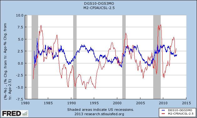
Since I'm not a highly paid Wall Street pundit, I simply rely upon the LEI for the short term, and the yield curve for the longer term with the caveat of watching out for deflation. The simple fact is, with one exception, if real M1, and real M2 (less 2.5%), are positive, and the yield curve 12 months ago was positive, the economy has always been in expansion. When real money supply is negative, and the yield curve was inverted 12 months ago, the economy has always been in contraction. The exception is that the yield curve does not help to project the economy 12-16 months later if the economy at that later date is in deflation - as it was in 1930-32 and late 2008 and early 2009.

Since in the last couple of years I have also learned a lot about the methods of the late Prof. Geoffrey Moore, the founder of ECRI, I've also been able to intergrate his findings about short and long leading indicators into my forecast.

This year, the LEI, the yield curve, and the short and long leading indicators of Prof. Moore are in close agreement: they suggest that, for the next 3 to 6 months, the economy will continue to shamble along just barely avoiding recession. Thereafter all of the long leading indicators are suggesting further improvement. But as we saw in late summer 2012, an unexpected Oil price spike can complicate the picture. And the embrace of austerity as enacted by last week's "fiscal cliff" agreement also throws a monkey wrench into the forecast.

Let's take each of those items in order.

For the first half of 2013, the economy will shamble along basically sideways.

Here is a chart, from Briefing.com, of the monthly change in the LEI for the last two years:


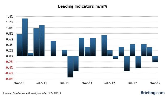
Notice that in March 2012, the positive bias downshifted markedly. In fact, for the last 6 months through November, the index did not advance at all. Since a significant downdraft in November was the spike in inital jobless claims post-Sandy that completely reversed itself in December, we can expect a similar rebound in the LEI for December when it is released in a couple of weeks. This suggests an economy that is moving forward, but with very little momentum.

ECRI's Weekly Leading Index, which is also supposed to be a short, 6 to 8 month leading index, suggests the same shambling forward - which is no surprise, since it contains many of the same components. More specifically, it consists of initial jobless claims, the JoC ECRI commodity index, purchase mortgage applications, commercial vs. treasury yield spreads, real M2 money supply, stock prices, and corporate bond yields. Here is ECRI's latest publicly available graph of its WLI growth index:


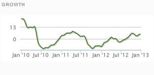
Six to twelve months ago this index was generally negative to neutral. It is only in the second half of 2012 that it began to improve and then turn positive for the last three months. Additionally, several short leading indicators that only appear monthly, and are therefore not in the WLI - namely, new factory orders and ISM backlog of deliveries and inventory readings - are at recessionary readings. This index actually suggests deterioration in the economy in the next three months or so before stabilization by midyear.

We can also take note of the Oil choke collar in this analysis. It appears that gas prices bottomed in December 2012 at the identical price they were in 2011. It is reasonable to expect that the Oil choke collar will engage by spring and remain engaged, with gas quite likely hitting $4 a gallon by summer.

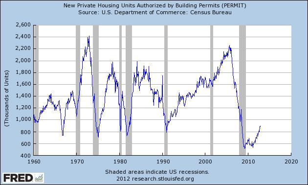
So is the balance tipped towards expansion or contraction in the first part of the year? With housing permits and car sales hitting new post-recession highs, with the S&P 500 index having just made a new 4 year high, and with initial jobless claims hitting new 4+ year lows, the answer should be an easy "NO!" None of these things has ever been consistent with a recession.

But Congress and President Obama just threw a monkey wrench into the works, in the form of a 2% payroll tax increase on the first $110,000 of income. The fact is, in order to maintain the long-term solvency of the Social Security Trust Fund, that increase (really just the ending of a temporary cut) was necessary. But for the health of the economy, without any offsetting relief on consumers, a new and significant drag has been added to consumer spending.

And it is consumer spending via refinancing which has been keeping the economy treading water for many months now. Frankly, I expect to see a significant pullback in consumer spending as a result of the decrease in disposable income within the next 3 months. Unless a further opportunity to refinance at even lower interest rates appears, that may be enough to tip us into a short term contraction at some point in the first 6 months of this year, specifically including one or more months of actual job losses beginning in March or April.

Contractionary fiscal policy is, after all, contractionary.

(continued in part 2)

Morning Market Analysis; Potential Bull Market Charts Developing


The above three charts show the IWM (Russell 2000, top), QQQs (NASDAQ, middle), and SPYs (S&P 500, bottom) in a daily (6 month) format.  I think it's best to think of all three averages as a coherent system rather than separating each market out individually.  While the IWMs are now at 6 month highs, the QQQs and SPYs are not.  Perhaps most disappointing is the SPYs stalled at resistance after such a strong jump higher at the opening on Wednesday.  Also note the declining volume as the week progressed, which is also a negative. 

It is still possible for follow through to occur.  The markets have not meaningfully sold-off and the underlying technicals are still good for the averages (rising MACD and positive CMF).  However, the lack of follow-through last week is troubling for the bulls.

Let's now look at the entire US treasury market.


Above are the weekly charts of all the major treasury ETFs, from shortest maturity to longest maturity.  There are a few key points to make:

1.) The longer ETFs have clearly declining MACDs.  The shorter ETFs do not have rising MACDs.

2.) All the ETFs have weakening CMFs

3.) The longer ETFs are at or near important, long-term resistance levels.

4.) The intermediate ETFs are approaching important, long-term resistance levels.

Also note there now appears to be some dissent within the Federal Reserve's ranks about the the timing of the end of QE.  Assuming the Fed signals the program will end at the end of this year, I would expect a sell-off of some magnitude in the treasury market.

However, also remember that certain yields on government bonds will naturally attract buyers looking for (or perhaps needing) the safety associated with government debt.  With inflation running at very cool levels, buy points will be low.